25 device presets
Phones, tablets, rotation and scale. Pick a model or set your own dimensions.
 Mobile Viewer
Website in 52 languages
Chrome extension · Free
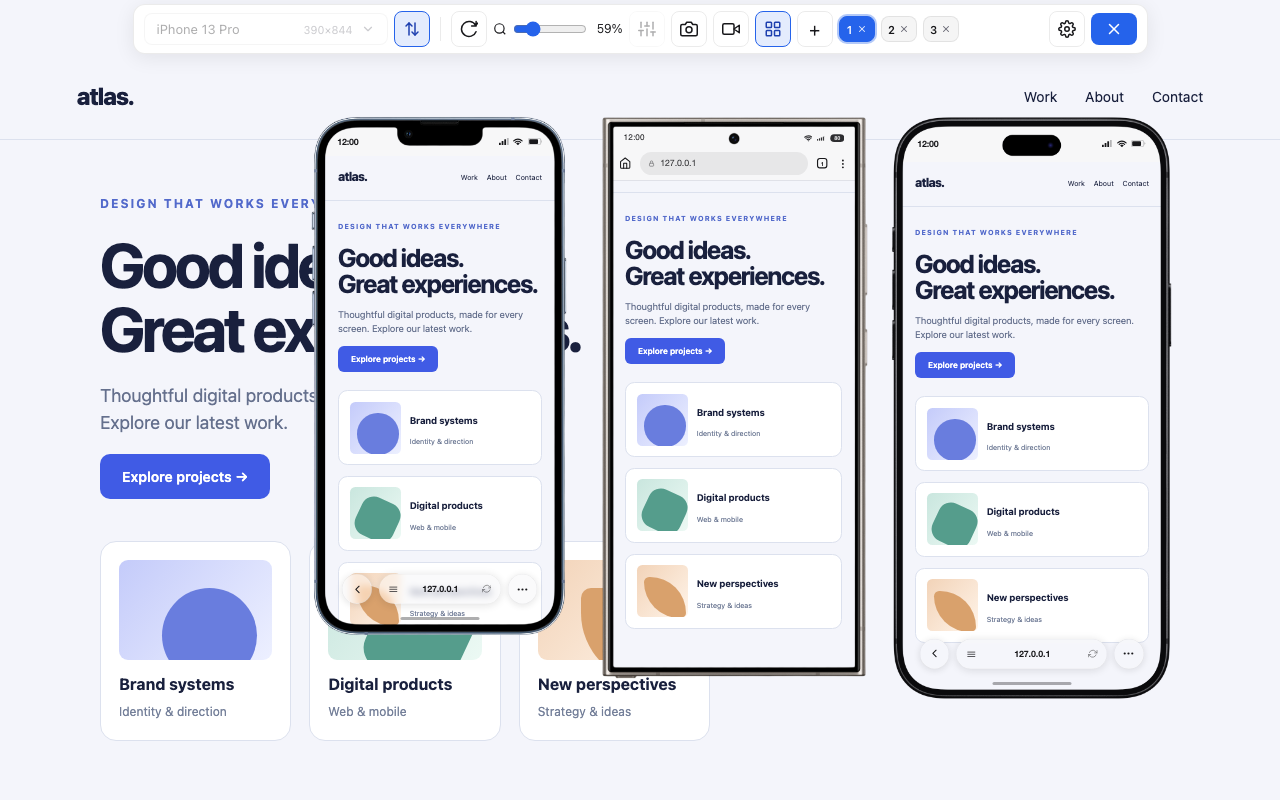
Preview your site in phone and tablet frames, right over the open page. Compare layouts and save screenshots or video.
Mobile Viewer
Phones, tablets, rotation and scale. Pick a model or set your own dimensions.
Compare responsive layouts side by side. Toggle scroll, click and typing sync.
Save a framed PNG or record your device or tab as MP4/WebM, depending on browser support.
Save custom viewports, device positions and preferences locally for your next session.
Pin the extension in the Chrome toolbar.
Open a website and click the extension icon.
Choose a device, compare layouts and capture the result.