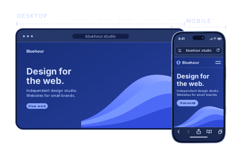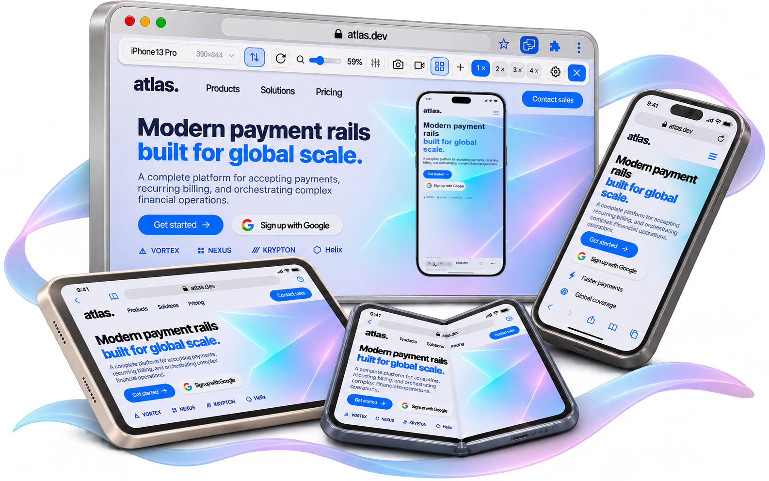
25 phone and tablet presets
Preview your site across different screen sizes. Choose a device, switch between portrait and landscape, and adjust the preview zoom.
 Mobile Viewer
Website in 52 languages
Free browser extension
Mobile viewer & mobile simulator: preview websites in mobile view, add devices, and test responsive layouts. Explore user flows and prepare demos for your clients.
 Chrome
 Edge
 Opera
 Brave
See how Mobile Viewer brings mobile and desktop previews together on a real website.
Preview your site across different screen sizes. Choose a device, switch between portrait and landscape, and adjust the preview zoom.
View your desktop site alongside up to five mobile devices at once. Turn on Sync to mirror scrolling, clicks, and text input across previews.
Save PNG screenshots with device frames. Record a single device preview or the entire tab. Videos save as MP4 or WebM, depending on your browser.
Set your own screen width and height. Save custom sizes, device positions, and preferences in your browser so you can pick up where you left off.
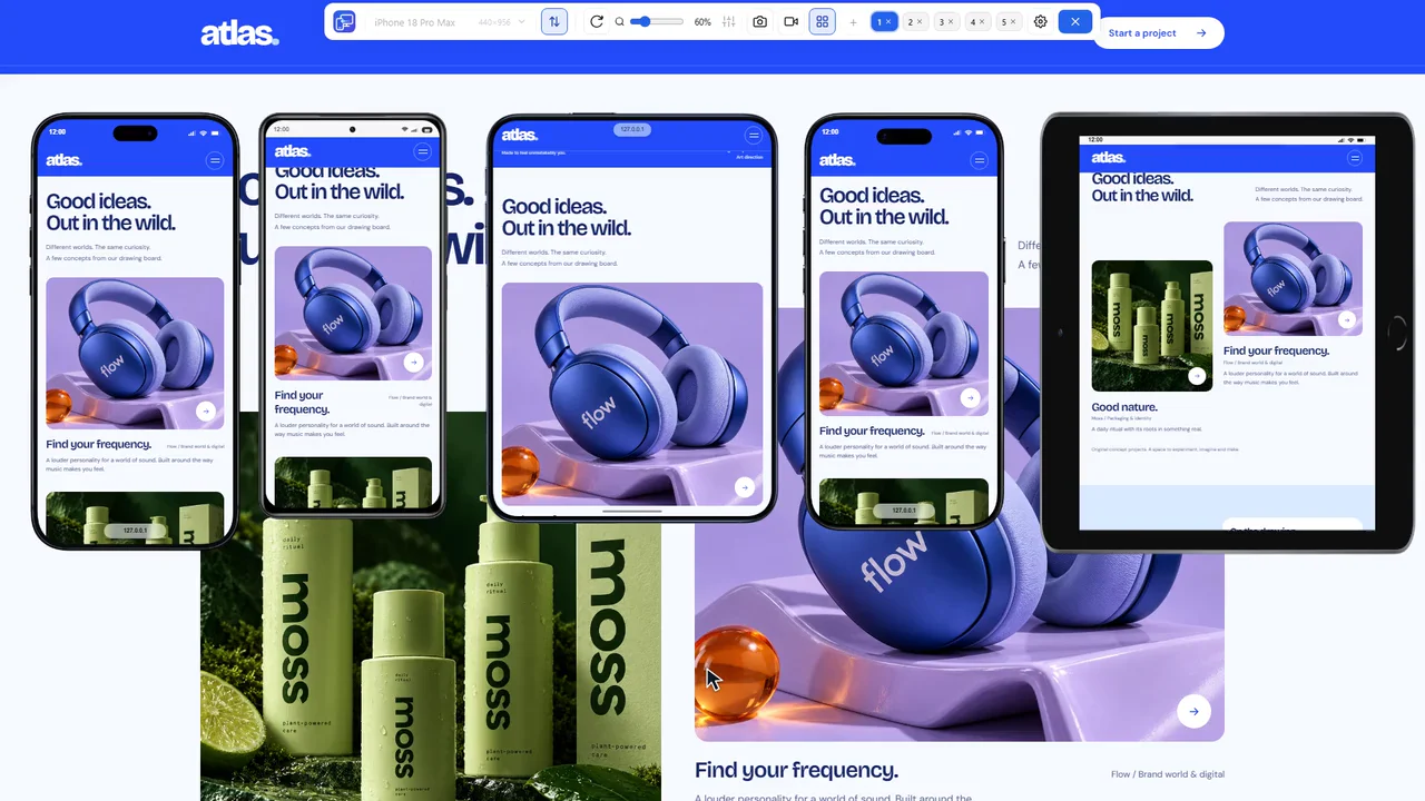


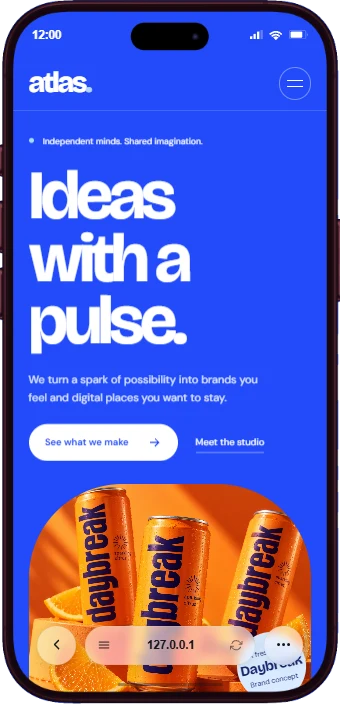
Check responsive layouts across screen sizes. Spot clipped text, misaligned elements, and buttons that fall off screen. Compare layouts as you make fixes.
Test the same user flow across up to five screen sizes at once. Sync mirrors scrolling, clicks, and text input, making differences easier to spot. Record bugs to show developers exactly what went wrong.
Check how your designs translate to a live website. Review spacing, typography, and layouts across screen sizes. Capture screenshots and videos to show your team what needs adjusting.
Check pages after updating copy and images. Catch awkward headline breaks, cut-off labels, and images that don’t fit well on phone and tablet screens.
Show clients how their site looks on phones and tablets. Export PNG screenshots with device frames for presentations, or record videos to walk them through menus, forms, and page transitions.
Mobile ViewerPreview your site on multiple phones and tablets alongside the desktop view, all in one tab.
Already installed? Set up Mobile Viewer