Guide
Bug report template
Copy a report template and describe a website issue someone can reproduce.
Explore guideLive screen resolution checker
Use the screen resolution checker to see your screen size in CSS pixels, live viewport and device pixel ratio. Copy these readings or learn how to measure a layout bug on the affected page.
Free browser extension · No account required · Runs on your computer
Screen size here is in CSS pixels. For the current output resolution, open your system’s display settings. For native panel pixels, check the display model’s specifications.
These readings describe this page. To diagnose a bug, measure the affected page in the failing state.
Check screen size in CSS pixels with the live screen resolution checker. If you are asking “What is my viewport size?” for responsive testing, start with Layout viewport. Your device pixel ratio (DPR) appears alongside the dimensions. Resize the window or rotate your phone to see which measurements change.
When you ask “What is my screen resolution?”, you may need the browser’s CSS dimensions for a website or the native display mode for a monitor. For the monitor’s hardware specifications, look up the display model. For its configured output resolution, open your operating system’s display settings.
| Measurement | Meaning | Use it for |
|---|---|---|
| Browser-reported screen size | The screen rectangle the browser reports in CSS pixels. | Recording the display context of a report. |
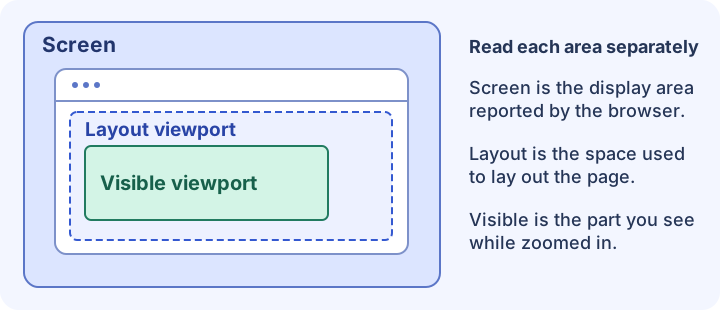
| Layout viewport | The page’s layout width and height, including rendered scrollbars. | Recreating the starting dimensions for a layout bug. |
| Visible viewport | The part of the page currently visible to the user. | Diagnosing an obscured button or a short visible area. |
| Device pixel ratio (DPR) | The ratio of physical to CSS pixels reported by this browser. | Explaining pixel density and image rendering differences. |
Reproduce the issue on the affected page and measure it there. Opening this checker can change the available space: the other page may use a different viewport setting, and leaving a form field may close the keyboard. Use an undocked developer console or a remote inspector if opening docked tools changes the layout.
Run this read-only snippet in the developer console for the affected page while the bug is visible. If opening the tools changes the state, take a screenshot or recording first and label any later readings with the state you measured.
(() => {
  const viewport = window.visualViewport;
  console.table({
    layout: `${window.innerWidth} × ${window.innerHeight} CSS px`,
    visible: viewport
      ? `${viewport.width} × ${viewport.height} CSS px`
      : "Unavailable",
    visualViewportScale: viewport?.scale,
    dpr: window.devicePixelRatio,
  });
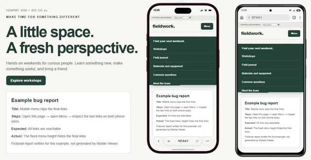
})();Measured on: Margin journal demo (margin.html), menu open
Layout viewport: 402 × 874 CSS px
Visible viewport: 402 × 814 CSS px
Device pixel ratio: 3
Steps: Open Explore and scroll to the end of the menu.
Expected: About the journal is reachable and opens its section.
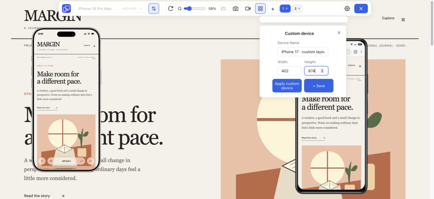
Actual: Scrolling stops before the last item becomes reachable.Open the affected URL and enter the reported layout width and height in Mobile Viewer’s Custom panel. Check the original state, then compare with a slightly wider or shorter view. If the failure depends on browser UI, keyboard behavior or the rendering engine, verify it on the original browser and device as well.
Keep the affected page open at the point of failure. Record the browser, device, orientation and whether the keyboard is open or the page is zoomed.
Include the measurements from the affected page, its URL, the steps, the expected result and what happened. Attach a screenshot or recording if the problem is visual.
Use a responsive preview at the recorded width and height for a layout check. For touch, keyboard or browser-specific bugs, retest on the original browser and device.
The viewport size checker shows the Layout viewport for the browser’s layout area and the Visible viewport for the area currently in view. Both update when their dimensions change.
The browser reports screen size in CSS pixels. The operating system’s display mode and the panel’s native resolution use physical pixel dimensions, which can differ because of scaling or display configuration.
Check the manufacturer’s specifications for your model to find its diagonal in inches. The screen size checker reports the display area in CSS pixels.
The visible area can get smaller when you pinch zoom or open an on-screen keyboard. The layout viewport can stay the same while less of the page is visible.
Use the copied width and height in Mobile Viewer, then test the same page alongside another size.
Install extensionChrome Web StoreFreeFree browser extension · No account required · Runs on your computer
Guide
Copy a report template and describe a website issue someone can reproduce.
Explore guideGuide
Choose viewport dimensions and know what to inspect at each size.
Explore guideFeature
Inspect layout changes at several screen widths and around your breakpoints.
Explore featureDevice reference
Find an iPad model, compare its display and CSS dimensions, and choose a viewport to test.
Explore device