Feature
Mobile simulator
Choose a phone or tablet, rotate its preview, and try custom screen sizes.
Explore feature Mobile Viewer
Website in 52 languages
A practical Chrome guide
You can view a mobile website on your computer with Chrome’s built-in Device Mode or with the Mobile Viewer extension. Device Mode is useful when you also need developer tools. Mobile Viewer keeps phone previews beside the desktop page and lets you compare several sizes at once. Here is how to use each approach.
Read the guideOpen the website in desktop Chrome. Open the Chrome menu, choose More tools, then Developer tools. In DevTools, click Toggle device toolbar. The page appears in a responsive viewport where you can select a device or enter a width and height.
Choose a phone preset or use Responsive mode to try a range of sizes. To add a missing device, open DevTools Settings → Devices → Add custom device, save its details, then select it from the Dimensions menu. Rotate the viewport to inspect portrait and landscape. Reload the page if needed after changing the device settings, then review the content and interactions you came to check.
Device Mode is a good fit when you want the page inspector and other developer tools alongside a preview. It is a simulation on your computer, so it does not replace testing on the actual phone and browser.
Install Mobile Viewer from the Chrome Web Store and open the website you want to preview. Click the extension icon to show the device preview. The initial activation may reload your page, so save unfinished form input before you start.
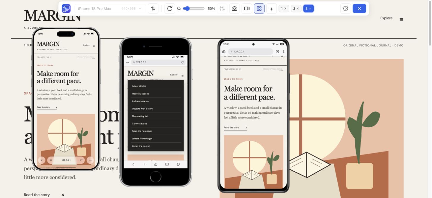
Choose one of the 25 phone and tablet presets. Change orientation and adjust zoom until the device fits comfortably on your monitor. The desktop version stays behind the preview, which makes differences in navigation, text wrapping, and image placement easier to compare.
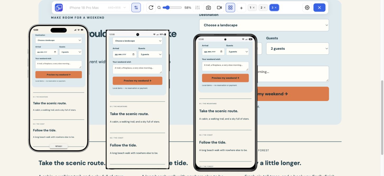
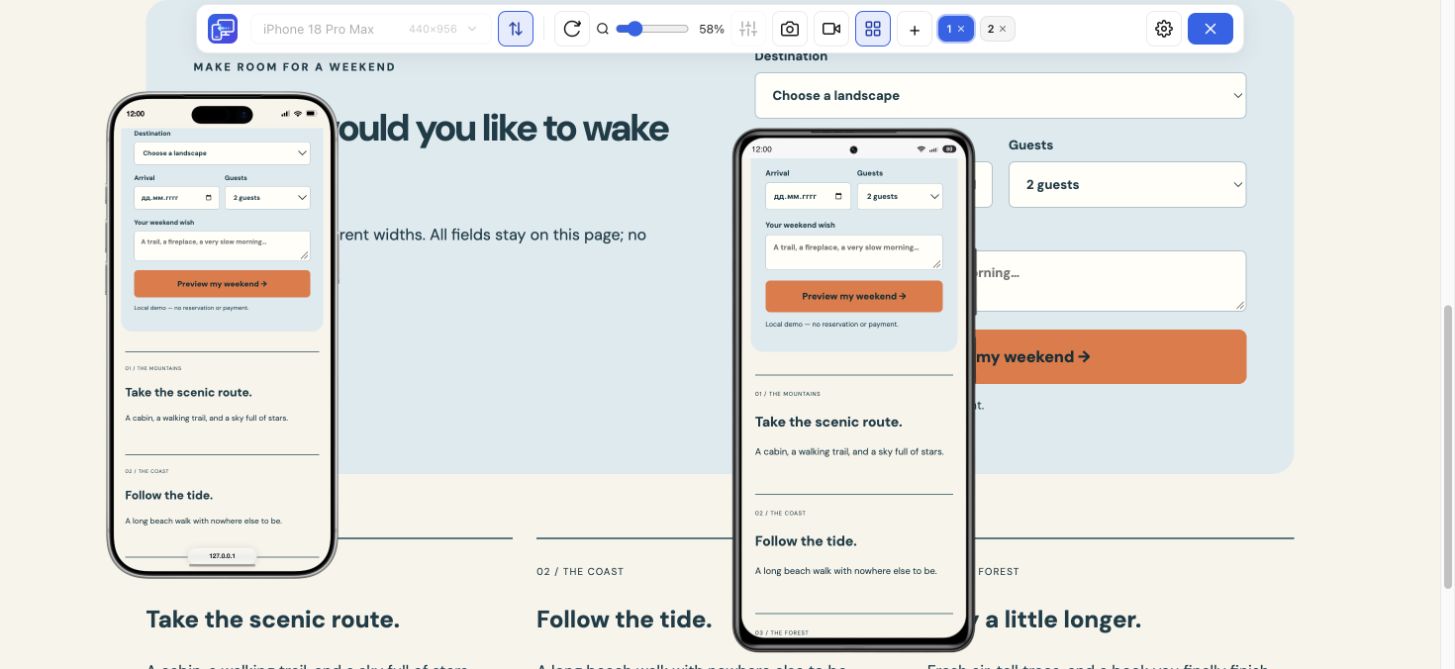
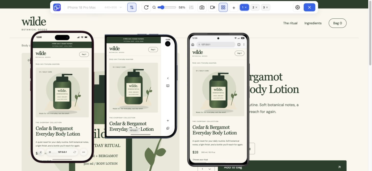
To switch your browser to mobile view with more than one size visible, enable multi-view and add devices. You can have up to five mobile previews at once. Move the frames so important sections remain visible, and keep a compact phone next to a larger phone or tablet.
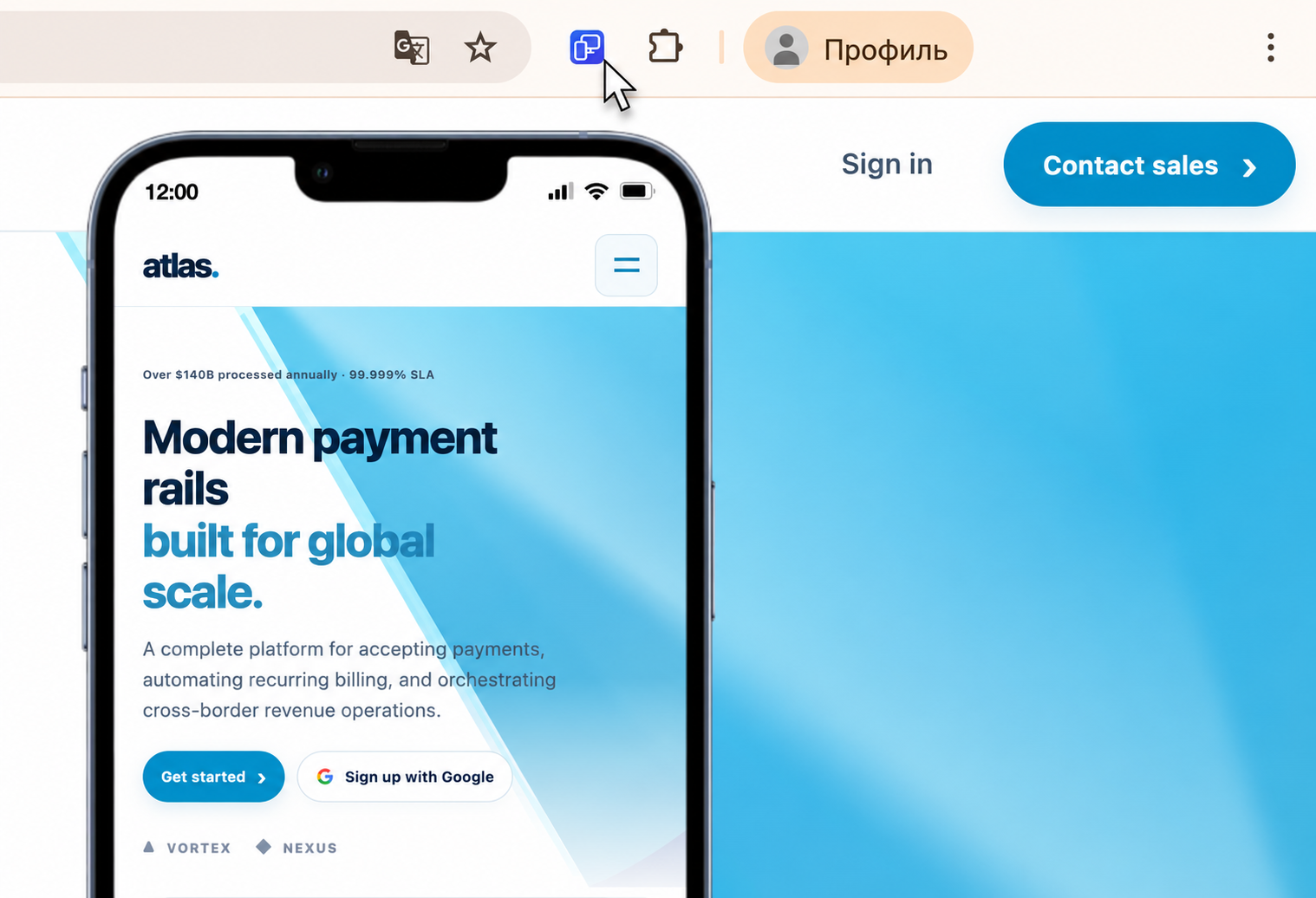
Follow a small checklist rather than looking only at the first screen. Review the header and menu, the main content, images, forms, and the footer. Look for clipped text, overflowing buttons, awkward gaps, and content that becomes hard to find on a narrow screen.
Try portrait and landscape because the available width changes. For a custom layout breakpoint, enter a custom width and height. Revisit the same content after a change to confirm that the fix works on more than one size.
Sync can mirror scrolling, clicks, and text input across previews. It is useful for comparing a menu or an ordinary test form. Turn it off when you need to inspect each view separately, and use a test environment for actions that could submit data or change an account.
Open the menu at a compact phone width, follow a link, and close it again. Check that long labels remain readable and that the menu does not cover its own close control. Repeat in landscape and at a tablet width. Keep the desktop page beside the previews to compare which links each layout makes available.
Use an ordinary test form with short and long input. Check labels, required-field messages, and the final button at a narrow width. Inspect a validation error as well as a successful state. Use test data for submissions. Finish on a real phone to check the on-screen keyboard and touch behavior, which a desktop preview does not reproduce.
Use Mobile Viewer’s custom dimensions to reproduce horizontal scroll and note the first width where it appears. Keep a nearby width beside it to compare the same content. Check wide images, tables, long unbroken text, and containers with fixed widths. In Chrome DevTools, inspect the suspected element and its box model; temporarily disable a width, minimum width, or margin to see whether the overflow changes. Hiding overflow can clip content, so identify the cause before treating a hidden scrollbar as a fix. Repeat the same width after correcting the site.
When you find a layout issue, use the screenshot control to save the selected device as a PNG with its frame. In multi-view, focus the device you want to capture. This saves that device preview, not a stitched full-page image or a batch of every window.
For a sequence of actions, choose video recording for one device or the whole tab. Walk through the menu or page transition, stop recording, and find the saved file in Downloads. MP4 or WebM availability depends on the browser.
Use Chrome Device Mode when you want a built-in preview together with developer tools. Use Mobile Viewer when you want phone frames alongside the desktop site, several mobile sizes visible together, synchronized interactions, or captures for a teammate or client.
Both approaches help you inspect a mobile view of a website from a computer. Neither means the page is running in the actual Safari engine or on an Android phone. Finish important compatibility, touch, and performance checks on real devices.
Open a real page in desktop Chrome and launch Mobile Viewer. Compare a compact phone with a wider phone, read the longest heading and open the main navigation. Save a screenshot or short walkthrough when the difference needs to be explained to someone else.
Yes. Open DevTools, click Toggle device toolbar, and choose a phone preset or responsive dimensions. Mobile Viewer is an optional extension for a different workflow with side-by-side previews.
To force mobile view on desktop, open Chrome’s More tools → Developer tools, click Toggle device toolbar, and choose a phone preset. The narrower viewport lets the site apply its mobile layout rules. If the page stays in a desktop layout, reload it and inspect its viewport settings and responsive CSS. To compare several mobile sizes beside desktop, open Mobile Viewer on the same website.
In Mobile Viewer, compare the same page in phone and tablet previews beside desktop. Keep the viewport width, orientation, and open menu or form state consistent with the case you are investigating. Responsive rules can intentionally rearrange content. If the difference is unexpected, inspect fixed widths and the viewport setup; then compare the actual phone browser. A desktop Chrome preview does not reproduce every browser engine, keyboard, or touch behavior.
Mobile Viewer supports local HTTP pages such as localhost and 127.0.0.1. This previews the local site on your computer; it does not connect a physical phone to your development server.
Open Mobile Viewer on the page, select the width where the issue appears, and compare a second preview beside desktop. Capture the failed state before you change the site.
Install extensionChrome Web StoreFreeFree browser extension · No account required · Runs on your computer
Feature
Choose a phone or tablet, rotate its preview, and try custom screen sizes.
Explore featureFeature
View the current website on mobile sizes alongside its desktop version.
Explore featureFeature
Follow a user journey across mobile sizes and record what needs fixing.
Explore featureFeature
Check your website at compact and large iPhone sizes, side by side.
Explore featureFeature
Compare Samsung, Pixel and Xiaomi website layouts in your Chrome workspace.
Explore feature