Feature
Mobile simulator
Choose a phone or tablet, rotate its preview, and try custom screen sizes.
Explore feature Mobile Viewer
Website in 52 languages
One website, several views
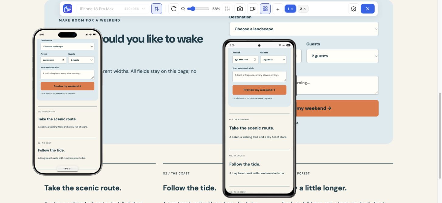
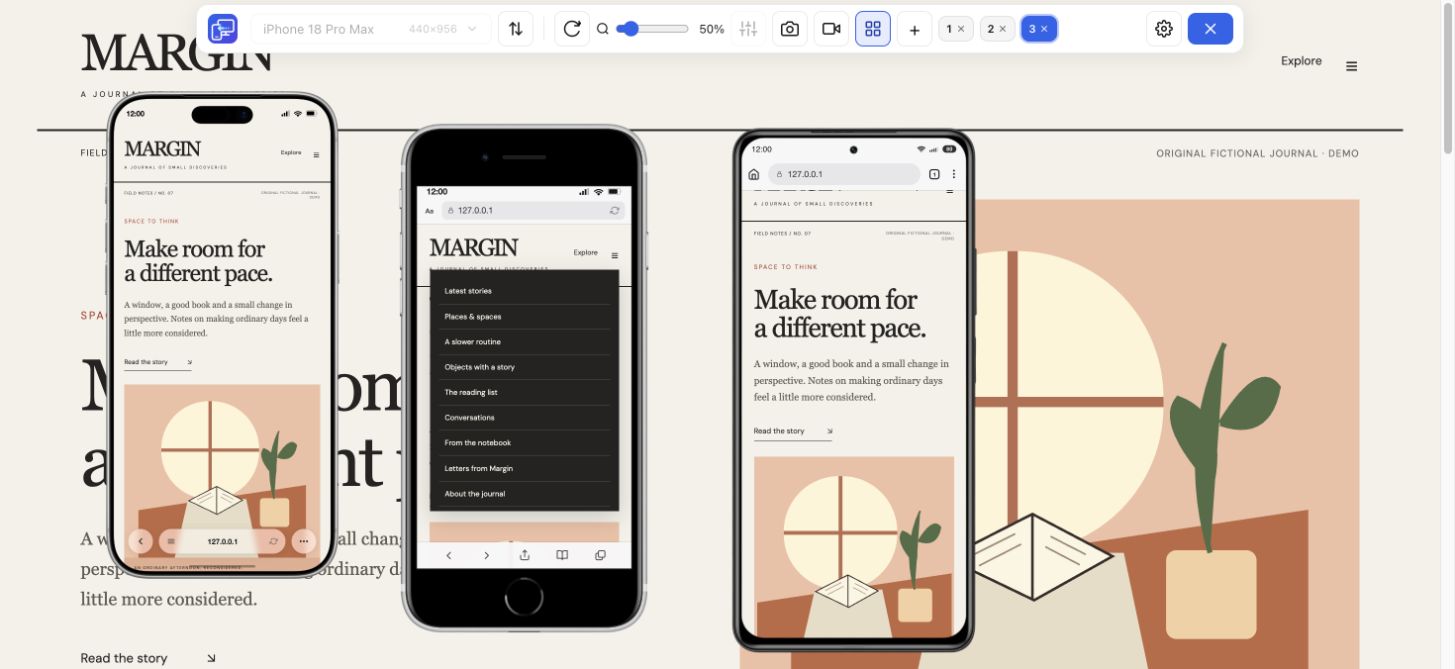
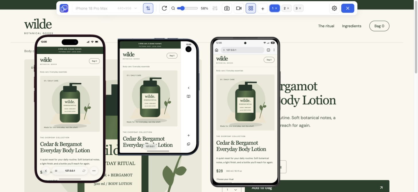
View your website on mobile and desktop side by side in Chrome. Mobile Viewer opens phone and tablet previews over the page you are already viewing. Choose two sizes and compare the same content on one screen.
Free browser extension · No account required · Runs on your computer
View your website as a mobile visitor would: inspect the real page at a phone-sized viewport rather than reviewing a static mockup. Keep desktop visible for comparison, then repeat the check at the same dimensions after a change.
To see your website in mobile view after an edit, open the page and choose a phone preset. Read the longest heading, check the image crop, and open the menu. Scroll through the rest of the page to catch changes that are easy to miss on desktop.
The mobile site viewer keeps the original desktop page in the same workspace. Compare how navigation changes, whether the main action remains clear, and where cards or columns wrap. You can move the device windows and adjust their zoom to keep the parts you need visible.
Add up to five mobile devices for a wider comparison. A compact phone, a large phone, and a tablet often reveal more than one preview alone. Switch between portrait and landscape or use custom sizes when your layout needs a closer look.
Turn on Sync to mirror scrolling, clicks, and text input across previews. Follow a menu or a simple test form through several sizes, then compare where the layout changes. Turn Sync off when you want to browse each device independently. Use a test environment for actions that can submit data or change accounts.
Use your website’s mobile view to check a page after changing copy or images. Look for headline breaks, labels that no longer fit, pictures that push important content down, and buttons that extend beyond the viewport. Try the mobile navigation and check both short and long form values.
For a repeatable review, visit the same sections at every size: the first screen, navigation, main content, forms, and footer. This is a manual visual workflow. The extension does not return a mobile-friendly score or automatically certify that a website has no layout problems.
Capture a PNG of the selected device preview with its frame when you need to show a layout issue or prepare a presentation. In multi-view, the screenshot action saves the focused device rather than a batch of every preview.
For a sequence of interactions, record one device or the entire tab. Videos save as MP4 or WebM depending on browser support. A short walkthrough can show a menu opening, a page transition, or the difference between desktop and phone layouts more clearly than a written description.
This mobile website viewer requires the Chrome extension; it is not an online URL form that runs without installation. It supports HTTPS websites and local HTTP development pages such as localhost. Browser-internal pages, the Chrome Web Store, and the built-in PDF viewer are not supported.
The preview renders in desktop Chrome. It helps you inspect responsive behavior, but it does not run the actual Safari engine or an Android operating system. Use real-device testing for final browser, hardware, and performance checks.
Get a mobile phone view of a website beside its desktop layout. Open a product page, expand the navigation and follow the same task in both views. Mobile Viewer keeps the page interactive, so the result is more useful than a static phone frame.
Install Mobile Viewer, open your website in Chrome, and click the extension icon. The first activation may reload the page.
Choose a phone or tablet. Add more devices to compare sizes, rotate a preview, and adjust its zoom.
Inspect content and interactions, use Sync when useful, and save a selected-device PNG or a video.
Install Mobile Viewer for Chrome, open the site, click the extension icon, and choose a phone or tablet preset. The preview appears beside your desktop page.
It is a Chrome extension. Install it from the Chrome Web Store before opening device previews.
Yes. Keep the desktop page visible and add up to five mobile previews in the same tab.
No. These are device previews rendered in desktop Chrome. Check real phones and browsers for final compatibility and performance.
Use Mobile Viewer to keep a compact phone, a larger phone, and your desktop page visible together. Compare the same heading, image, and open menu before sharing a finding.
Install extensionChrome Web StoreFreeFree browser extension · No account required · Runs on your computer
Feature
Choose a phone or tablet, rotate its preview, and try custom screen sizes.
Explore featureGuide
Follow the steps for Chrome Device Mode or use Mobile Viewer beside desktop.
Explore guideDevice reference
Search iPhone sizes, compare CSS rectangles and choose a website test configuration.
Explore device