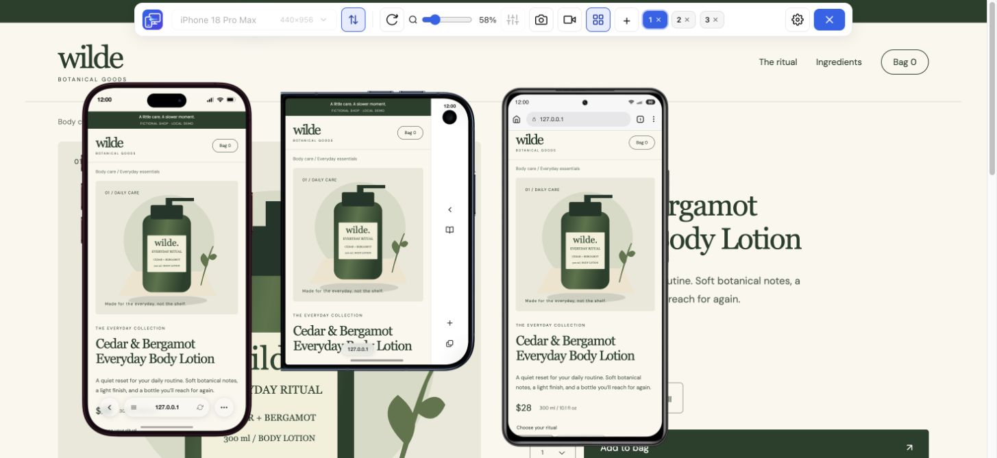
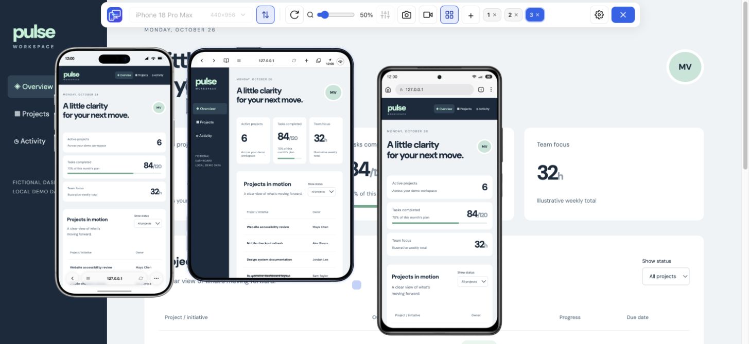
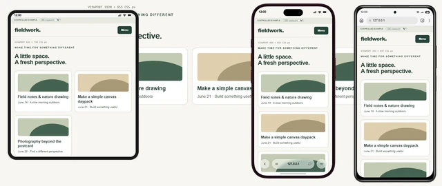
Display diagonal
A physical measurement in inches. It helps compare hardware, but does not tell you where a CSS card grid should change.
 Mobile Viewer Free browser extension
Turn iPhone screen sizes into a check of your own website. Choose a compact and a large phone, compare layouts in Mobile Viewer and capture what needs fixing.
Presets + custom sizes
Free browser extension · No account required · Runs on your computer
 Chrome
 Edge
 Opera
 Brave
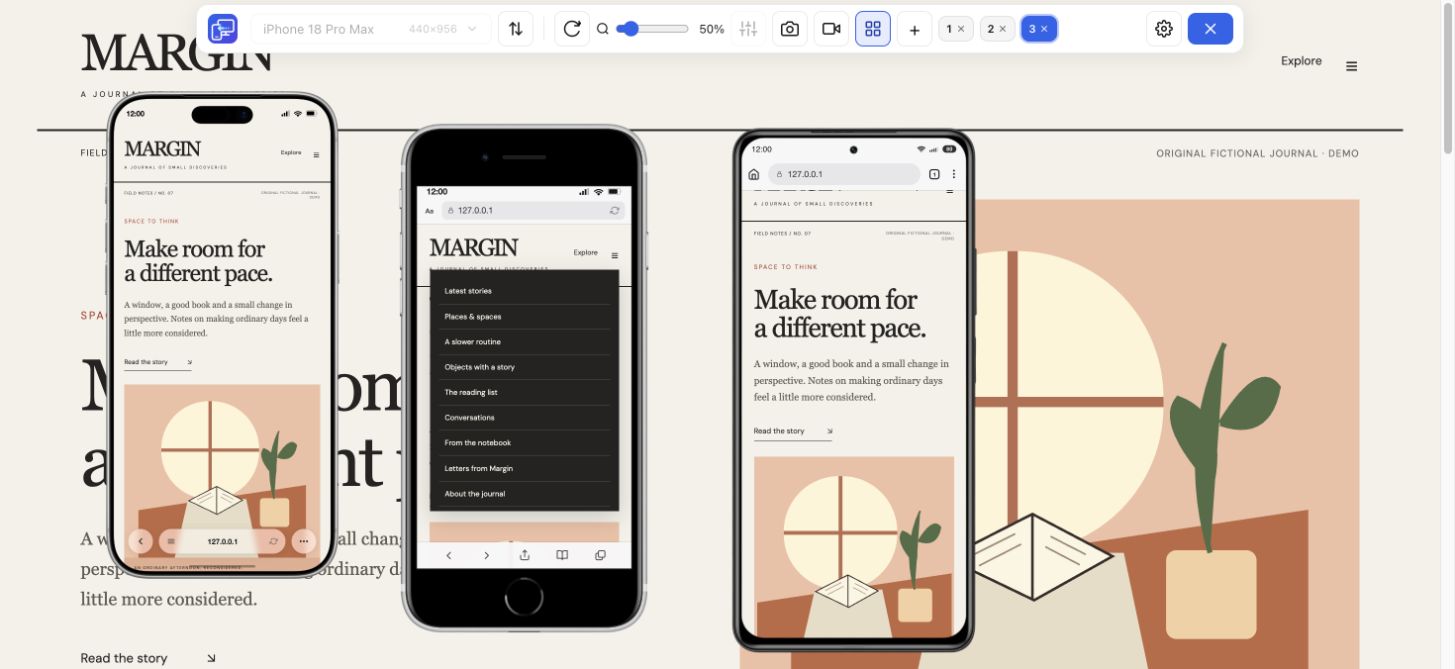
An iPhone screen resolution tells you how many physical pixels its display contains. Your CSS layout uses a different measurement. Use this iPhone screen sizes reference to find a website configuration, distinguish the units and turn the numbers into a repeatable page check.
Search a model or width, then select up to three configurations to compare their CSS rectangles. The table includes every current iPhone-labeled preset in Mobile Viewer, plus the two clearly labeled custom configurations. It is not a complete history of every iPhone. Built-in presets and custom configurations are labeled separately.
14 of 14 configurations. Select up to three to compare.
| Compare / model | Default CSS rectangle | Preset / reference DPR | Preview setup | Physical display px |
|---|---|---|---|---|
| 626 × 890 | 3 | Built-in preset | 1878 × 2670 (inner) | |
| 678 × 466 | 3 | Built-in preset | 1398 × 2034 (outer) | |
| 440 × 956 | 3 | Built-in preset | — | |
| 402 × 874 | 3 | Built-in preset | — | |
| 420 × 912 | 3 | Built-in preset | — | |
| 440 × 956 | 3 | Built-in preset | 1320 × 2868 | |
| 402 × 874 | 3 | Built-in preset | 1206 × 2622 | |
| 390 × 844 | 3 | Built-in preset | 1170 × 2532 | |
| 414 × 896 | 3 | Built-in preset | 1242 × 2688 | |
| 414 × 896 | 2 | Built-in preset | 828 × 1792 | |
| 375 × 667 | 2 | Built-in preset | 750 × 1334 | |
| 320 × 568 | 2 | Built-in preset | — | |
| 440 × 956 | 3 (reference) | Custom configuration | 1320 × 2868 | |
| 402 × 874 | 3 (reference) | Custom configuration | 1206 × 2622 |
CSS values are Mobile Viewer preset configurations or labeled custom starting points. Hardware resolution is included only for entries linked to a verified manufacturer reference. A blank hardware reference does not mean zero resolution. Preset names such as iPad Mini or iPhone SE can cover older generations; match the listed dimensions rather than assuming the latest model. Android display scaling can change CSS dimensions; browser bars can reduce visible height. For custom entries, 3× is a reference calculation; the custom panel sets width and height, without a DPR field. The diagram compares CSS rectangles, not physical phone sizes.
“iPhone screen size” can mean a diagonal in inches, a physical pixel resolution or a CSS viewport. Choose the measurement that answers your question before copying a number into your website.
A physical measurement in inches. It helps compare hardware, but does not tell you where a CSS card grid should change.
The physical display pixel grid. For example, the iPhone 13 Pro specification lists 1170 × 2532 pixels in portrait order.
The layout space used by responsive CSS. The Mobile Viewer iPhone 13 Pro preset uses 390 × 844 CSS pixels with DPR 3.
For a simple reference calculation at DPR 3, 1170 ÷ 3 = 390. Likewise, 2532 ÷ 3 = 844. This explains the iPhone 13 Pro configuration in the table; it does not mean every live browser has an 844 px visible height.
Browser controls, zoom, display settings and the distinction between layout and visual viewports matter. On a physical phone, measure the browser state you need to reproduce. A custom 440 × 956 preview is a useful starting rectangle for a large iPhone layout, not proof of Safari behavior.
<meta name="viewport" content="width=device-width, initial-scale=1">

/* Example content breakpoint, not a model detector */
@media (max-width: 400px) {
  .product-actions { flex-direction: column; }
}In Mobile Viewer, start with a 390 px iPhone 13 Pro and a 440 px iPhone 17 Pro Max. Add the 402 px iPhone 16 Pro if your component changes around 400 px. Keep the same content in every view; otherwise a different headline or page state can look like a size-related issue.
| Compare | Inspect | A useful finding |
|---|---|---|
| 390 → 402 px | Navigation and button layout near 400 px | A breakpoint leaves an action detached from its label |
| 390 → 440 px | Card count, title wrapping and image crop | A wider layout creates an orphan card or too much space |
| Portrait → landscape | Open menus, dialogs and fixed controls | A close button is hard to reach in a shorter view |
Install the free Chrome extension, open your site and choose the matching preset. For a model labeled Custom configuration, enter its width and height explicitly and apply the size. Repeat the same menu, product or form task; save a device PNG if the result needs to go into an issue report.
The table combines manufacturer display specifications with documented preview configurations. It does not convert desktop Chrome into iOS Safari. Finish browser-specific checks on a real iPhone or a suitable testing service.
An iPhone 13 screen size query does not automatically describe the iPhone 13 Pro configuration listed here. Match the model, generation, physical specification and CSS viewport separately. The same caution applies to the older iPhone 5/SE label and the iPhone SE preset: do not assume they represent the newest SE.
Use your audience and your content to choose useful widths. A compact layout, a mid-width iPhone and a larger iPhone make a practical starting set. Also check intermediate widths where your content changes, rather than designing only for named phones.
No. Screen resolution counts physical display pixels. Viewport dimensions describe CSS layout space; DPR relates CSS pixels to device pixels. Browser state can also change the visible area.
It includes every iPhone-labeled preset currently in Mobile Viewer, plus the labeled custom configurations. It does not cover every iPhone ever released. Match the listed dimensions and generation before using a preset as your test configuration.
Choose two iPhone sizes, open the same page in both, and see how your layout responds. Mobile Viewer keeps the comparison beside your desktop page.
Install extensionChrome Web StoreFreeFree browser extension · No account required · Runs on your computer
Feature
Check your website at compact and large iPhone sizes, side by side.
Explore featureDevice reference
An interactive device size reference with practical website checks.
Explore deviceGuide
Test a media-query boundary with a CSS example and expected results.
Explore guide