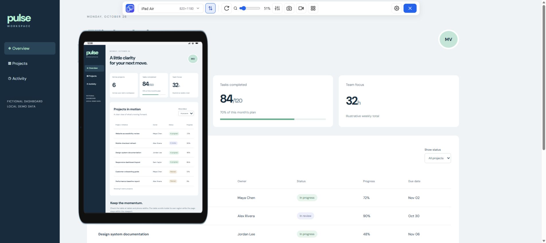
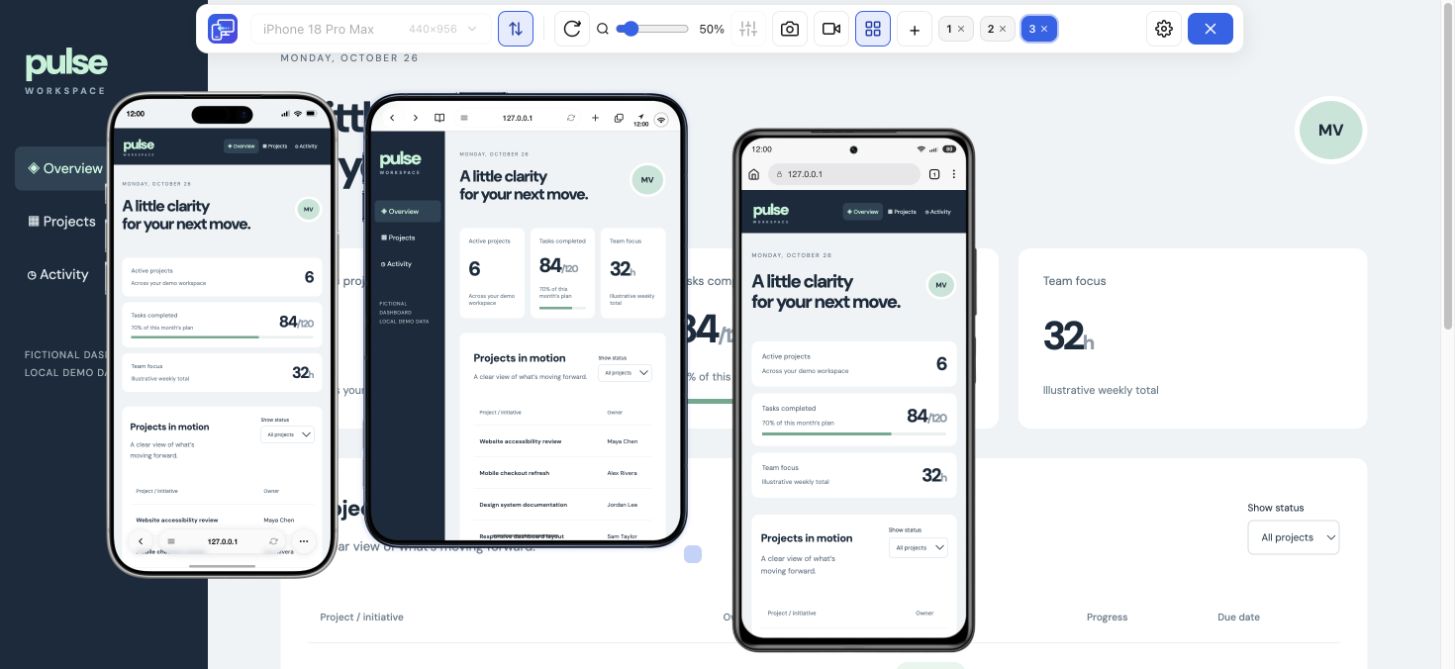
Compare iPad screen sizes, display resolutions and CSS viewports by generation. Find your model and test its layout width on your site with Mobile Viewer.
Free browser extension · No account required · Runs on your computer
Mobile Viewer previewOne site, two orientations
iPad Air
Portrait820 × 1180 CSS px
Landscape1180 × 820 CSS px
iPad screen sizes and resolutions by model
Use the iPad screen sizes chart to find the iPad screen resolution for your model or compare CSS widths across generations. Search by model, a width such as 820, or a size pair such as 820 × 1180. Select up to three configurations and switch to landscape to see the dimensions in width × height order.
19 matching configurations. Select up to three to compare.
iPad screen sizes and resolutions · Portrait
iPad model
Diagonal
Display pixels
Reference CSS px
DPR
Mobile Viewer setup
Copy CSS size
10.9 in
1640 × 2360
820 × 1180
2×
iPad Air preset size
10.2 in
1620 × 2160
810 × 1080
2×
Custom size
9.7 in
1536 × 2048
768 × 1024
2×
iPad Mini preset size
9.7 in
768 × 1024
768 × 1024
1×
iPad Mini preset size
8.5 in
1512 × 2316
756 × 1158
2×
Custom size
8.3 in
1488 × 2266
744 × 1133
2×
Custom size
7.9 in
1536 × 2048
768 × 1024
2×
iPad Mini preset size
7.9 in
768 × 1024
768 × 1024
1×
iPad Mini preset size
10.9 in
1640 × 2360
820 × 1180
2×
iPad Air preset size
12.9 in
2048 × 2732
1024 × 1366
2×
Custom size
10.9 in
1640 × 2360
820 × 1180
2×
iPad Air preset size
10.5 in
1668 × 2224
834 × 1112
2×
Custom size
9.7 in
1536 × 2048
768 × 1024
2×
iPad Mini preset size
11.1 in
1668 × 2420
834 × 1210
2×
Custom size
13 in
2064 × 2752
1032 × 1376
2×
Custom size
11 in
1668 × 2388
834 × 1194
2×
Custom size
12.9 in
2048 × 2732
1024 × 1366
2×
Custom size
10.5 in
1668 × 2224
834 × 1112
2×
Custom size
9.7 in
1536 × 2048
768 × 1024
2×
iPad Mini preset size
Preset matches refer to CSS dimensions. Browser controls, iPadOS windowing and zoom can change the actual browser viewport.
Which iPad viewport should you use for a website?
Use the reference CSS dimensions to choose a starting point for your layout test. The iPad screen resolution describes the physical display. The iPad viewport is the space the browser gives a page in CSS pixels, and the live browser height can change when controls are visible or the app window is resized.
iPad mini screen resolution
The iPad mini viewport depends on the generation. In portrait, the iPad mini (A20 Pro) has a 1512 × 2316 display and a 756 × 1158 CSS reference. The iPad mini 6 viewport size reference is 744 × 1133 CSS px, with a 1488 × 2266 display. Use Custom for these sizes. The built-in iPad Mini preset is 768 × 1024.
iPad and iPad Air viewport sizes
The iPad (A16) and 11-inch iPad Air share an 820 × 1180 CSS reference and a 1640 × 2360 display resolution in portrait. The iPad Air preset gives you the matching layout size.
iPad Pro screen resolution
The iPad Pro 11-inch viewport size reference is 834 × 1210 CSS px in portrait on M4 and M5 models, which have a 1668 × 2420 display. The 13-inch versions are 2064 × 2752 on the display and 1032 × 1376 in CSS px. Earlier 11-inch models share the 834 px width but use a 1194 px reference height.
Try one navigation at several iPad widths
Select 768 px to open a compact menu and 820 px to use the same links in a sidebar. The demo switches at 800 CSS px. Try 799 and 800 to isolate the breakpoint, then choose the same destination in both layouts. On your own site, repeat the action after rotating the tablet preview.
768 CSS px · Compact menu
Projects
This example switches navigation at 800 CSS px.
How to test iPad CSS breakpoints on your site
For a width-only CSS rule, one check at 820 px covers the same width as the iPad (A16) and the 11-inch iPad Air. Use your site’s actual breakpoint to choose the next check. If your rule starts at 800 px, compare 799 and 800 px with the same content, then sample a narrower iPad mini and a wider iPad Air. The demo uses 800 px to make that change easy to see.
Group by width
For a breakpoint check, group matching widths together. Keep height as a separate test if a sticky footer, menu or modal can cover an action.
Probe the boundary
Check one pixel below the breakpoint and at the breakpoint. Try the longest label or title you ship and verify that every action is still reachable in both states.
Measure the real window
For Safari, zoom or an iPadOS windowed layout, measure the affected page on the iPad. If the failure changes when browser controls appear, record the visible viewport as well.
Get started in three steps
Find and copy the CSS dimensions
Pick your model and orientation from the iPad viewport chart. Copy its reference width and height.
Open your website in desktop Chrome
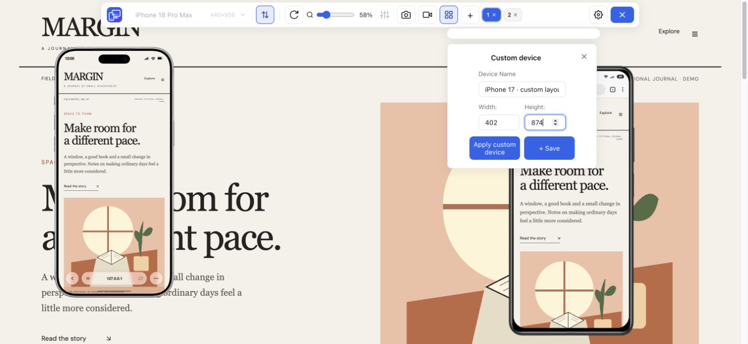
Install Mobile Viewer, open your site and select the matching tablet preset or enter width and height in Custom.
Compare and verify
Keep the same content and state across previews. Confirm Safari behavior, touch and on-screen keyboard interactions on the target iPad.
Frequently asked questions
What is the screen resolution of an iPad?
It depends on the generation. The iPad (A16) is 1640 × 2360 physical pixels in portrait. To find your iPad screen size in pixels, look up the model in the Display pixels column. Use Reference CSS px for website layout.
What are common iPad viewport sizes in CSS pixels?
Useful starting points are 744 × 1133 for iPad mini (6th generation), 820 × 1180 for iPad (A16), and 1032 × 1376 for the 13-inch iPad Pro (M4 or M5). Measure the live viewport if the exact browser area matters.
What is the iPad Air screen resolution?
The 11-inch Air models with M2, M3 or M4 are 1640 × 2360 physical pixels in portrait. The 13-inch models in those generations are 2048 × 2732.
How do I find the iPad landscape viewport for my model?
Switch the chart to Landscape to see the reference width and height. To test that size, use the rotated preset or enter the copied dimensions in Custom. Verify Safari-specific behavior on your iPad.