Feature
Mobile simulator
Choose a phone or tablet, rotate its preview, and try custom screen sizes.
Explore feature Mobile Viewer
Website in 52 languages
Mobile Viewer for Chrome
Mobile Viewer is a free mobile view extension for Chrome. Open the website you are working on, click the extension icon, and bring a phone or tablet preview onto the same screen as desktop. Compare layouts, follow a user flow, and capture the result without creating an account.
Free browser extension · No account required · Runs on your computer
Install Mobile Viewer from its Chrome Web Store listing. Open a website, then click the Mobile Viewer icon in the extensions menu. You can pin the icon in Chrome if you want it close at hand. Save any unfinished input first: the initial activation may reload the page.
Choose one of the 25 phone and tablet presets. Change orientation, adjust the preview zoom, or move the frame to keep the desktop content visible. The website inside the frame uses the selected viewport dimensions, so reducing the display zoom does not turn a phone layout into a desktop layout.
A Chrome extension for mobile view is useful when you need to review the actual page beside another layout. For responsive design testing, check navigation, headings, cards, and calls to action at narrower widths. Scroll beyond the first screen to review long content and the footer.
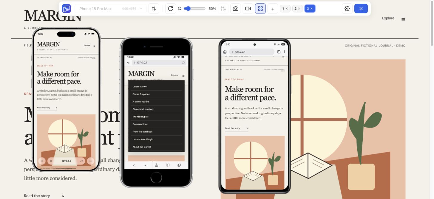
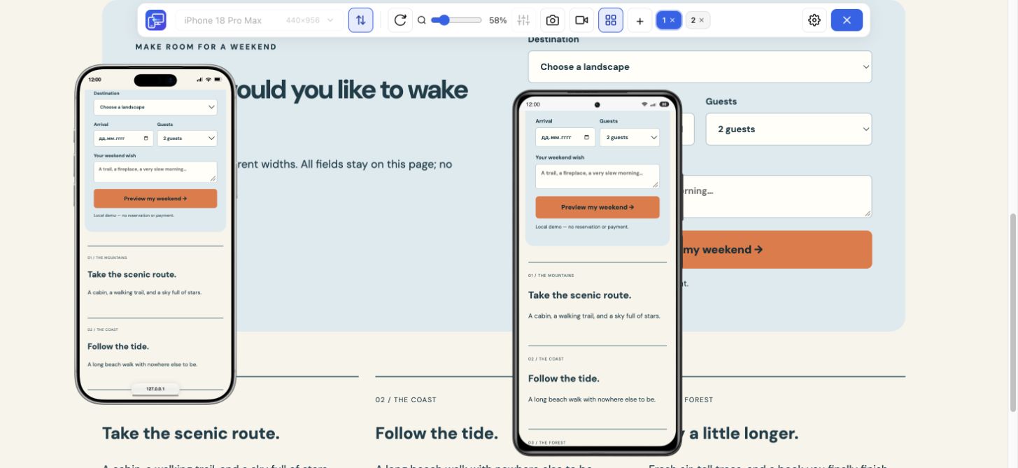
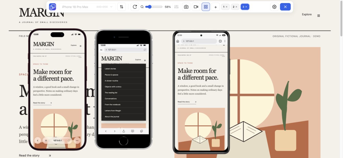
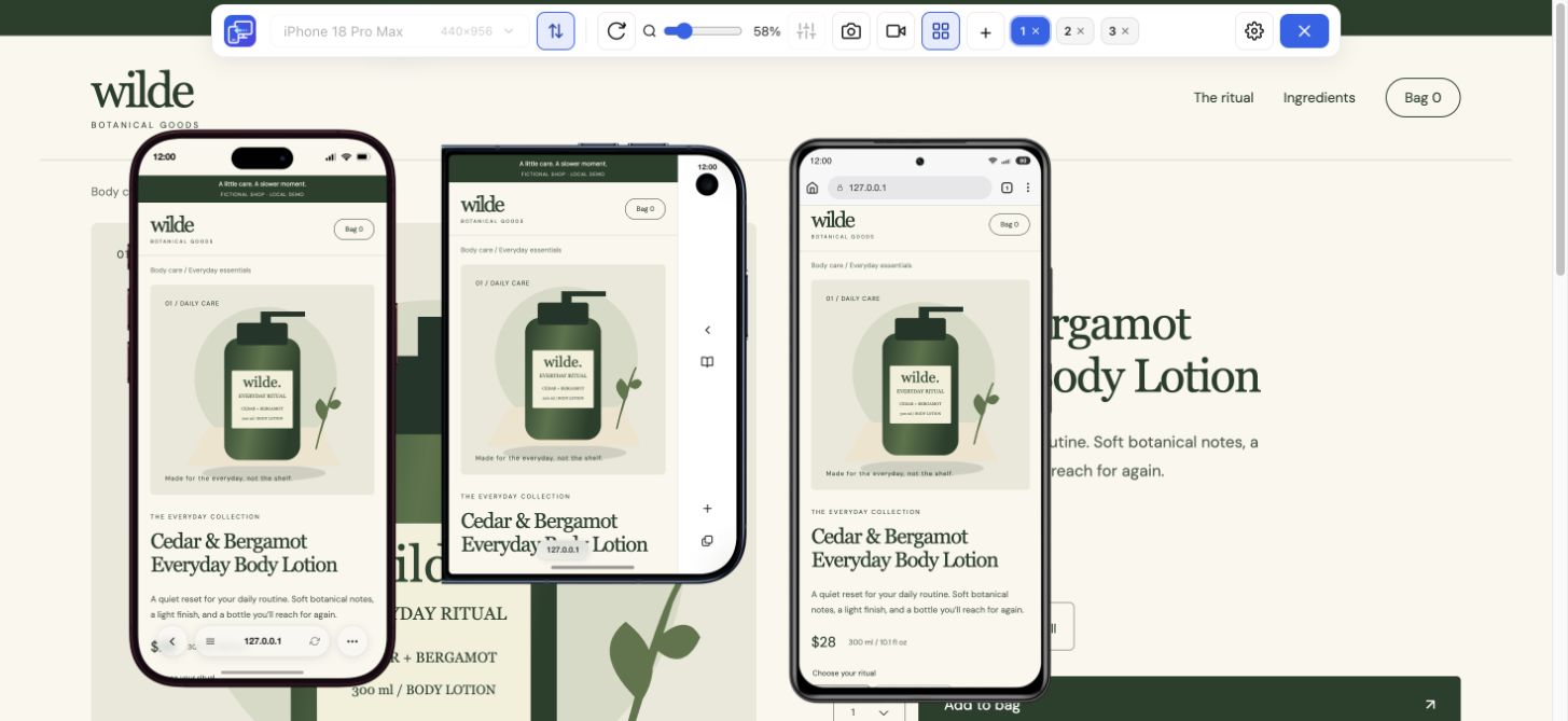
Add up to five mobile previews for a comparison across sizes. Keep a small phone next to a larger phone or tablet, or enter a custom width and height around a breakpoint you are investigating. Saved device positions and preferences help you return to a familiar workspace.
Turn on Sync when you want scrolling, clicks, and ordinary text input to be mirrored across previews. It can help you compare the same navigation or form state at several sizes. Turn Sync off when each preview needs a different state. Use test data when checking actions that submit a form.
Save the focused device as a PNG with its frame, or record a walkthrough of one device or the full tab. The recording saves as MP4 or WebM depending on browser support. A screenshot captures the selected preview; it does not automatically stitch a whole page or export every device at once.
Use this mobile view extension when side-by-side previews, device frames, synchronized interactions, and captures suit your work. Chrome Device Mode is another option when you need the built-in inspector and other developer tools alongside a responsive viewport.
Mobile Viewer previews websites through desktop Chrome. It does not run an Android operating system, install phone apps, or reproduce the Safari engine. Check important device-specific behavior on a real phone too. The extension supports HTTPS websites and local HTTP development pages such as localhost; browser internal pages and remote HTTP sites are outside this workflow.
A mobile simulator extension is useful when you need to compare a website while staying in Chrome. Start with the page already open, add contrasting devices and decide whether Sync helps. This mobile simulator Chrome extension can save a selected-device PNG or a short device or tab recording when you need to share the finding.
Yes. Mobile Viewer is free to install from the Chrome Web Store, and you can use it without creating an account.
Open the website you want to check and click the Mobile Viewer icon in Chrome’s extensions menu. Choose a device, orientation, and preview zoom. The first activation may reload the page.
Yes. Multi-view supports up to five mobile previews beside desktop. You can use presets or custom width and height, and enable Sync when matching interactions is useful.
This workflow uses the extension in desktop Chrome to preview websites at phone and tablet sizes. It is not an Android or iPhone app emulator.
Install Mobile Viewer, open your website in Chrome, and activate a phone preview from the extension icon. Choose a second size when you need a comparison.
Install extensionChrome Web StoreFreeFree browser extension · No account required · Runs on your computer
Feature
Choose a phone or tablet, rotate its preview, and try custom screen sizes.
Explore featureFeature
View the current website on mobile sizes alongside its desktop version.
Explore featureGuide
Follow the steps for Chrome Device Mode or use Mobile Viewer beside desktop.
Explore guideFeature
Compare Samsung, Pixel and Xiaomi website layouts in your Chrome workspace.
Explore featureGuide
Choose between a Chrome extension workflow and a dedicated responsive browser.
Explore guide