Guide
CSS breakpoints
Test a media-query boundary with a CSS example and expected results.
Explore guide Mobile Viewer
Website in 52 languages
Visual responsive website checks
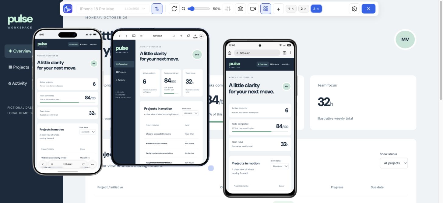
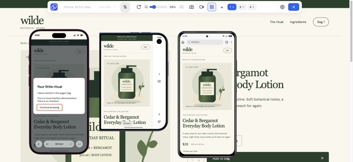
Use Mobile Viewer as a responsive checker when you want to inspect how a website changes across screen sizes. Keep the desktop page beside phone and tablet previews, compare the same content, and look for layout problems. This is a free Chrome extension for hands-on checks; it does not generate an automatic pass score.
Free browser extension · No account required · Runs on your computer
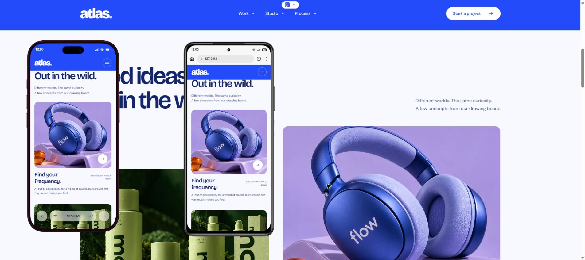
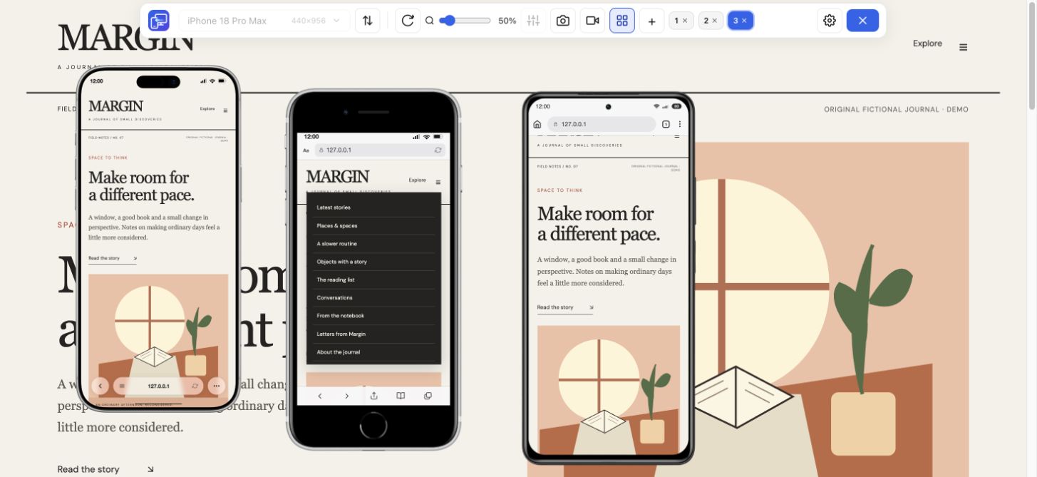
Start with a compact phone, a larger phone, and a tablet from the 25 available presets. Multi-view can show up to five mobile devices beside desktop. Rotate a preview to compare portrait and landscape, then move or zoom the frames so the content is easy to inspect.
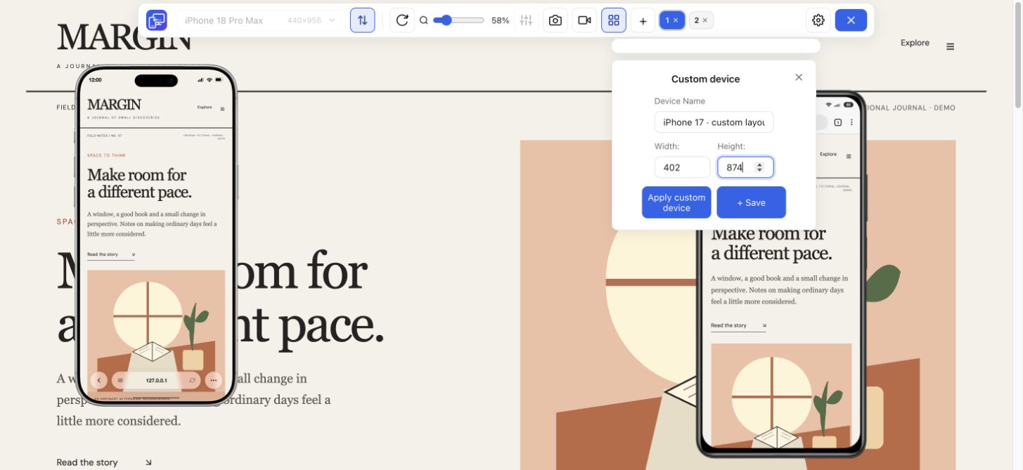
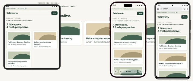
Use a custom width and height to look just below and just above a layout breakpoint. A row of cards can fit at a familiar phone size but overflow at an intermediate width. Custom sizes help you investigate the transition rather than checking only a list of popular devices.
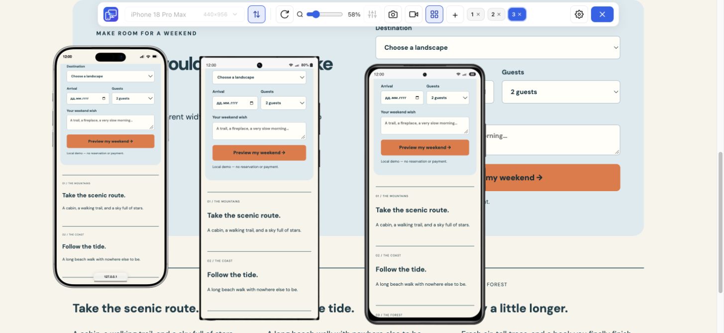
Review the page from the header to the footer. Compare long headings, navigation labels, card rows, images, and calls to action. Look for unexpected horizontal scrolling, clipped content, excessive gaps, and controls that disappear at a particular width.
A responsive design checker is most useful with realistic content. Try a long product name, a multi-line message, and the error state of an ordinary test form. A layout that works with short placeholder text may fail after a content update.
Enable Sync when mirrored scrolling or ordinary interactions help you reach the same content. Compare alignment, wrapping, and space around the active control at each viewport. Turn Sync off when you need different states side by side.
Keep this check focused on the rendered layout. Use the Mobile Website Testing workflow for the complete sequence through menus, links, and form states, and real devices for their keyboard, touch, and browser-specific behavior.
Focus the device that shows a problem and save a PNG of that preview with its frame. Include the device or custom viewport dimensions in your bug report. For a menu or transition, record one device or the whole tab and save the walkthrough as MP4 or WebM, depending on browser support.
After changing the site, return to the same dimensions and repeat the failed check. Compare a second size too, since a narrow-screen fix can affect a wider layout. Mobile Viewer keeps device preferences and positions in your browser so you can reuse the workspace.
This responsive checker renders the website using desktop Chrome at the selected viewport sizes. It helps you inspect the page visually; it does not run a Safari engine or an Android operating system, produce an accessibility or performance audit, or certify mobile friendliness.
Install the extension first, then open an HTTPS website or a local HTTP development page such as localhost. You do not paste a URL into an online scoring service. Use real devices for final checks that depend on their operating system, browser, hardware, or touch input.
Choose the widths on either side of the change and keep the same content in view. A layout can fit at both named phone sizes and still fail between them. Use Mobile Viewer’s custom width and height for that intermediate checkpoint, then repeat the same menu, card or form task.
Check the specific task as well as the width: navigation can be unreachable, a form can fail, or text can become hard to read. In Mobile Viewer, reproduce the failed state at custom dimensions and compare a second preview beside desktop. Save a focused-device PNG or record the interaction, then retest after changing the site. Mobile Viewer provides manual previews, not an automatic mobile-friendly score. Performance, accessibility, keyboard, and touch also need their own checks.
Yes. Enter a custom width and height, then compare sizes just below and above the point where your layout changes.
No. Zoom changes how large the preview appears on your monitor. The selected device or custom viewport dimensions determine the website’s responsive layout.
Yes. It works as a manual responsive testing tool across device and custom viewport sizes. You inspect the layout and repeat a check after a change; the extension does not generate an automatic test score.
Yes. Local HTTP pages such as localhost and 127.0.0.1 are supported on your computer. Important real-device behavior still needs a separate check on a phone or tablet.
Choose the width where your content stops fitting, compare a nearby size, and save the focused-device PNG. After changing the site, repeat the same check.
Install extensionChrome Web StoreFreeFree browser extension · No account required · Runs on your computer
Guide
Test a media-query boundary with a CSS example and expected results.
Explore guideGuide
Choose viewport dimensions and know what to inspect at each size.
Explore guideGuide
Understand how layouts adapt, then check the behavior in your own website.
Explore guideFeature
View the current website on mobile sizes alongside its desktop version.
Explore featureFeature
Follow a user journey across mobile sizes and record what needs fixing.
Explore featureDevice reference
An interactive device size reference with practical website checks.
Explore deviceGuide
Decide when a Chrome preview is enough and when you need real-device testing.
Explore guideGuide
Check six mobile tasks, fix an overflowing action and copy your results for a retest.
Explore guide