Navigation that changes mode
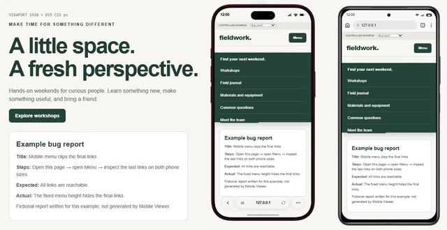
Open the menu at both formats. Check the last link and close control, then compare with a regular phone so the wider layout does not hide a compact-screen problem.
 Mobile Viewer Free browser extension
Two formats. One website. Compare menus, cards and tables in the folded and unfolded Duo presets beside a regular iPhone or Xiaomi in Mobile Viewer.
Two built-in presets
Free browser extension · No account required · Runs on your computer
 Chrome
 Edge
 Opera
 Brave
A foldable format gives your website another layout to get right. Use the iPhone Duo presets in Mobile Viewer to compare navigation, cards, tables and dialogs at two different rectangles. Keep a regular iPhone or Xiaomi beside them: extra width is useful only when it improves the task.
Apple lists two displays. The table keeps those hardware facts separate from the current extension presets. The folded configuration starts in the wider 678 × 466 rectangle; use Rotate when you need its taller 466 × 678 layout.
| State | Hardware display | Default website configuration |
|---|---|---|
| Unfolded / inner display | 7.6 inches · 1878 × 2670 physical pixels | 626 × 890 CSS px · DPR 3 |
| Folded / outer display | 5.4 inches · 1398 × 2034 physical pixels | 678 × 466 CSS px · DPR 3; rotation changes the rectangle |
Choose the other Duo configuration in the interactive comparison, or try a regular iPhone. Rotate the diagrams and notice how much vertical space changes. Then open the same configurations in Mobile Viewer to inspect the actual page.
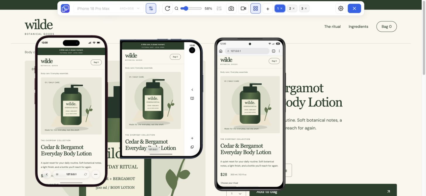
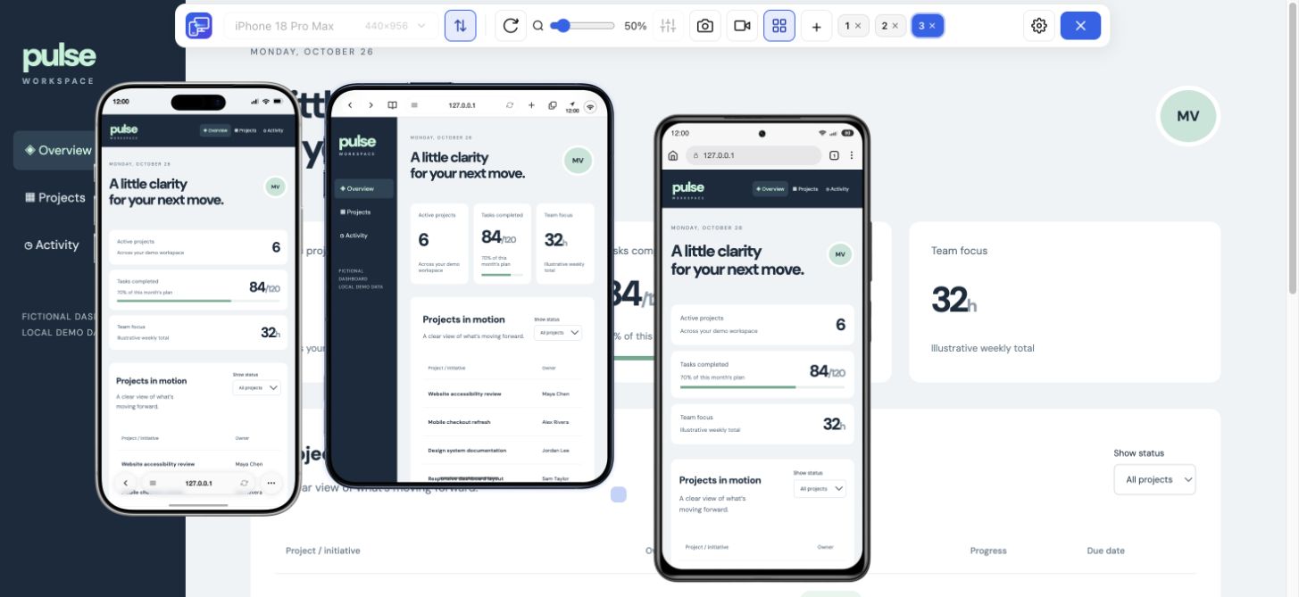
Our fictional Pulse dashboard below shows the point: the wider Duo preview has a sidebar and room for several cards, while the iPhone 17 Pro Max and Xiaomi use compact navigation. These are actual installed-extension previews.
52 CSS px difference in width. Check whether your component changes between these sizes.
CSS rectangle diagrams at 1:5 scale. In Mobile Viewer, add these configurations beside your desktop page and repeat the task above. Use custom width and height for a configuration without a named preset.
Pick one page your visitors need and follow a complete task. Do not stop after the first screen.
Open the menu at both formats. Check the last link and close control, then compare with a regular phone so the wider layout does not hide a compact-screen problem.
Keep the important columns readable. Scroll the table inside its container and reach the filter or action without forcing the entire page sideways.
Open a cart or form dialog. Rotate the preview and confirm its final action stays reachable; give long dialog content a deliberate scrolling area.
A CSS width condition can match many phones, foldables and resized windows. Use it to change a component when the content needs more room. The following examples are starting points for your project.
Keep user zoom available. Confirm the actual browser viewport when reproducing a real-device finding.
<meta name="viewport" content="width=device-width, initial-scale=1">An illustrative content breakpoint, not an iPhone Duo detector. Check intermediate widths and both orientations before keeping it.
.table-region {
  max-width: 100%;
  overflow-x: auto;
}
.table-region table {
  min-width: 40rem;
  border-collapse: collapse;
}
@media (min-width: 38rem) {
  .dashboard {
    display: grid;
    grid-template-columns: 10rem minmax(0, 1fr);
  }
}Keep the measured values with the screenshot and reproduction steps. Browser controls and the software keyboard can change visible height.
console.table({
  layoutWidth: document.documentElement.clientWidth,
  layoutHeight: document.documentElement.clientHeight,
  visualWidth: window.visualViewport?.width,
  visualHeight: window.visualViewport?.height,
  dpr: window.devicePixelRatio
});Install Mobile Viewer, open your HTTPS or localhost page and enable Multiple devices. Add iPhone Duo (Unfolded) and iPhone Duo (Folded), then a regular iPhone or Xiaomi. The workspace supports up to five mobile previews beside desktop.
Use Sync to follow supported interactions together, or turn it off to inspect different page states. Save the selected-device PNG or a short recording when you find something worth sharing. This is a desktop Chrome website preview; confirm Safari, the real display transition and keyboard behavior on target hardware.
Yes. Install Mobile Viewer and choose the two built-in Duo configurations. Compare their layouts with a regular phone, rotate the previews and follow the same menu, table or form task.
The current folded preset is stored as 678 × 466 CSS pixels. Rotate it to inspect 466 × 678. Match the stated dimensions and orientation when repeating a check; the state name alone does not describe the current browser rectangle.
It provides separate website preview configurations in desktop Chrome. It does not emulate the physical hinge, iOS, Safari or the full transition between displays. Verify those behaviors on the actual target environment.
Put Duo beside an iPhone and Xiaomi, open the page you are improving and follow one useful task. Start with the free Mobile Viewer extension for Chrome.
Install extensionChrome Web StoreFreeFree browser extension · No account required · Runs on your computer
Feature
Check your website at compact and large iPhone sizes, side by side.
Explore featureDevice reference
An interactive device size reference with practical website checks.
Explore deviceGuide
Copy a report template and describe a website issue someone can reproduce.
Explore guide