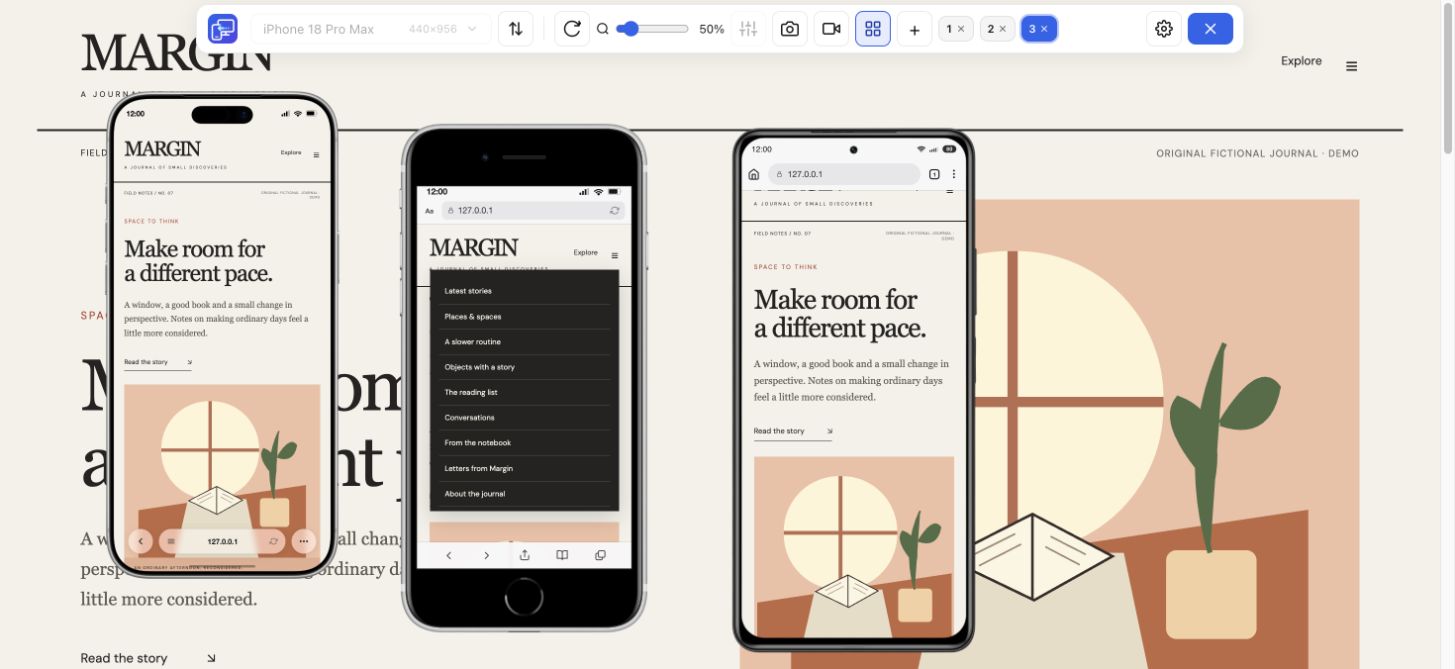
Read the first screen
Try a long headline, a product name and the main button. A heading may gain a line at 375 px and push the action below the visible area.
Your website, at iPhone sizes
Catch a crowded menu, a wrapped heading or a hidden form button before you share your website. Mobile Viewer is a free iPhone simulator for website layout checks in desktop Chrome. Install the extension, open your page and compare iPhone previews beside desktop. The page stays interactive, so you can follow the same journey at different sizes.
Free browser extension · No account required · Runs on your computer
A large iPhone preview can look comfortable while a compact screen exposes the problem. Choose a small and a large preset, keep the same page open in both, and look for changes in reading order, navigation and controls. Mobile Viewer includes the following iPhone configurations; these are preset dimensions in CSS pixels, not a promise about every Safari window.
| Preset | Default CSS px | Why include it? |
|---|---|---|
| iPhone SE | 375 × 667 | Shorter view: open menus and long forms |
| iPhone 13 Pro | 390 × 844 | A narrower modern phone layout |
| iPhone 16 Pro | 402 × 874 | Check changes near the 400 px range |
| iPhone 17 Pro Max | 440 × 956 | A wider phone: spacing and image crops |
| iPhone 18 Pro | 402 × 874 | Compare a current iPhone-labeled configuration with Xiaomi |
| iPhone Duo (Unfolded) | 626 × 890 | A wider layout for columns, menus and dialogs |
| iPhone Duo (Folded) | 678 × 466 | A different aspect ratio; confirm orientation and reachable actions |
Use one real page and one clear task. These checks turn a preview into a useful review, rather than a collection of phone frames.
Try a long headline, a product name and the main button. A heading may gain a line at 375 px and push the action below the visible area.
Expand the menu, follow a link and find its close control. Repeat in landscape, where the preview is wider but shorter.
Use fictional test details. Inspect labels, errors and the submit button in each preview; then verify keyboard behavior on a real iPhone.
Add the folded and unfolded Duo configurations beside a regular iPhone or Xiaomi. A wider rectangle can switch a sidebar or card grid into a different mode, while a shorter orientation can make a dialog harder to finish. Compare both dimensions and follow the same task.
Show up to five mobile previews beside desktop. Turn on Sync when you want supported interactions to follow across the views, or review each preview independently. Keep the same content and page state in view when deciding whether a CSS change helped.
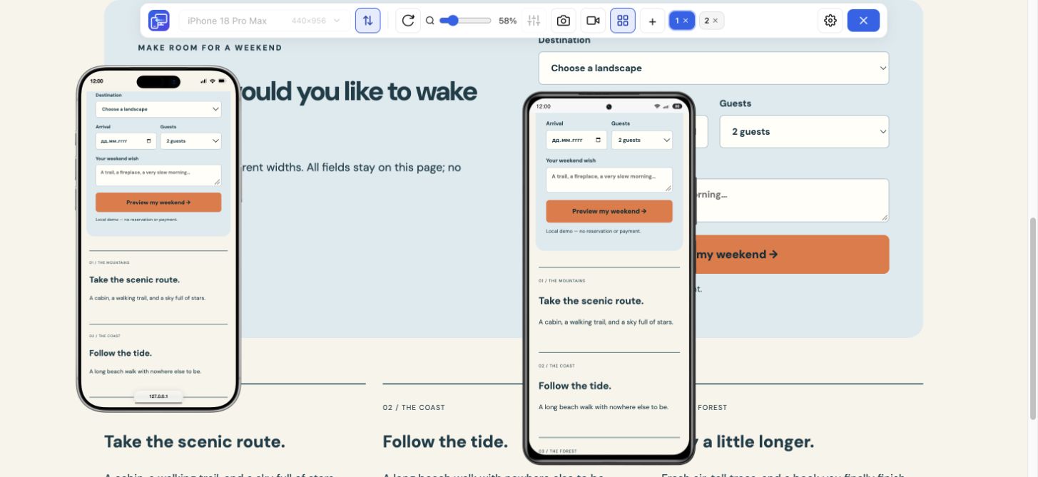
The capture below uses independent states: a cart is open inside the iPhone while Xiaomi and Duo show the product. Preview zoom makes devices fit your monitor; it does not replace the selected CSS viewport width. Rotate a preview when you need another check.
If your goal is to see a website at iPhone sizes, this workflow runs the page through a Chrome extension on your computer. You install Mobile Viewer first; this page itself does not launch an iPhone simulator online. Open an HTTPS site or your localhost project, then start the extension on that page.
An iPhone emulator for apps solves a different task. Mobile Viewer does not boot iOS, run an IPA file or supply the Safari rendering engine. Use these previews for fast layout and interaction checks, then verify Safari, keyboard, browser bars and device-specific behavior on an actual iPhone or an appropriate testing service.
When you find a layout issue, save a PNG of the selected device or record a short device or tab walkthrough. Include the page, preset, orientation and steps in your report. After a fix, reopen the same iPhone configuration and repeat the task.
Install Mobile Viewer from the Chrome Web Store in desktop Chrome. Open the HTTPS website or localhost page you want to review, then launch the extension.
Start with iPhone SE and iPhone 17 Pro Max. Compare one headline, menu and form at the same page position; use Sync where it helps.
Review landscape as well as portrait. Save the selected-device screenshot or a short recording when there is something useful to show.
This page helps you choose a website-preview workflow. Mobile Viewer itself requires installation in desktop Chrome. Once installed, open your HTTPS or localhost page and compare interactive iPhone-sized views beside desktop.
Check what engine the service actually provides. Mobile Viewer renders your website in desktop Chrome; it is useful for responsive layouts and supported interactions. Use a real Safari environment for Safari-specific verification.
Mobile Viewer is currently a free Chrome extension for website previews. Install it on your computer to use its iPhone presets, custom viewport sizes and comparison tools.
Yes. This website-preview workflow runs in desktop Chrome, including on Windows. It does not install Apple’s iOS Simulator or run iPhone apps.
The website renders in Chrome. iPhone dimensions and a device frame do not turn Chrome into Safari. Confirm Safari-specific behavior with Safari on an actual device or a suitable test environment.
Use a custom width and height for the layout you need to check. A matching viewport is useful for responsive work, but it does not make the custom preview a complete model emulation.
Open your own page, compare a compact iPhone with a larger one, and check the action that matters. Start with the free Mobile Viewer extension.
Install extensionChrome Web StoreFreeFree browser extension · No account required · Runs on your computer
Device reference
Search iPhone sizes, compare CSS rectangles and choose a website test configuration.
Explore deviceFeature
Compare Samsung, Pixel and Xiaomi website layouts in your Chrome workspace.
Explore featureGuide
Follow the steps for Chrome Device Mode or use Mobile Viewer beside desktop.
Explore guide