Device reference
Screen sizes and viewports
An interactive device size reference with practical website checks.
Explore device Mobile Viewer Free browser extension
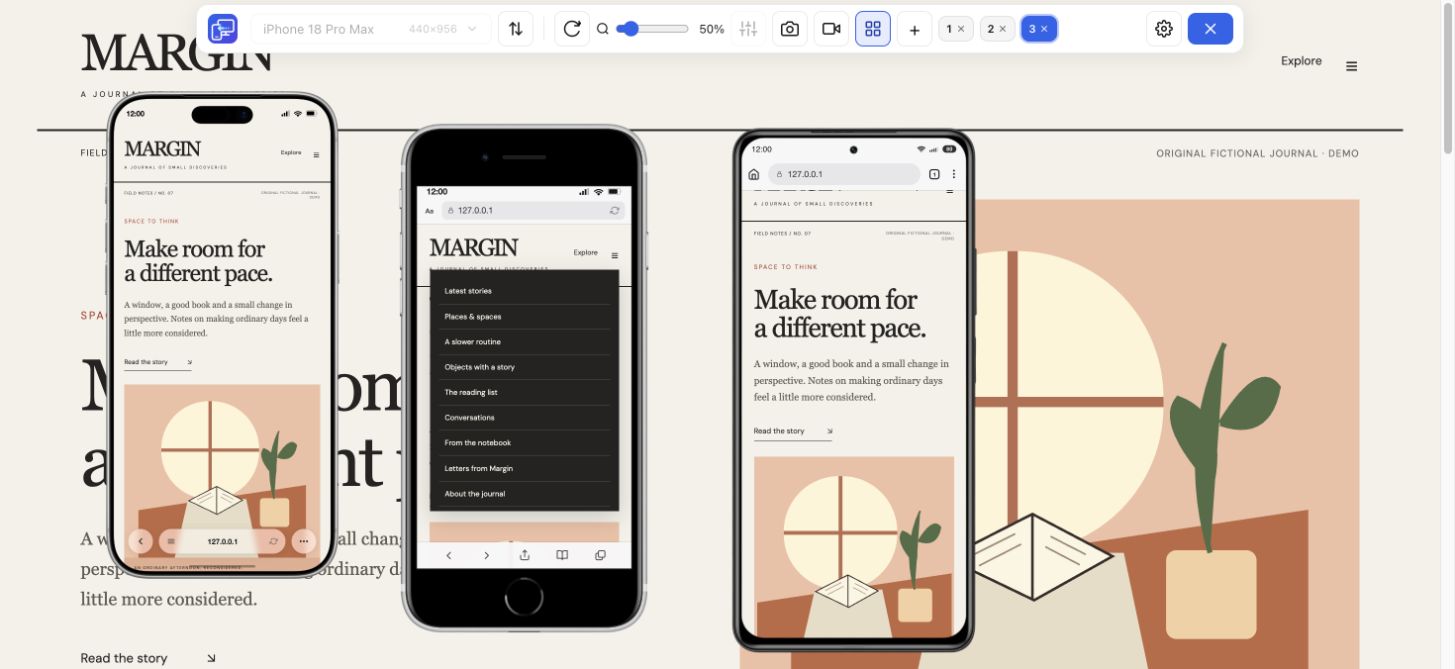
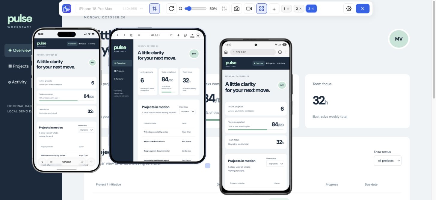
Find a device viewport, then see your own website at that size. Compare iPhone, Android and tablet layouts in Mobile Viewer and check menus and key actions.
Presets + custom sizes
Free browser extension · No account required · Runs on your computer
 Chrome
 Edge
 Opera
 Brave
Search the device catalogue below. Every built-in configuration is listed with its CSS dimensions and DPR. Model references add verified display specifications, useful code and a specific layout check. Custom configurations are labeled separately.
Device reference
An interactive device size reference with practical website checks.
Explore deviceDevice reference
Search iPhone sizes, compare CSS rectangles and choose a website test configuration.
Explore deviceDevice reference
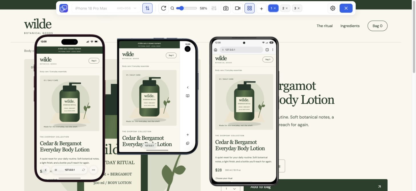
Compare both Duo configurations with a regular iPhone and Xiaomi, then check your own website.
Explore deviceDevice reference
Find an iPad model, compare its display and CSS dimensions, and choose a viewport to test.
Explore deviceSearch the device catalogue below. Every built-in configuration is listed with its CSS dimensions and DPR. Model references add verified display specifications, useful code and a specific layout check. Custom configurations are labeled separately.
Find a preset by name or CSS width and select up to three rectangles to compare. Follow a linked model for its display facts, viewport explanation and website testing scenario. Folded and unfolded entries are states of one model.
27 of 27 configurations. Select up to three to compare.
| Compare / model | Default CSS rectangle | Preset / reference DPR | Preview setup | Physical display px |
|---|---|---|---|---|
| 626 × 890 | 3 | Built-in preset | 1878 × 2670 (inner) | |
| 678 × 466 | 3 | Built-in preset | 1398 × 2034 (outer) | |
| 440 × 956 | 3 | Built-in preset | — | |
| 402 × 874 | 3 | Built-in preset | — | |
| 420 × 912 | 3 | Built-in preset | — | |
| 440 × 956 | 3 | Built-in preset | 1320 × 2868 | |
| 402 × 874 | 3 | Built-in preset | 1206 × 2622 | |
| 390 × 844 | 3 | Built-in preset | 1170 × 2532 | |
| 414 × 896 | 3 | Built-in preset | 1242 × 2688 | |
| 414 × 896 | 2 | Built-in preset | 828 × 1792 | |
| 375 × 667 | 2 | Built-in preset | 750 × 1334 | |
| 320 × 568 | 2 | Built-in preset | — | |
| 393 × 873 | 2.75 | Built-in preset | — | |
| 884 × 1104 | 2.625 | Built-in preset | — | |
| 384 × 938 | 2.813 | Built-in preset | — | |
| 412 × 891 | 2.625 | Built-in preset | — | |
| 412 × 918 | 2.625 | Built-in preset | 1440 × 3120 | |
| 412 × 915 | 2.625 | Built-in preset | 1440 × 3088 | |
| 360 × 740 | 3 | Built-in preset | — | |
| 412 × 732 | 3.5 | Built-in preset | — | |
| 412 × 892 | 3.5 | Built-in preset | 1440 × 3120 | |
| 393 × 851 | 2.75 | Built-in preset | — | |
| 800 × 1280 | 2 | Built-in preset | — | |
| 820 × 1180 | 2 | Built-in preset | — | |
| 768 × 1024 | 2 | Built-in preset | — | |
| 440 × 956 | 3 (reference) | Custom configuration | 1320 × 2868 | |
| 402 × 874 | 3 (reference) | Custom configuration | 1206 × 2622 |
CSS values are Mobile Viewer preset configurations or labeled custom starting points. Hardware resolution is included only for entries linked to a verified manufacturer reference. A blank hardware reference does not mean zero resolution. Preset names such as iPad Mini or iPhone SE can cover older generations; match the listed dimensions rather than assuming the latest model. Android display scaling can change CSS dimensions; browser bars can reduce visible height. For custom entries, 3× is a reference calculation; the custom panel sets width and height, without a DPR field. The diagram compares CSS rectangles, not physical phone sizes.
A display diagonal, physical screen resolution and CSS viewport answer different questions. Use the viewport for layout checks, keep DPR as a separate density setting and record the browser state when reproducing a height-related problem.
Each reference separates manufacturer specifications from the extension configuration. The iPhone 16 Pro Max and iPhone 17 entries use custom width and height; they are not named built-in presets.
Choose a compact phone, a wider phone and a tablet. Open your own website in Mobile Viewer and compare the same content, menu or form.
Install extensionChrome Web StoreFreeFree browser extension · No account required · Runs on your computer