Guide
Website dimensions
Choose viewport dimensions and know what to inspect at each size.
Explore guide Mobile Viewer
Website in 52 languages
From layout principles to a useful check
Responsive web design is an approach that lets a website adapt its layout to the space available. Content can reflow, navigation can change, and images can fit a narrower column while the page remains usable. This guide explains the idea through everyday website examples, then shows how to inspect those changes in a browser.
Read the guidePicture a product page with a photograph, a description, and a purchase panel. On a wide screen they might sit in neighboring columns. On a phone they can form a reading sequence: photograph, description, then the purchase controls. The content remains useful because its arrangement changes with the available room.
Shrinking a fixed desktop page into a small rectangle can leave text and controls difficult to use. A responsive layout instead lets content wrap and reposition. Mobile-first design starts with the narrow layout and adds arrangements as more space becomes available.
Flexible dimensions let elements grow or wrap without a separate rule for every device. CSS Grid and Flexbox are common ways to build these layouts. A maximum content width can keep a reading column comfortable on a large monitor while allowing it to fit a smaller viewport.
A breakpoint is a condition where styling changes, often through a CSS media query. Choose the transition because the content needs a different arrangement, rather than treating one phone model as the only target. Media queries are useful, but a flexible layout can also adapt without them.
Suppose three product cards become too narrow before a particular tablet preset is reached. Inspect that intermediate width too. The question is whether the title, price, and action still fit together, not whether the page looks correct in a small list of named devices.
Use these small scenarios as a starting point for your own review. They describe behavior to look for, rather than a gallery of websites whose implementation has been verified.
On mobile browsers, the viewport meta setting controls how the page’s layout width and scaling are handled. A page can have flexible CSS and still appear as a scaled desktop layout when its mobile viewport setup is wrong. Check this in the source and verify the result on a real phone.
Keep images within their containers and preserve the intended proportions. Text should remain readable as it wraps, with controls that users can reach. A desktop preview helps reveal crowding and overflow; it cannot confirm phone keyboard behavior, touch comfort, or every browser difference.
Choose a page with real content and one task to follow. Chrome’s Device Mode lets you adjust the viewport and inspect the page with developer tools. Move through widths around a layout transition, rather than checking only its two endpoints.
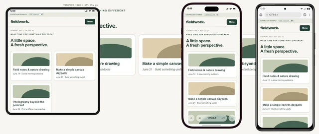
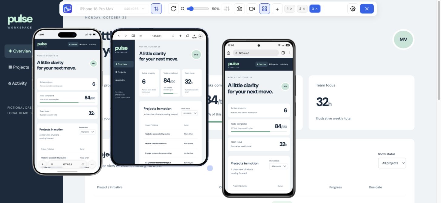
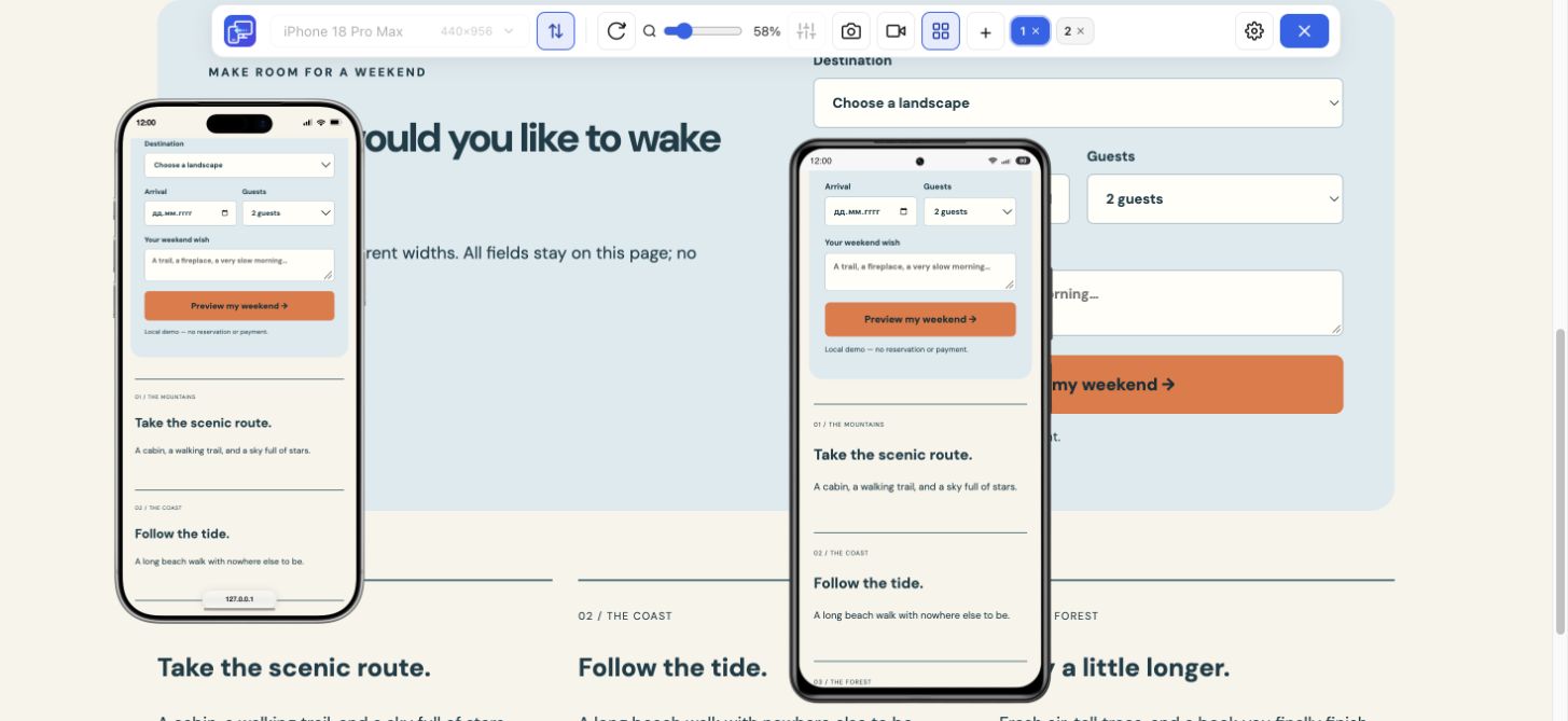
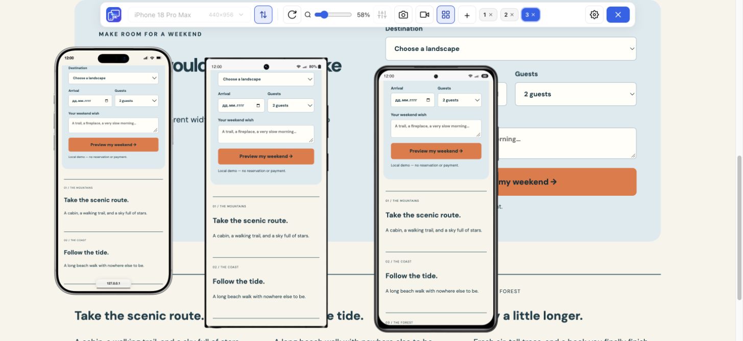
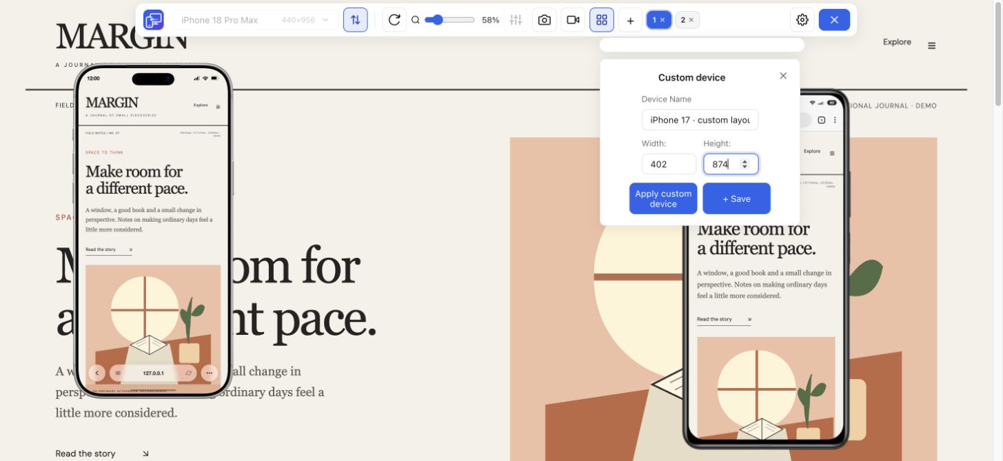
For a visual comparison beside desktop, open Mobile Viewer and select phone and tablet presets or custom dimensions. You can keep up to five mobile previews visible and turn on Sync for supported interactions. This is useful when a long heading, open menu, or form state needs comparing at the same moment.
Record the dimensions and what you expected to happen. Save a focused-device PNG for a static issue or a device/tab video for a sequence. After a CSS change, repeat the same case and inspect a neighboring width. Mobile Viewer helps you observe the page; it does not rewrite its layout or issue an automatic audit score.
A page may fit the screen while its menu leads to the wrong destination or a form fails after submission. Keep visual checks and functional checks connected: first inspect the arrangement, then complete the task. Our Responsive Checker page covers layout inspection; Mobile Website Testing focuses on user flows.
Finish important checks in the browsers and devices your visitors use. Desktop Chrome previews are useful during development, but do not supply a real Safari engine or a mobile operating system. Performance and accessibility also deserve their own checks; a good-looking screenshot does not settle them.
It means arranging a website so its content adapts to the available space. For example, neighboring columns can become a readable vertical sequence on a narrower screen.
Mobile-first describes the starting point: plan the narrow-screen content and task first, then expand the arrangement. Responsive describes how the resulting layout adapts. Check the important task at narrow, wide, and intermediate sizes whichever process you use.
Responsive layouts adapt to available space, while adaptive often describes choosing among prepared arrangements. Projects can combine techniques. A screenshot or a CSS breakpoint alone does not prove which strategy a site uses; inspect the implementation when that distinction matters.
They overlap, but describe different things. Responsive design is a layout approach. A useful mobile experience also depends on readable content, working interactions, accessibility, and performance.
Start with representative phone, tablet, and desktop widths, then inspect the space around layout transitions and any width where content becomes crowded. Named presets alone cannot cover every possible viewport.
Start with a layout that fits narrow screens, then check real content, navigation, images, and forms. Fix the relevant styles in your website or site builder, and repeat the same checks after each change. Mobile Viewer helps you inspect the result; it does not edit the site. Check performance, accessibility, and important interactions separately on real devices.
No. It shows the existing website at selected sizes so you can inspect it. You make any necessary changes in the website’s HTML and CSS, then repeat the check.
Use Mobile Viewer to compare a product grid, open menu, or form at phone and tablet widths beside desktop. Check the same content and state to see whether the arrangement stays usable.
Install extensionChrome Web StoreFreeFree browser extension · No account required · Runs on your computer
Guide
Choose viewport dimensions and know what to inspect at each size.
Explore guideGuide
Test a media-query boundary with a CSS example and expected results.
Explore guideFeature
Inspect layout changes at several screen widths and around your breakpoints.
Explore featureGuide
Follow the steps for Chrome Device Mode or use Mobile Viewer beside desktop.
Explore guideFeature
Follow a user journey across mobile sizes and record what needs fixing.
Explore feature