Guide
Bug report template
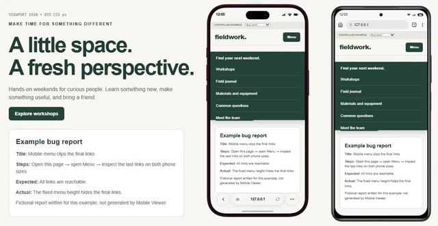
Copy a report template and describe a website issue someone can reproduce.
Explore guide Mobile Viewer
Website in 52 languages
Hands-on website checks
Test your site on mobile screen sizes by following a short user journey in desktop Chrome. Mobile Viewer keeps phone and tablet previews beside your website so you can compare each step. Open the menu, follow the main action, and try a form with test data. Record any failure and repeat the same steps after a fix.
Free browser extension · No account required · Runs on your computer
Choose one task, such as finding a product, reaching the contact form, or moving from an article to a related page. Write down the starting page, the actions to take, and the outcome you expect. A short repeatable case makes it easier to tell a layout difference from a broken interaction.
Open an HTTPS site or a local HTTP development page such as localhost. Activate Mobile Viewer and select the phone and tablet sizes you need from the 25 presets, or enter custom dimensions. Save unfinished input before the first activation, which may reload the page. Use a staging site and ordinary test data for submissions.
Separate the failure: does the menu fail to open, does another element cover its controls, or can you not reach the final link? Start from the closed state, open it, follow a link, and record the first step that fails. Use Mobile Viewer’s custom dimensions to compare a short phone height with a wider viewport, then record the device to show the failing sequence.
If nothing opens, inspect the site’s script errors and navigation settings; the fix may depend on its theme or site builder. If the panel opens but clips its links, inspect its height, scrolling, and stacking. Mobile Viewer helps reproduce the state; it does not repair the menu. Confirm touch-specific failures on the actual phone.
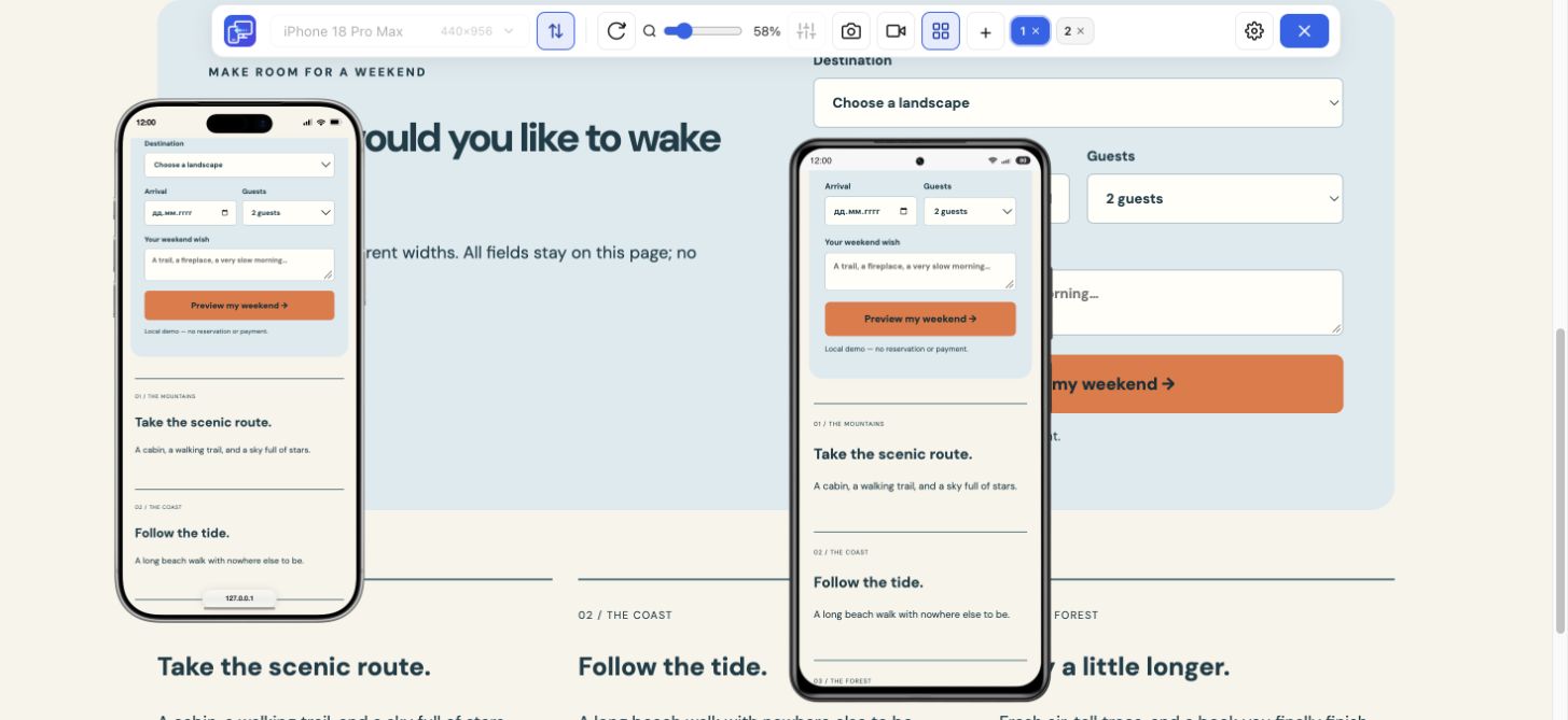
Use a short value, a long value, and a missing required field. Inspect where the label, error message, and submit button appear. After correcting the error, check whether the user can continue. Repeat any steps that depend on a changed selection or newly revealed field.
Mobile website testing in a desktop preview does not reproduce a phone’s on-screen keyboard. Check keyboard overlap, input behavior, and touch on a real device too. Sync excludes sensitive fields by default; do not rely on mirroring for those fields when writing your test case.
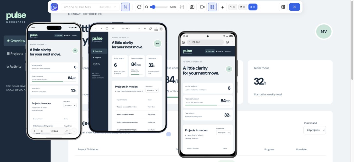
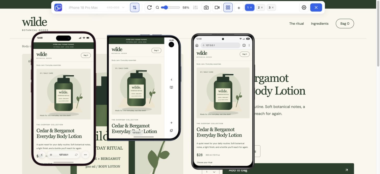
Multi-view supports up to five mobile previews beside desktop. Turn on Sync to mirror scrolling, clicks, and ordinary text input where useful, then compare the visible state at the same point in the task. This helps reveal controls or messages that fit one size but become difficult to reach in another.
Turn Sync off when each preview needs its own state or when you want to repeat an action in one device only. An action in a live website can still submit information. Choose the test environment and sample data before beginning the flow.
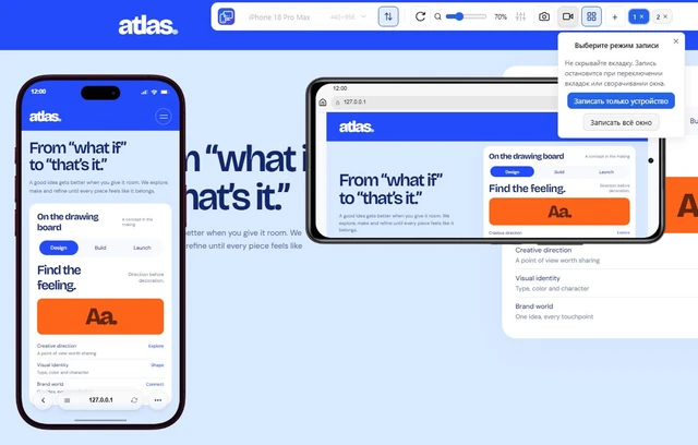
Write down the page, viewport dimensions, orientation, steps, expected result, and actual result. Save a PNG of the focused device when one state explains the problem. For a sequence, record that device or the full tab; the video saves as MP4 or WebM according to browser support.
After a fix, repeat the original steps at the same dimensions and check a second size. Mobile Viewer keeps device positions and preferences in your browser to help you return to the workspace. Keep layout checks focused on breakpoints and spacing in the Responsive Checker workflow; use this page’s test case approach for the actions and resulting states.
The extension uses desktop Chrome to render each preview. It does not run native apps, provide a real Safari engine, execute a scripted regression suite, or generate an automatic quality score. It is a tool for interactive inspection and for communicating a finding.
Combine these checks with the real devices, browsers, accessibility checks, and automated tests your project needs. A mobile website testing workflow is broader than one preview: use the extension for quick comparisons and repeat the important device-dependent cases in their actual environment.
No. You perform the actions and judge their outcome. Sync can mirror supported interactions across previews, but it is not a scripted test runner or an automatic pass/fail report.
A layout check inspects sizes, breakpoints, wrapping, and overflow. A functional check follows a task through menus, links, forms, and page states. The two workflows complement each other.
Yes. Multi-view supports up to five mobile previews beside desktop. Use Sync for supported shared interactions, or turn it off to inspect each preview independently.
Yes. Desktop previews do not reproduce every mobile browser, operating system, keyboard, or touch behavior. Verify device-dependent cases on real hardware.
Open the same page at the failing dimensions, repeat the menu or form steps, and record the device when the sequence matters. Retest the same case after the site changes.
Install extensionChrome Web StoreFreeFree browser extension · No account required · Runs on your computer
Guide
Copy a report template and describe a website issue someone can reproduce.
Explore guideFeature
Record one device preview or the whole tab to explain a website interaction.
Explore featureFeature
Inspect layout changes at several screen widths and around your breakpoints.
Explore featureFeature
Choose a phone or tablet, rotate its preview, and try custom screen sizes.
Explore featureGuide
Follow the steps for Chrome Device Mode or use Mobile Viewer beside desktop.
Explore guideGuide
Check six mobile tasks, fix an overflowing action and copy your results for a retest.
Explore guideGuide
Choose separate mobile artwork, understand banner sizes and check the storefront after a theme change.
Explore guide