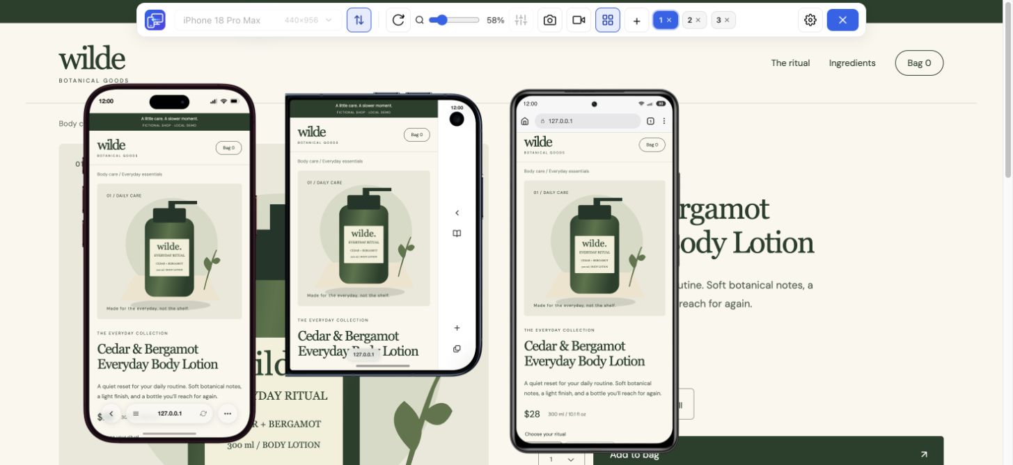
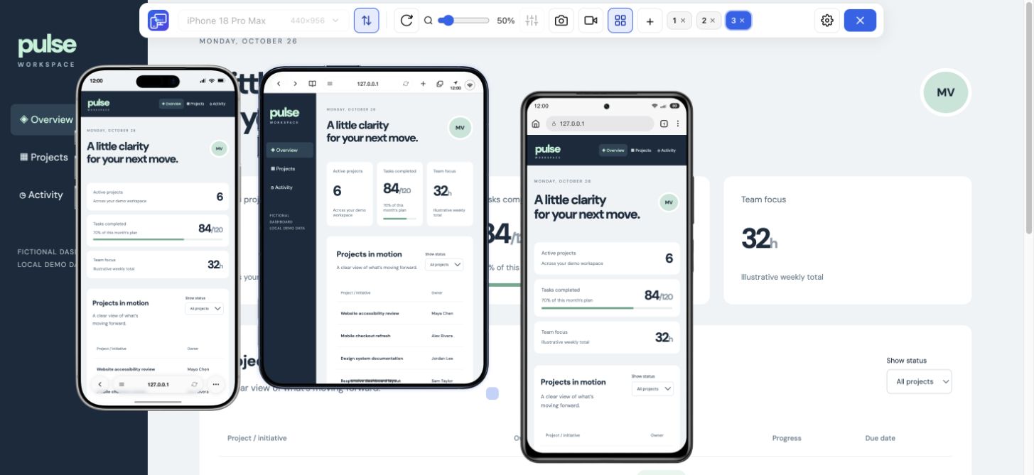
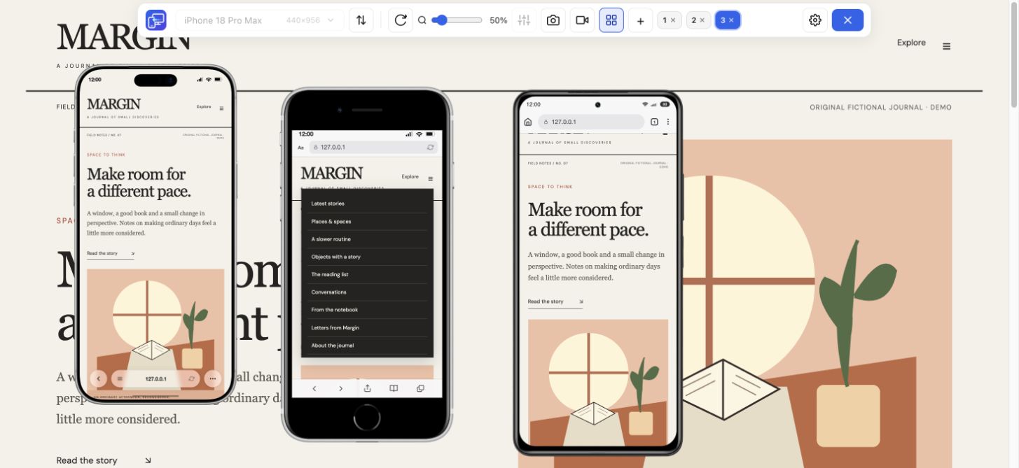
Look
Inspect text wrapping, the main action and any content that reaches the right edge. Open the menu or dialog involved in your task.
 Mobile Viewer Free browser extension
Check both sides of a responsive breakpoint. Compare the iPhone 16 Pro preset with a narrower iPhone in Mobile Viewer and spot changes in navigation and cards.
Built-in preset
Free browser extension · No account required · Runs on your computer
 Chrome
 Edge
 Opera
 Brave

The iPhone 16 Pro has a 6.3-inch display with a 1206 × 2622-pixel physical resolution in portrait order. For a website layout check, start with the 402 × 874 CSS-pixel configuration below. Keep screen pixels and CSS layout space separate, then use the practical test to inspect your own page.
Hardware specifications below come from the manufacturer. The CSS dimensions and DPR identify the current Mobile Viewer preset. They do not describe every browser state on the phone.
| Measurement | Value | Use it for |
|---|---|---|
| Display diagonal | 6.3 inches | Physical screen comparison |
| Physical screen resolution | 1206 × 2622 pixels | Manufacturer hardware reference |
| Portrait website configuration | 402 × 874 CSS px | Responsive layout checks |
| Preset DPR | 3 | Density configuration, separate from CSS width |
| Landscape rectangle | 874 × 402 CSS px | A wider, shorter layout check |
| Mobile Viewer setup | Built-in preset | Choose iPhone 16 Pro in the device catalogue |
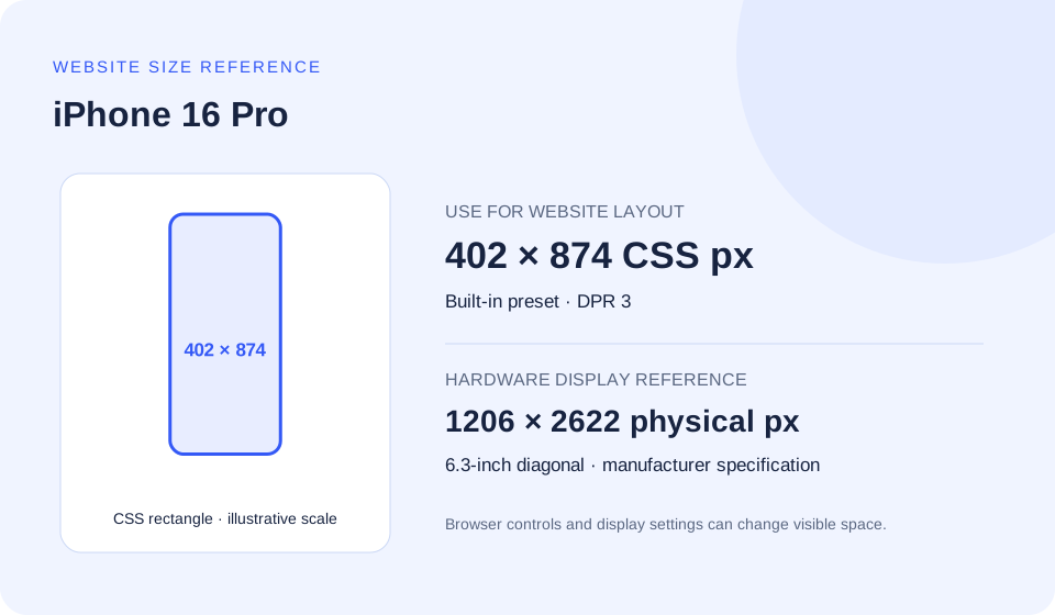
At a 3× preset scale, divide each physical dimension by 3 to obtain 402 × 874. This is a useful CSS starting rectangle. A 1 px CSS border is not necessarily a single physical display pixel.
Safari controls and the on-screen keyboard can change the visible viewport. The full screen rectangle is therefore different from the space a visitor sees at every moment. Check shorter heights as well, and verify Safari-specific behavior on an actual iPhone or an appropriate testing service.
Start with the 402 CSS-pixel configuration as a test case, then choose breakpoints where your content needs them. These examples describe layout conditions; they do not identify a unique iPhone 16 Pro. Expand the example you need and copy its code.
The placeholder image files and component classes below belong to your own project. Replace them before use. Keep zoom enabled and test the result above and below the selected width.
Let the browser use its device width for layout. Add viewport-fit=cover only when you also handle edge-to-edge safe areas.
<meta name="viewport" content="width=device-width, initial-scale=1">An example content breakpoint for stacked product actions. Other devices and resized desktop windows can match the same condition.
@media (max-width: 402px) {
  .product-actions {
    display: grid;
    grid-template-columns: minmax(0, 1fr);
    gap: 0.75rem;
  }
}Read these values in the target browser when reproducing a finding. Visual viewport height may change when the browser UI or keyboard changes.
const viewport = {
  layoutWidth: document.documentElement.clientWidth,
  layoutHeight: document.documentElement.clientHeight,
  visualWidth: window.visualViewport?.width,
  visualHeight: window.visualViewport?.height,
  devicePixelRatio: window.devicePixelRatio,
};
console.table(viewport);This condition matches environments at or above 3 dppx. The threshold uses the preset DPR. Use responsive image selection for photographs; a density query alone does not guarantee an appropriate image size.
@media (min-resolution: 3dppx) {
  .brand-mark {
    /* Use a vector asset or a suitable high-density source. */
    background-image: url("/images/brand-mark.svg");
  }
}The sizes rule describes the rendered image width, while srcset provides source widths. Replace the example sizes and files to match your real component.
<img
  src="/images/product-480.jpg"
  srcset="/images/product-480.jpg 480w,
          /images/product-960.jpg 960w,
          /images/product-1440.jpg 1440w"
  sizes="(max-width: 402px) calc(100vw - 32px), 480px"
  width="480" height="600"
alt="Describe the product and relevant visual details">At the default 16 px root size, 25.125rem corresponds to 402px. Keep custom breakpoints in rem alongside Tailwind’s default units. This illustrative checkpoint is not a requirement to name a breakpoint after every device.
@import "tailwindcss";

@theme {
  --breakpoint-phone-check: 25.125rem;
}

/* Example markup: */
/* <div class="grid grid-cols-1 phone-check:grid-cols-2">…</div> */The iPhone 16 Pro preset records a island cutout and inset hints of 59 px at the top and 34 px at the bottom. These are extension configuration values, not a measured promise about every browser state on the physical device.
For an edge-to-edge page, protect important content on every side and give a fixed bottom action its own padding. Keep ordinary spacing when the environment inset is zero. A drawn notch is not evidence that your real browser will expose a particular env() value.
Use with an edge-to-edge layout. Reserve the actual height of your fixed action in the page content. Confirm env() values and keyboard interaction on the target browser; the example does not hardcode a model-specific inset.
<meta name="viewport"
      content="width=device-width, initial-scale=1, viewport-fit=cover">

<style>
  :root { --action-height: 5rem; } /* Match your actual control. */
  .page-content {
    padding-left: max(1rem, env(safe-area-inset-left, 0px));
    padding-right: max(1rem, env(safe-area-inset-right, 0px));
    padding-bottom: calc(var(--action-height) + env(safe-area-inset-bottom, 0px));
  }
  .fixed-action {
    position: fixed;
    inset-inline: 0;
    bottom: 0;
    padding: 1rem;
    padding-bottom: max(1rem, env(safe-area-inset-bottom, 0px));
  }
</style>The following string is stored in Mobile Viewer’s current preset. Its browser and OS versions are a fixture configuration; they are not a claim about the latest software running on every phone with this model name.
User-Agent strings can be reduced or changed, and iPhones do not reliably expose the exact hardware model through them. A mobile User-Agent also does not replace Chrome’s rendering engine with Safari. Prefer feature detection for application behavior and keep the browser/version with a reproducible issue report.
Useful as a configuration or log reference, not as a reliable device identity test.
Mozilla/5.0 (iPhone; CPU iPhone OS 17_0 like Mac OS X) AppleWebKit/605.1.15 (KHTML, like Gecko) Version/17.0 Mobile/15E148 Safari/604.1Put 390 px and 402 px previews beside each other. If a component switches near 400 px, compare its navigation, image crop and button alignment on both sides rather than assuming the larger device only adds padding.
Use the same content and page state in each view. A longer title in one preview can otherwise look like a device difference. Zoom the device frames to fit your monitor without changing the chosen CSS dimensions.
Inspect text wrapping, the main action and any content that reaches the right edge. Open the menu or dialog involved in your task.
Compare the neighboring width or rotate a preview. Keep the content fixed so the layout difference is easy to explain.
Save a PNG of the selected device or a short recording. Include width, height, orientation and the steps that lead to the result.
These are actual Mobile Viewer configurations close to 402 CSS px, selected by width and then height. A nearby width can expose a breakpoint transition; the same width with a different height can expose an unreachable menu or dialog action.
iPhone 18 Pro share the width, height and DPR shown in this guide. That can reduce repeated geometry checks, but it does not establish identical browser engines, content, settings or real-device behavior.
12 CSS px difference in width. Check whether your component changes between these sizes.
CSS rectangle diagrams at 1:5 scale. In Mobile Viewer, add these configurations beside your desktop page and repeat the task above. Use custom width and height for a configuration without a named preset.
| Preset | Portrait CSS px | DPR | Width difference |
|---|---|---|---|
| iPhone 18 Pro | 402 × 874 | 3 | 0 px |
| Xiaomi 11i | 393 × 873 | 2.75 | -9 px |
| Pixel 5 | 393 × 851 | 2.75 | -9 px |
| Galaxy A17 | 412 × 891 | 2.625 | +10 px |
Install Mobile Viewer in desktop Chrome, open your HTTPS or localhost page and choose iPhone 16 Pro. Confirm the 402 × 874 preset, then add another useful size for comparison. The workspace supports up to five mobile previews beside desktop.
Follow the page task above, make the CSS change you need and repeat the same check. For a browser-specific fault, keep the desktop finding as a lead and confirm it in the target browser.
The display diagonal is 6.3 inches; its physical resolution is 1206 × 2622 pixels in portrait order. For this website check, use the separately labeled 402 × 874 CSS configuration.
Yes. The current catalogue includes iPhone 16 Pro with the configuration shown above. Confirm real-device behavior separately.
The page renders in desktop Chrome. Use it to review layout and supported interactions at the chosen size; verify iOS Safari, browser controls and keyboard in a real device environment.
CSS queries test conditions such as width, height and resolution, not a unique phone identity. The 402 px example above helps inspect this layout format and narrower windows. Choose breakpoints from your content and test nearby widths too.
DPR describes a scale along each dimension; the configured preset value here is 3. At 2×, for example, a square CSS pixel can correspond to a 2 by 2 device-pixel region. Fractional DPR, browser zoom and rasterization add further details. DPR is different from physical pixels per inch and does not identify a unique model.
Browser controls can expand or collapse, and a software keyboard can change the visual viewport. Record both layout and visual viewport measurements when height is involved in an issue; the preset rectangle does not describe every real browser state.
Yes. Open localhost or 127.0.0.1 in desktop Chrome and start Mobile Viewer. For a non-local site use HTTPS. Compare the same content in each view and keep the configuration with your finding.
Open your page at 402 × 874, compare one neighboring width and follow the action your visitors need. Start with the free Mobile Viewer Chrome extension.
Install extensionChrome Web StoreFreeFree browser extension · No account required · Runs on your computer
Feature
Check your website at compact and large iPhone sizes, side by side.
Explore featureDevice reference
An interactive device size reference with practical website checks.
Explore deviceDevice reference
Search iPhone sizes, compare CSS rectangles and choose a website test configuration.
Explore device