Guide
Website dimensions
Choose viewport dimensions and know what to inspect at each size.
Explore guide Mobile Viewer
Website in 52 languages
One CSS rule, three boundary checks
A CSS breakpoint changes styles when a condition is met, such as a minimum viewport width. Choose it because the content needs a different arrangement. The example below switches two event cards from one column to two, then checks the transition at three adjacent widths.
Read the guideApply this CSS to a container holding two event cards. The 640px value is illustrative: choose a different point if your titles, dates, and actions need more room. A device label does not determine when those particular cards fit.
.event-cards {
  display: grid;
  grid-template-columns: minmax(0, 1fr);
  gap: 1rem;
}

@media (min-width: 640px) {
  .event-cards {
    grid-template-columns: repeat(2, minmax(0, 1fr));
  }
}For this example, compare 639, 640, and 641 CSS pixels. Keep both cards and their text identical. Use a long event title and an action label that could wrap. The endpoints of a phone/tablet preset list can look correct while a problem remains at a media query breakpoint.
| Width | Layout | Check |
|---|---|---|
| 639px | One column | Title and action fit before the switch |
| 640px | Two columns | Both cards remain usable as the rule begins |
| 641px | Two columns | Wrapping remains readable after the switch |
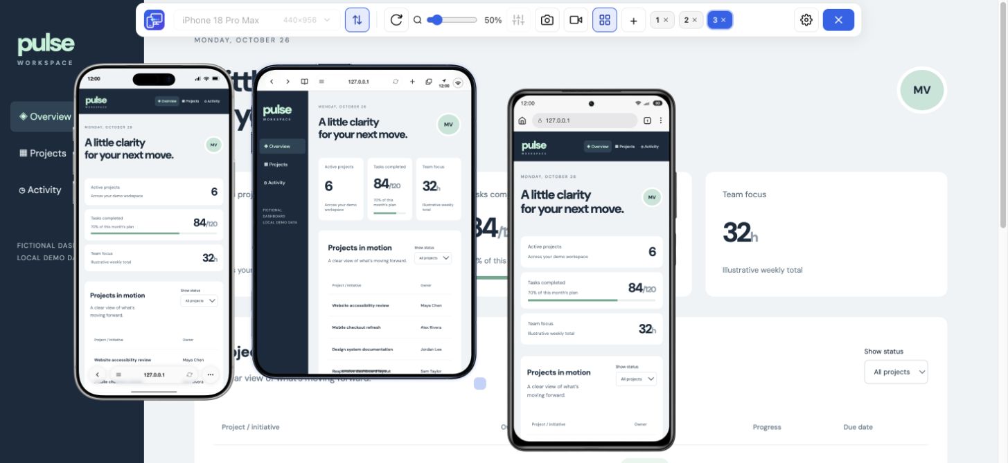
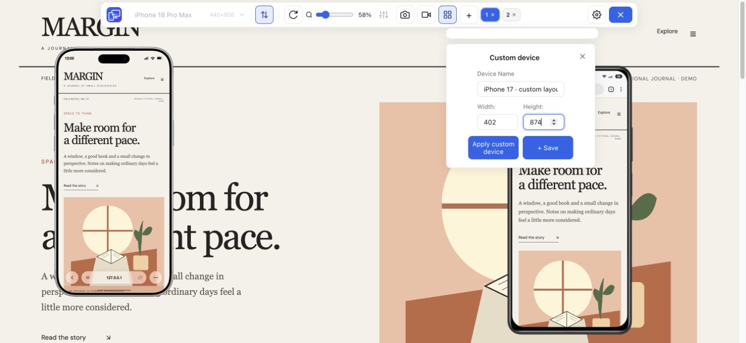
Use Chrome Device Mode and the inspector to see which CSS rule applies. In Mobile Viewer, enter custom dimensions to keep the three boundary views beside desktop. You choose the sizes; the extension does not discover breakpoints automatically.
If an action clips at 640px, record that width, the content, and the steps that reveal it. Save a focused-device PNG for the static state. After changing the CSS, repeat all three widths and a nearby wider size. Also reopen the menu and reveal a form error if the same breakpoint affects those components.
Check the actual viewport width and whether it meets the query condition. Confirm the stylesheet is loaded, then inspect the element in DevTools: a matching rule may still lose to another declaration in the cascade. In Mobile Viewer, set custom widths just below and above the intended breakpoint to compare the visible result beside desktop. For a phone showing a scaled desktop layout, check its viewport meta setup too. Mobile Viewer displays the result; it does not fix CSS rules.
No. Frameworks offer conventions, but your content may need different transitions. Check intermediate widths rather than relying only on named phone and tablet sizes.
No. Flexible grids and wrapping can change the arrangement without a separate query. Inspect the CSS before treating a visual change as a breakpoint.
Enter custom widths in Mobile Viewer just below, at, and above your breakpoint. Keep the same content visible and capture any clipping before repeating the check after a CSS change.
Install extensionChrome Web StoreFreeFree browser extension · No account required · Runs on your computer
Guide
Choose viewport dimensions and know what to inspect at each size.
Explore guideFeature
Inspect layout changes at several screen widths and around your breakpoints.
Explore featureGuide
Copy a report template and describe a website issue someone can reproduce.
Explore guide