Feature
Mobile website viewer
View the current website on mobile sizes alongside its desktop version.
Explore feature Mobile Viewer
Website in 52 languages
Phone and tablet simulation
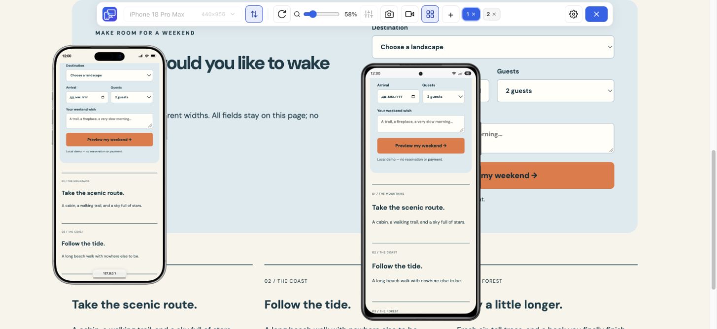
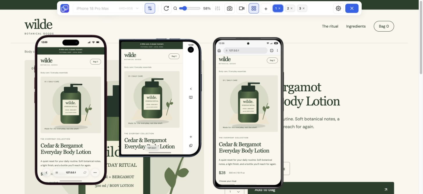
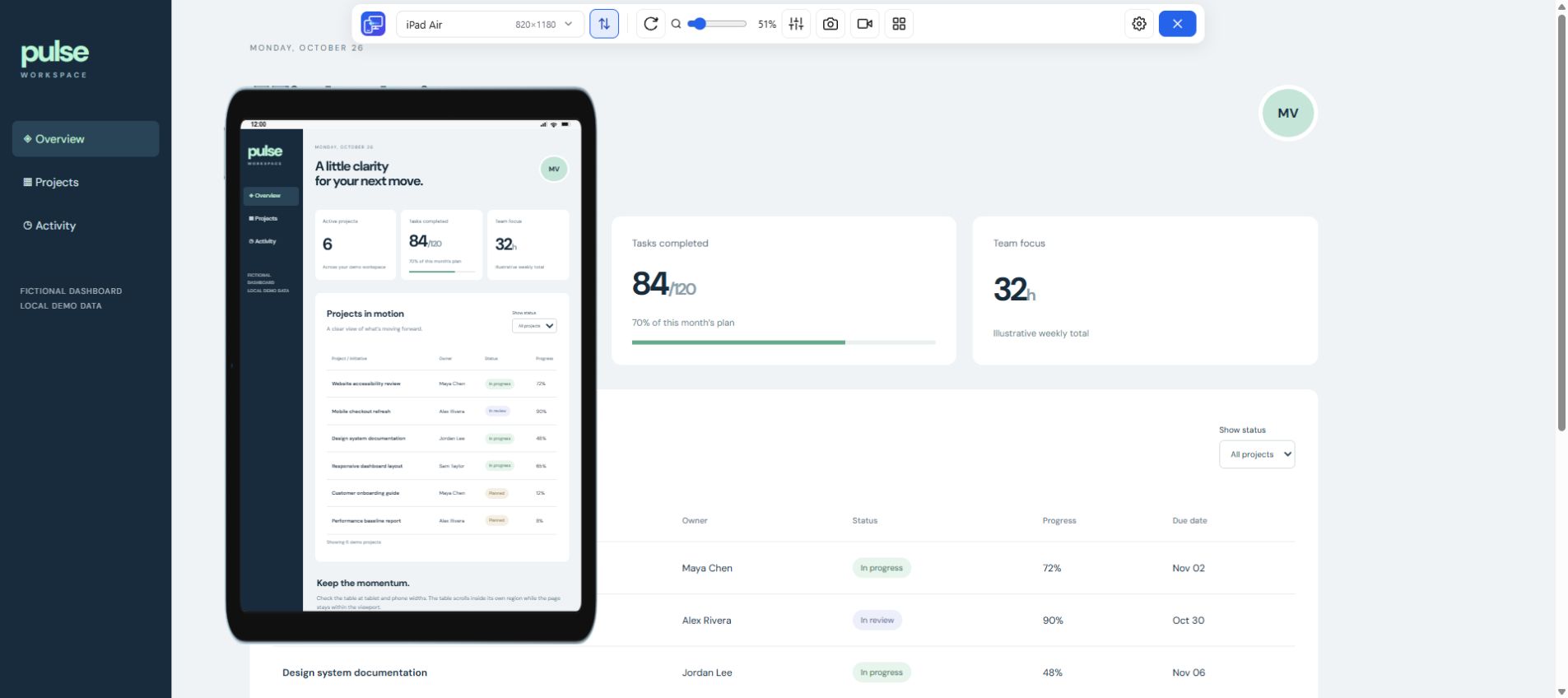
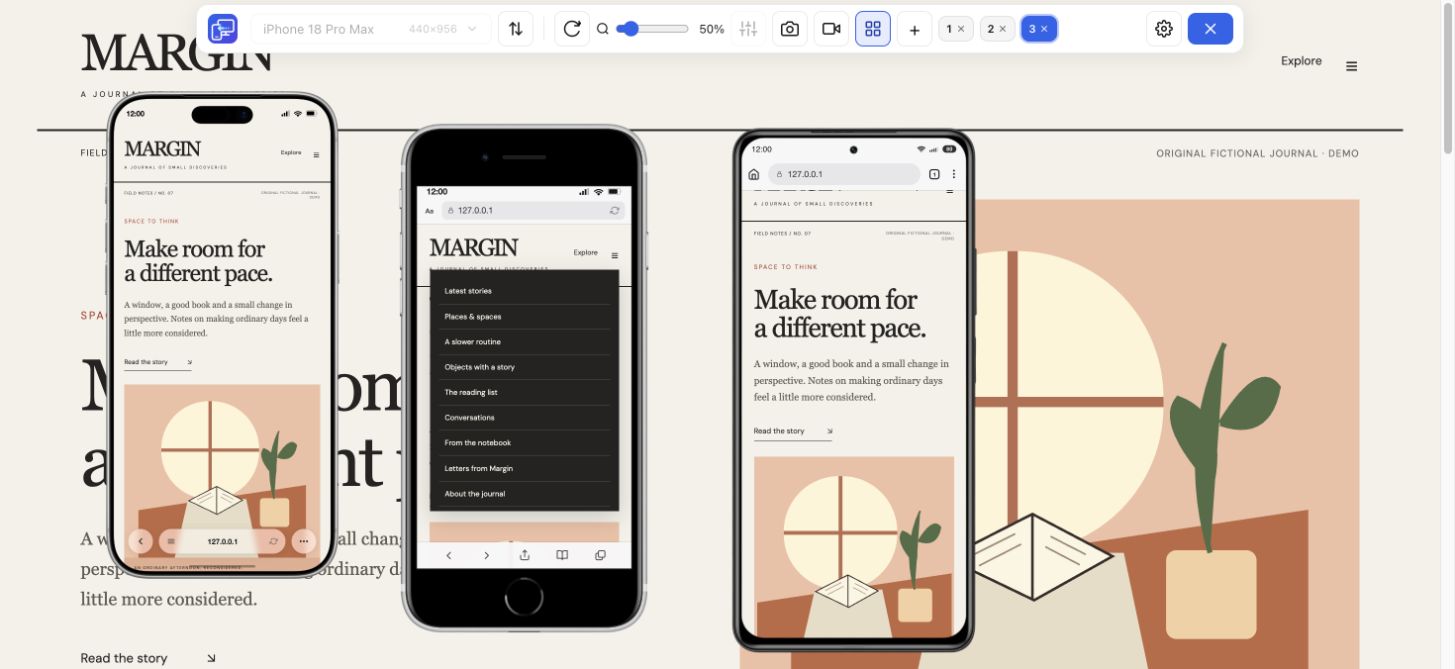
See how your website adapts to a phone or tablet while you work on your computer. Mobile Viewer is a free Chrome extension with 25 device presets, portrait and landscape views, and custom sizes. Install the extension, open your site, and choose the screen you want to preview.
Free browser extension · No account required · Runs on your computer
A narrow phone, a wide phone, and a tablet can reveal different layout problems. Choose from the built-in catalogue rather than repeatedly dragging a browser window to an approximate size. Each preview uses the selected device viewport while the rest of your desktop page remains available.
Start with the screen sizes your visitors use. Check a compact layout for wrapped headings and crowded controls, then choose a larger device to review spacing and how content fills the screen. The named presets make those checks easier to repeat after an edit.
Use zoom to fit a preview on your monitor. A smaller displayed frame is useful when comparing devices; it does not turn the website into a different layout width. Switch orientation to check how navigation, images, and forms respond to the wider viewport.
When a preset does not match the size you need, use a custom viewport. Enter a width and height, apply the size, and give a custom device a name if you want to keep it. Saved settings stay in your browser for the next time you return to the project.
Add up to five mobile previews alongside your desktop site. Keep a compact phone beside a larger phone or tablet and review the same part of the page. Turn on Sync when you want scrolling, clicks, and text input mirrored across previews, or turn it off to inspect each view independently.
The mobile simulator also works with HTTPS sites and local development pages on localhost. Each preview loads the site, so use a test environment when checking flows that could create orders or change account data. Save a PNG of the selected device or record a walkthrough when you need to share a finding.
If you are looking for a mobile browser emulator to inspect a website, start with the viewport and the task you need to check. Mobile Viewer renders the page inside phone and tablet previews while desktop stays visible. Use a preset or custom dimensions, compare orientations, and review the same content across sizes.
The mobile browser emulator workflow here uses desktop Chrome. A device frame and viewport do not install a mobile operating system or reproduce the actual Safari engine. Use the preview for quick layout and interaction checks, then verify important browser-specific behavior on real devices.
Use the preview to review responsive layouts, text wrapping, image placement, navigation, and everyday page interactions. A phone-shaped frame is helpful for client demos, but the page is rendered by desktop Chrome.
This is a website simulator, not a way to run Android apps or iOS applications. It does not provide the actual Safari or Android browser engine. Finish important checks on real devices, especially when behavior depends on the operating system, browser, touch hardware, or performance.
Look for something specific: a product name that gains an extra line, a menu whose final link is hard to reach, or a form action pushed away from its fields. Compare the same state at two sizes, then keep the preset and screenshot with your finding. Mobile Viewer turns the preview into a repeatable website check.
Install Mobile Viewer from the Chrome Web Store, then open the page you want to preview. Save unfinished input before the first activation, which may reload the page.
Click the Mobile Viewer icon, select a phone or tablet, and switch between portrait and landscape. Adjust zoom to fit your monitor.
Add more devices if needed, review the layout, and capture the selected device or record a short demonstration.
Yes. The current Mobile Viewer extension is free to use, with no account required.
Yes. Set a custom width and height and save named custom sizes in your browser.
No. It previews websites in desktop Chrome. It does not run native applications or replace real-device browser testing.
It provides device-sized website previews in desktop Chrome, including custom viewport sizes and orientation. It does not run a separate phone operating system or replace testing in the actual mobile browser.
Yes. Local HTTP pages such as localhost and 127.0.0.1 are supported, as well as HTTPS websites. Other remote HTTP pages are not supported.
Open your website in Mobile Viewer, choose a preset or custom dimensions, and rotate the preview to compare how the same content fits.
Install extensionChrome Web StoreFreeFree browser extension · No account required · Runs on your computer
Feature
View the current website on mobile sizes alongside its desktop version.
Explore featureGuide
Follow the steps for Chrome Device Mode or use Mobile Viewer beside desktop.
Explore guideFeature
Check your website at compact and large iPhone sizes, side by side.
Explore featureFeature
Compare Samsung, Pixel and Xiaomi website layouts in your Chrome workspace.
Explore featureFeature
Check the layout between phone and desktop with iPad and Galaxy Tab previews.
Explore feature