Columns that nearly fit
Read the longest card in a two-column section. Check whether the title, image and action still form a clear sequence.
The layout between phone and desktop
A website can work on a phone and still feel awkward on a tablet: two columns almost fit, the menu changes too early or a form stretches across the screen. Use Mobile Viewer as a tablet and iPad simulator for website checks in desktop Chrome. Compare a tablet with a phone and desktop, then rotate the tablet to inspect the other layout.
Free browser extension · No account required · Runs on your computer
Mobile Viewer includes three tablet presets. These dimensions identify the extension’s CSS configurations; they are not a catalogue of all hardware generations or every browser’s visible area.
| Preset label | Portrait CSS px | DPR | Review focus |
|---|---|---|---|
| iPad Mini | 768 × 1024 | 2 | Navigation and columns near a common layout transition |
| iPad Air | 820 × 1180 | 2 | Reading width, forms and two-column content |
| Galaxy Tab S7 | 800 × 1280 | 2 | Tall content, dialogs and a neighboring Android tablet size |
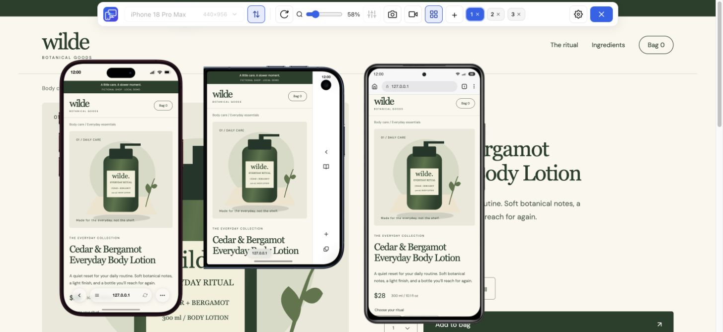
Choose a page with enough content to expose an intermediate layout. Put a phone and a tablet beside desktop, then inspect the same section. A wider screen is useful only if its extra space improves the task.
Read the longest card in a two-column section. Check whether the title, image and action still form a clear sequence.
Follow the same link in portrait and landscape. Confirm that navigation does not become crowded just before a desktop-style menu appears.
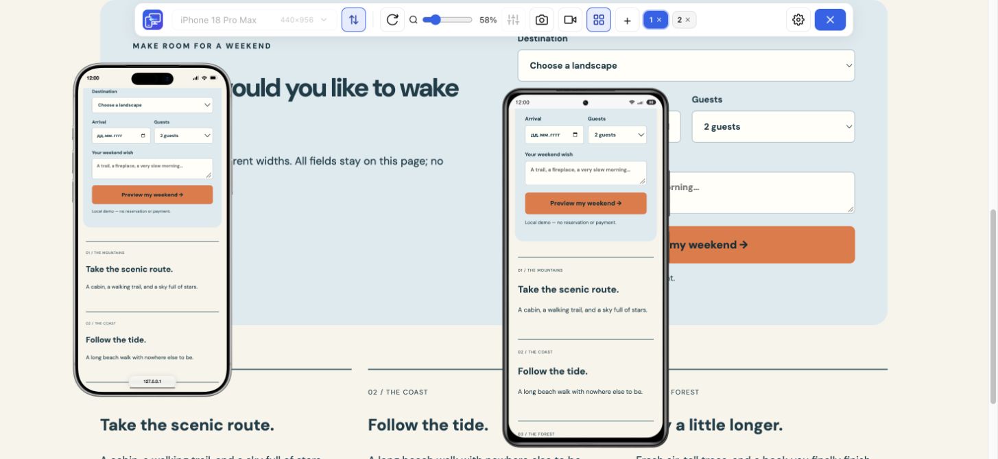
Inspect field width, label position and the distance to the submit button. A tablet form should be easy to scan without becoming a full-width stripe.
An iPad simulator for websites is useful for exploring how a layout changes when the available width and height swap. Rotate the selected tablet in Mobile Viewer, keep the same page section in view and reopen any menu or dialog involved.
An open dialog that fits in portrait may need scrolling in the shorter landscape rectangle. Check its final action and close control. The actual iPad Air capture below shows the same dashboard in landscape; compare how the table and sidebar use the available space.
This tablet simulator uses an installed Chrome extension on your computer. It does not launch a cloud iPad from this page, run iPad apps or provide the Safari engine. If you need an iPad simulator online for app or operating-system testing, choose a service designed for that task.
For everyday website work, open an HTTPS or localhost page, choose the tablet preset and compare it with a phone. Save a selected-device PNG or record a short walkthrough when you find a useful result. Confirm Safari, touch, keyboard and device-specific behavior on target hardware or a suitable testing service.
Install Mobile Viewer from the Chrome Web Store, visit your HTTPS or localhost page and start the extension.
Choose iPad Mini or iPad Air, then a narrower phone. Compare one page task beside the desktop layout.
Rotate the tablet, inspect its menu, form or dialog and keep a screenshot or recording when the result needs a follow-up.
Yes, for website layout previews using the listed iPad preset configurations in desktop Chrome. It does not run iPadOS, iPad apps or the Safari rendering engine.
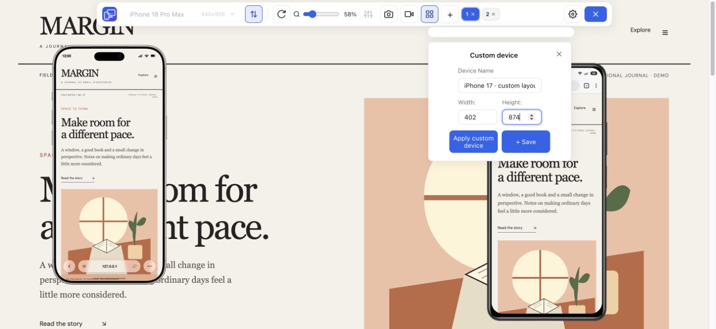
Enter a custom width and height and apply them. Keep the configuration labeled as custom, and measure your target browser when exact visible dimensions matter.
Yes. Add the iPad and Galaxy Tab presets to a Multiview workspace. Mobile Viewer supports up to five mobile previews beside desktop, including phone and tablet configurations.
Put a tablet beside a phone and desktop. Find the column, menu or form that needs a little more attention, then keep a clear result for your next edit.
Install extensionChrome Web StoreFreeFree browser extension · No account required · Runs on your computer
Feature
Check your website at compact and large iPhone sizes, side by side.
Explore featureFeature
Compare Samsung, Pixel and Xiaomi website layouts in your Chrome workspace.
Explore featureGuide
Choose viewport dimensions and know what to inspect at each size.
Explore guide