Read
Headings and body text fit the available width. Images stay within their containers and important content remains available when text is enlarged.
A practical mobile-friendly website check
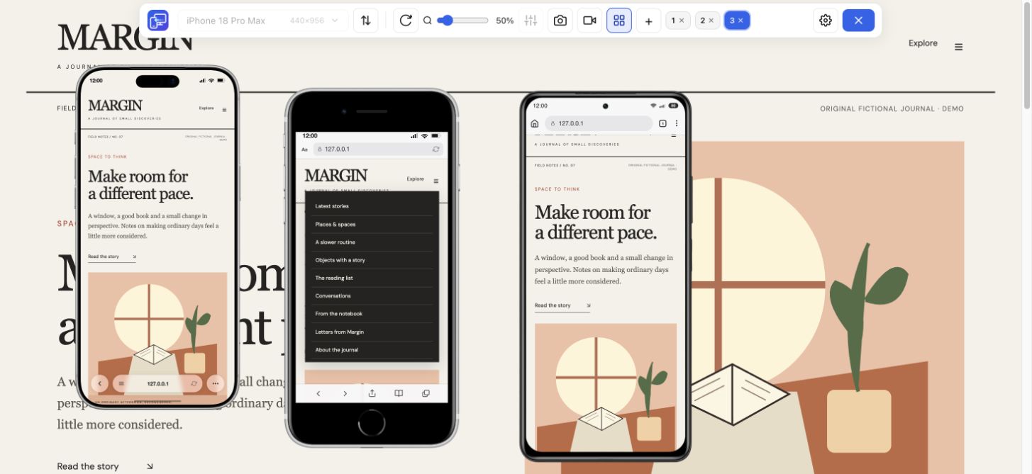
Check your website’s mobile friendliness by reading its content, opening the menu and completing one important task at two phone widths. Install Mobile Viewer for Chrome on your computer to keep those previews beside desktop, then use the checklist below to record what needs work.
Free browser extension · No account required · Runs on your computer
A mobile-friendly site lets visitors read, navigate and finish their task on a small screen. Check the page after opening menus, choosing options and triggering a form error, as well as when it first loads.
Use this checklist as a manual first pass on a page, not an automatic score for the whole website. Repeat it on representative pages such as your home page, a product or service page, and a contact or checkout flow. Check loading performance separately and confirm important tasks on your target phone.
Headings and body text fit the available width. Images stay within their containers and important content remains available when text is enlarged.
Menu links, buttons and close controls remain reachable. A sticky panel leaves enough space to use the page behind it.
A visitor can select an option, understand an error and reach a confirmation. The flow still works after the layout changes.
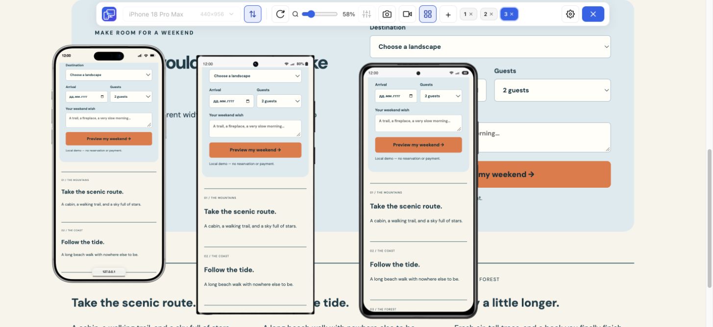
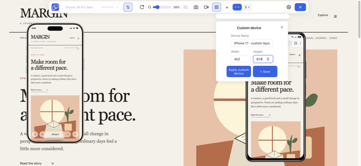
Open the page you want to review in desktop Chrome. Save unfinished input, then launch Mobile Viewer. Choose a compact phone and a wider phone, or enter custom dimensions such as 320 × 800 and 390 × 844 CSS px. These are useful starting points for this exercise. Add the sizes where your own visitors encounter problems.
Work through all six checks at both widths. Choose Pass only when the action succeeds at every size you listed. If either size fails, choose Needs work and record the failing dimensions, browser and steps in the notes. Leave unfinished checks as Not checked; use N/A only when the page has no such element.
0 of 6 checks recorded
Read the longest heading, body text and form labels at each width.
Pass when Text wraps, stays readable and can be enlarged without losing content.
Scroll from the first screen to the footer. Inspect wide images, cards and tables.
Pass when The page fits the viewport. Any wide table or diagram scrolls within its own region.
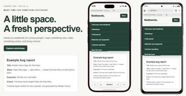
Open the menu, reach its last item, follow a link and close the menu again.
Pass when Every destination is reachable and the page remains usable after closing the menu.
Choose the longest product option or other realistic input, then follow the primary action. On your phone, check that you can tap it without hitting a nearby control.
Pass when The button stays visible, its label fits and the expected next step opens. On the target phone, it is easy to tap accurately.
Use test data. Leave a required field empty, correct the error and complete the flow.
Pass when The error identifies the field, existing input remains and a corrected submission succeeds.
Open any cookie banner, dialog or sticky panel and try its close or continue action.
Pass when The action is reachable and the content can be used again after the panel closes.
Keep this tab open while you review your site. Copy your results before leaving or reloading the page.
Start with the first failure that blocks the task. For example, a long product option and its Add to cart button may be forced onto one row. The button can then extend beyond the phone viewport. Inspect the container and control widths in DevTools before changing the CSS.
Apply these rules to the container and controls in this example. Replace the selector with the one used by your site and inspect any conflicting fixed widths.
/* Let long controls wrap inside a narrow container. */
.product-actions {
  display: flex;
  flex-wrap: wrap;
  gap: 0.75rem;
}

.product-actions > * {
  flex: 1 1 12rem;
  min-width: 0;
  max-width: 100%;
}

.product-actions button {
  white-space: normal;
  overflow-wrap: anywhere;
}| Checkpoint | Before the fix | After the fix |
|---|---|---|
| Narrow phone | The action extends beyond the viewport. | The controls wrap and the full button is reachable. |
| Wider phone | The row may appear to fit with a short option. | A long option still fits or wraps without covering the action. |
| Complete the action | The visitor cannot reliably reach the next step. | The cart or confirmation shows the chosen option. |
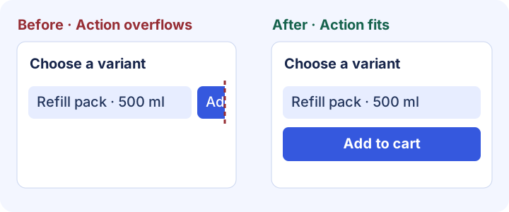
A form can fit the screen and still be difficult to finish. Leave a required field empty using test data, trigger validation and find the error. Correct the field, confirm that earlier input remains, then check the expected confirmation. Repeat at the second width.
A useful mobile-friendly website tester should help answer a specific question. Use the manual checklist for reading and completing tasks, browser tools to inspect the cause, and a physical phone to confirm device behavior. Keep the same page, dimensions and steps so you can repeat the mobile friendliness test after a fix.
| Your question | Method | Result to keep |
|---|---|---|
| Can visitors read and finish the task? | Mobile Viewer or Chrome Device Mode, plus this checklist | The failing size, steps and screenshot or recording. |
| Which CSS rule causes the overflow? | Chrome DevTools | The responsible element, rule and verified change. |
| Does touch, Safari or the keyboard behave correctly? | The target phone and browser | A result from the affected device and browser. |
| Is loading slow? | PageSpeed Insights and browser performance tools | Loading diagnostics and the result after optimization. |
Copy the results from the checklist or download the blank template below. A useful report includes the exact page, viewport, steps and evidence. After a fix, repeat the same task at both original widths and one nearby width. Keep remaining issues assigned to an owner.
MOBILE-FRIENDLY WEBSITE CHECK
Page checked:
Browser / device:
Viewport sizes in CSS px:
Orientation / zoom / keyboard state:
Result rule: Pass at every listed size; Needs work if any size fails.

[Not checked] Read the content
[Not checked] Look for sideways scrolling
[Not checked] Reach the last menu link
[Not checked] Use the main button
[Not checked] Recover from a form error
[Not checked] Dismiss banners and pop-ups

Issue and steps to reproduce:
Expected result:
Observed result:
Failing viewport and state:
Screenshot / recording:
Fix owner:
Retest at the same sizes:Open an important page at a compact and a wider phone width. Read the content, scroll to the footer, open the menu and complete the main task using test data. Record each result in the checklist, repeat it on the main page types and verify device-specific behavior on a phone.
Common causes include fixed widths, unbreakable content, clipped menus, covered buttons and forms that are difficult to finish. Identify the first failed action, inspect the responsible element or rule, and repeat the same case after changing the site.
This guide helps you find and document the problem. Apply the correction in your site’s CSS, theme or editor, then check the result at the same sizes. Mobile Viewer keeps the previews available while you compare and retest.
It includes useful checks for reading, reflow and reachable controls. A complete accessibility review also covers keyboard operation, focus, semantics, contrast and assistive technology. Use the W3C references below to plan those checks.
Google retired its Mobile-Friendly Test on December 1, 2023. Use current browser tools and a repeatable manual check for layout and interaction, and PageSpeed Insights for loading diagnostics.
Install the extension in desktop Chrome, open your website and compare two phone sizes beside desktop. Follow one task, save the failing state and use the same dimensions to verify the fix.
Install extensionChrome Web StoreFreeFree browser extension · No account required · Runs on your computer
Feature
Follow a user journey across mobile sizes and record what needs fixing.
Explore featureFeature
View the current website on mobile sizes alongside its desktop version.
Explore featureGuide
Choose viewport dimensions and know what to inspect at each size.
Explore guideGuide
Copy a report template and describe a website issue someone can reproduce.
Explore guideGuide
Choose separate mobile artwork, understand banner sizes and check the storefront after a theme change.
Explore guide