“Does this layout fit?”
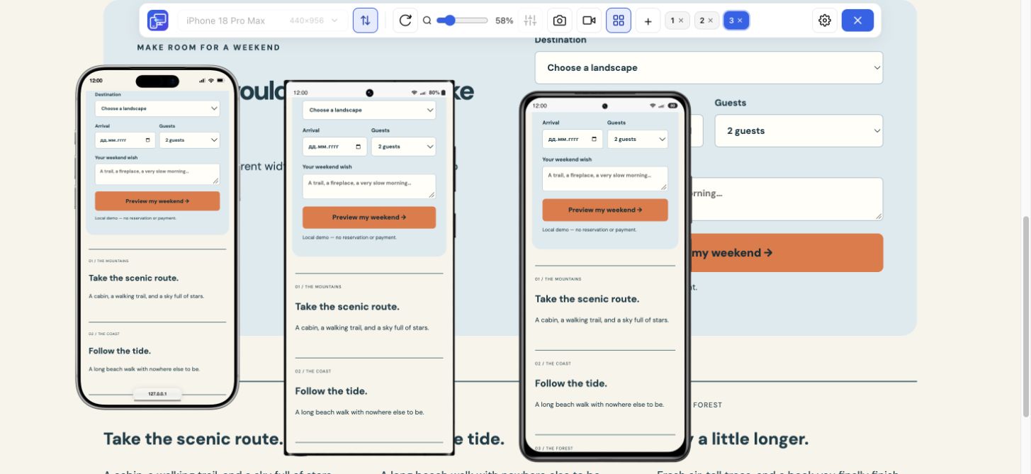
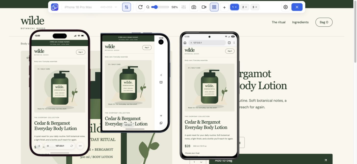
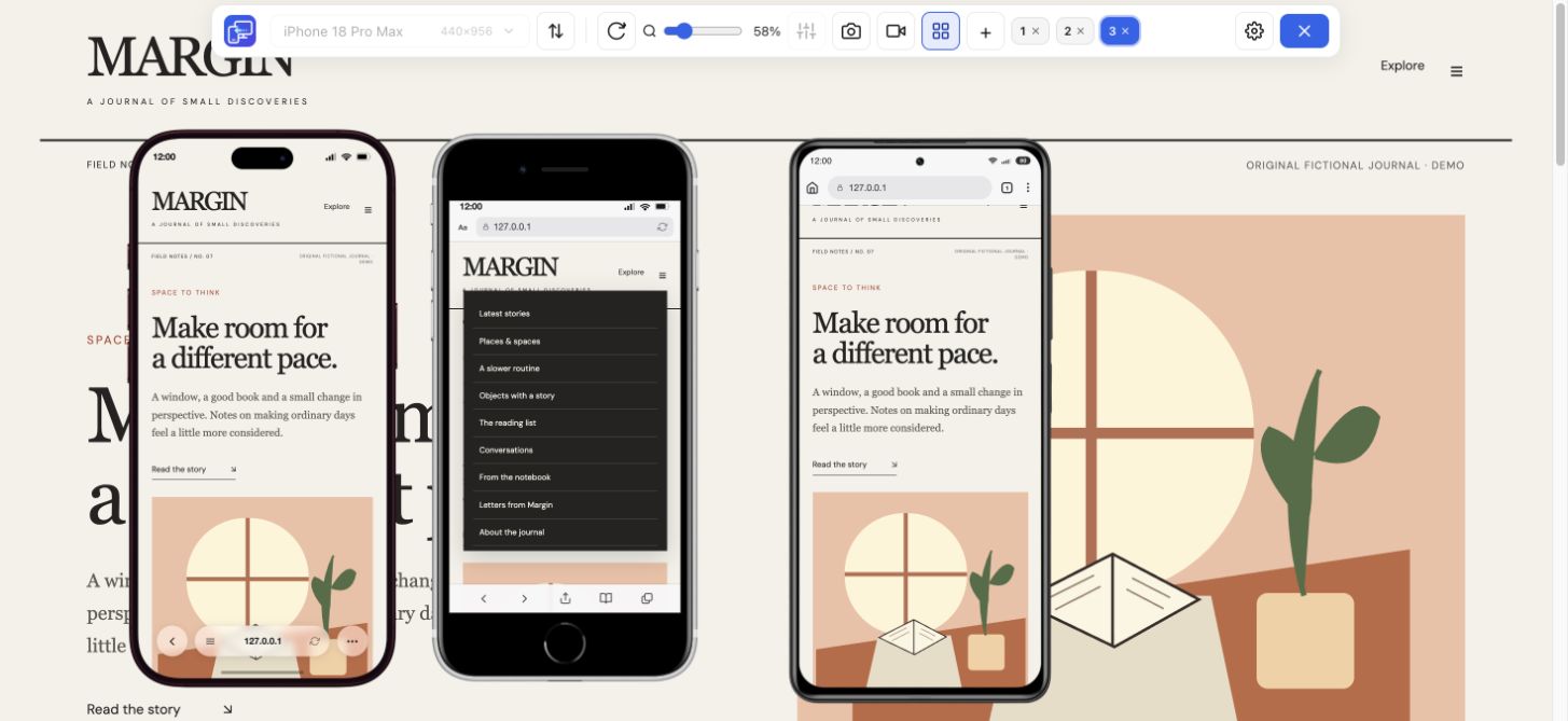
Start in Mobile Viewer. Compare a narrow phone, a larger phone and a tablet while keeping your desktop page visible.
Choose by the job you need done
If you are looking for a BrowserStack alternative to compare responsive layouts while editing a website, Mobile Viewer offers a lightweight starting point: a free Chrome extension with several device-sized previews beside desktop. First decide what you need to prove. A layout comparison and a real-device compatibility check answer different questions.
Read the guideUse a fast preview while changing content, spacing or breakpoints. Use a real browser environment when the question is whether a particular browser or phone behaves correctly. You may use both in the same release workflow.
Start in Mobile Viewer. Compare a narrow phone, a larger phone and a tablet while keeping your desktop page visible.
Use Safari on an actual iPhone or an appropriate real-device testing environment. Chrome frames cannot establish Safari compatibility.
Choose an automation platform and runner for the browsers you need. Mobile Viewer is an interactive manual preview tool.
BrowserStack Live provides interactive testing on real desktop and mobile browsers. Mobile Viewer renders your page in desktop Chrome at selected preview configurations. The table compares the kind of evidence each workflow can provide; it does not rank every BrowserStack product.
| Need | Mobile Viewer | BrowserStack Live |
|---|---|---|
| Compare several responsive widths | Up to five mobile previews beside desktop | Use device/browser sessions to inspect your target environments |
| Test iOS Safari or an actual Android browser | Desktop Chrome preview only | Real mobile browser testing is a core purpose |
| Keep a layout check in your current Chrome workspace | Install the extension and open your page | Open the appropriate cloud browser/device session |
| Share a manual finding | Selected-device PNG or device/tab recording | Use the evidence tools available in your testing session |
| Run an automated regression suite | No test runner | Evaluate the relevant BrowserStack automation product separately |
Suppose a long product title pushes the main action down on a compact phone. Install Mobile Viewer, open that product page and compare iPhone 13 Pro at 390 px with Galaxy S24 Ultra at 412 px and iPhone 17 Pro Max at 440 px.
Keep the same product selected. Inspect the title, price and action, change the CSS or content, then revisit the same three sizes. This is a concrete reason to use the extension: it makes the layout comparison visible during the edit, without requiring a separate cloud session for each width.
Once the layout is comfortable, test browser-dependent behavior in the environment your visitors use. Pay particular attention to Safari rendering, on-screen keyboards, browser controls, input behavior and device features. Keep the preview dimensions with the finding so the next check starts from a known state.
For a useful handoff, save a selected-device screenshot or a short recording in Mobile Viewer, state what you observed and identify what still needs device verification. A passing desktop preview is evidence about that preview, not a compatibility certificate.
| Stage | Action | Keep |
|---|---|---|
| During editing | Compare relevant sizes in Mobile Viewer | The configuration that exposed the problem |
| After the fix | Repeat the same content and interaction | A screenshot or short walkthrough if useful |
| Before release | Verify target real browsers and devices | Browser/version details and the actual outcome |
Mobile Viewer is currently free for interactive website previews in desktop Chrome. Use it to compare sizes, follow a page task and document a finding. If the requirement is real iOS Safari, a cloud device or automated execution, keep that requirement and choose an environment that provides it.
It is currently a free alternative for a narrower task: manual responsive layout previews in desktop Chrome. It does not replace BrowserStack’s real-device environments or automation products.
No. An iPhone preset changes the preview configuration, not Chrome’s rendering engine. Use an actual Safari environment to confirm Safari behavior.
For a spacing, content or breakpoint edit, start with a quick layout comparison. For a fault that appears only in a specific browser or device, start with that actual environment.
Open the page you are editing, compare useful phone sizes and see what changes. Mobile Viewer is free to install in desktop Chrome.
Install extensionChrome Web StoreFreeFree browser extension · No account required · Runs on your computer
Feature
Follow a user journey across mobile sizes and record what needs fixing.
Explore featureFeature
Check your website at compact and large iPhone sizes, side by side.
Explore featureGuide
Choose between a Chrome extension workflow and a dedicated responsive browser.
Explore guide