A narrow checkpoint
Start around 360–390 CSS px. Check long headings, fixed-width content, side-by-side actions and whether a menu can close.
 Mobile Viewer Free browser extension
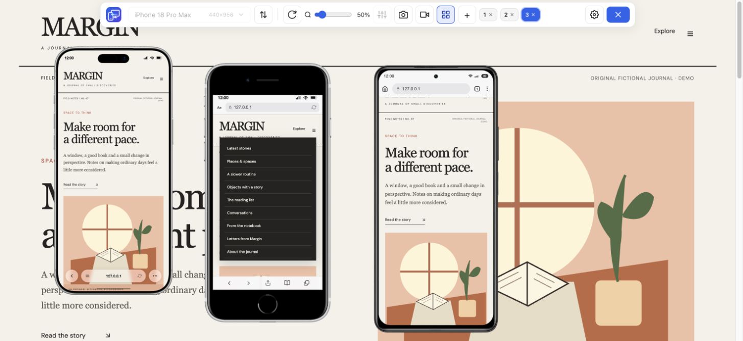
Find a device viewport, then see your own website at that size. Compare iPhone, Android and tablet layouts in Mobile Viewer and check menus and key actions.
Presets + custom sizes
Free browser extension · No account required · Runs on your computer
 Chrome
 Edge
 Opera
 Brave
Use device viewport sizes to make a website check repeatable. Find an iPhone or Samsung configuration, compare its CSS rectangle with another, then inspect the same content in the extension. The table identifies what each number means and which models have a built-in preset.
Search all 25 current Mobile Viewer presets, including phones, tablets and folded/unfolded configurations. Two additional custom iPhone rectangles are labeled separately. The linked model guides include verified hardware information; an unlinked preset still provides a useful, repeatable layout configuration. Folded/unfolded entries describe two states of one model, not two different phones.
27 of 27 configurations. Select up to three to compare.
| Compare / model | Default CSS rectangle | Preset / reference DPR | Preview setup | Physical display px |
|---|---|---|---|---|
| 626 × 890 | 3 | Built-in preset | 1878 × 2670 (inner) | |
| 678 × 466 | 3 | Built-in preset | 1398 × 2034 (outer) | |
| 440 × 956 | 3 | Built-in preset | — | |
| 402 × 874 | 3 | Built-in preset | — | |
| 420 × 912 | 3 | Built-in preset | — | |
| 440 × 956 | 3 | Built-in preset | 1320 × 2868 | |
| 402 × 874 | 3 | Built-in preset | 1206 × 2622 | |
| 390 × 844 | 3 | Built-in preset | 1170 × 2532 | |
| 414 × 896 | 3 | Built-in preset | 1242 × 2688 | |
| 414 × 896 | 2 | Built-in preset | 828 × 1792 | |
| 375 × 667 | 2 | Built-in preset | 750 × 1334 | |
| 320 × 568 | 2 | Built-in preset | — | |
| 393 × 873 | 2.75 | Built-in preset | — | |
| 884 × 1104 | 2.625 | Built-in preset | — | |
| 384 × 938 | 2.813 | Built-in preset | — | |
| 412 × 891 | 2.625 | Built-in preset | — | |
| 412 × 918 | 2.625 | Built-in preset | 1440 × 3120 | |
| 412 × 915 | 2.625 | Built-in preset | 1440 × 3088 | |
| 360 × 740 | 3 | Built-in preset | — | |
| 412 × 732 | 3.5 | Built-in preset | — | |
| 412 × 892 | 3.5 | Built-in preset | 1440 × 3120 | |
| 393 × 851 | 2.75 | Built-in preset | — | |
| 800 × 1280 | 2 | Built-in preset | — | |
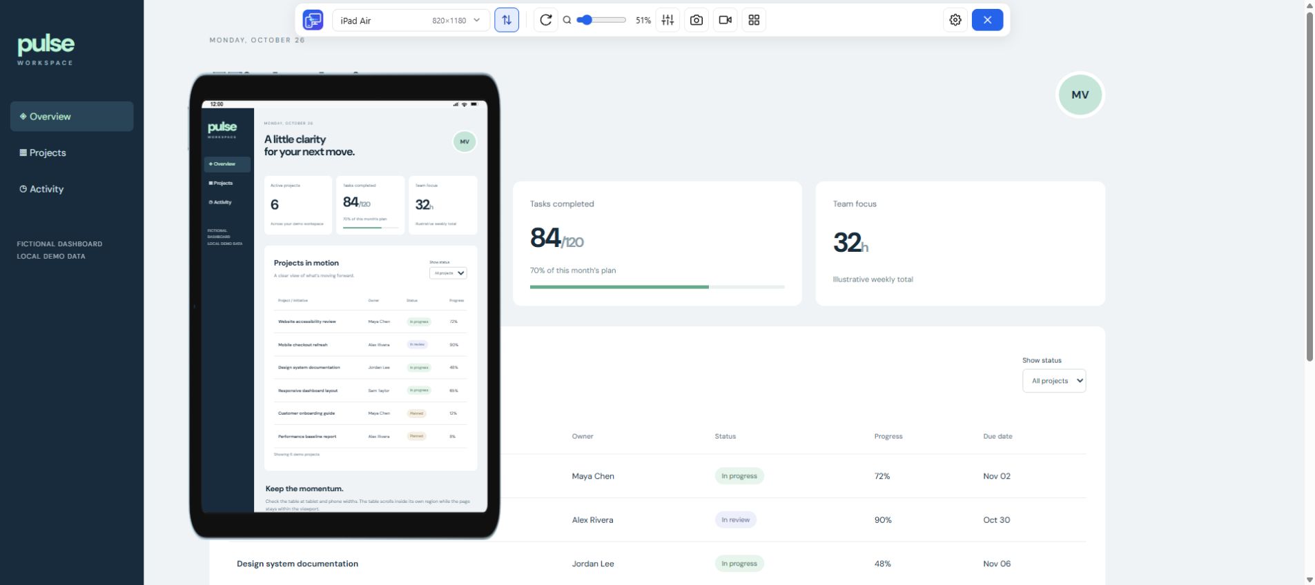
| 820 × 1180 | 2 | Built-in preset | — | |
| 768 × 1024 | 2 | Built-in preset | — | |
| 440 × 956 | 3 (reference) | Custom configuration | 1320 × 2868 | |
| 402 × 874 | 3 (reference) | Custom configuration | 1206 × 2622 |
CSS values are Mobile Viewer preset configurations or labeled custom starting points. Hardware resolution is included only for entries linked to a verified manufacturer reference. A blank hardware reference does not mean zero resolution. Preset names such as iPad Mini or iPhone SE can cover older generations; match the listed dimensions rather than assuming the latest model. Android display scaling can change CSS dimensions; browser bars can reduce visible height. For custom entries, 3× is a reference calculation; the custom panel sets width and height, without a DPR field. The diagram compares CSS rectangles, not physical phone sizes.
For mobile website dimensions, width usually determines when content reflows; height affects how much a visitor can reach without scrolling. Two phones can share a CSS width and still differ in height, density and browser behavior.
Start around 360–390 CSS px. Check long headings, fixed-width content, side-by-side actions and whether a menu can close.
Compare 412–440 CSS px. Inspect grid leftovers, image crops and spacing; a wider viewport does not automatically make the layout better.
Rotate a preview or try a reduced custom height. Keep dialog controls reachable. Verify the actual on-screen keyboard on a real device.
The reference CSS values match our current built-in preset data, or a labeled custom starting point for the stated model. A manufacturer’s maximum physical resolution is a separate specification. In particular, multiplying an Android preset width by DPR need not reproduce its maximum hardware resolution.
If your target Galaxy reports a different viewport, record its display settings and browser state. Enter the measured width and height as a custom viewport. Keep that configuration with the issue report so another person can repeat the layout check.
On your target browser, the following values help distinguish CSS layout size, the visible viewport and DPR. Browser controls, zoom and a software keyboard can affect these differently. This diagnostic is a measurement aid, not a way to detect a model reliably.
({
  layoutWidth: document.documentElement.clientWidth,
  layoutHeight: document.documentElement.clientHeight,
  visualWidth: window.visualViewport?.width,
  visualHeight: window.visualViewport?.height,
  dpr: window.devicePixelRatio
})Choose a narrow phone, a wider one and a tablet when the page needs it. Open the same website in Mobile Viewer, use up to five mobile previews beside desktop and follow one user journey. Start with the page’s main action, then inspect navigation and errors.
A good result is specific: “at 390 × 844, the long product title pushes the action below the offer,” with a screenshot and reproduction steps. A set of frames alone does not establish usability, accessibility or browser compatibility.
Choose sizes used by your visitors and widths that challenge your actual content. Start with a compact phone, a larger phone and a tablet; add intermediate custom widths where a layout changes.
Display scaling, resolution preferences, zoom and browser state can affect CSS dimensions and DPR. Our presets provide repeatable configurations, not every possible physical-device setting.
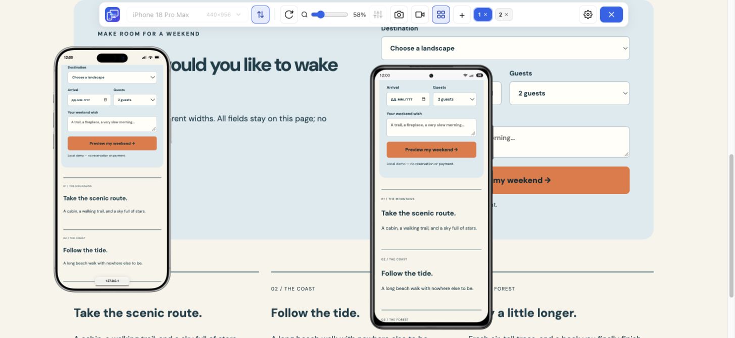
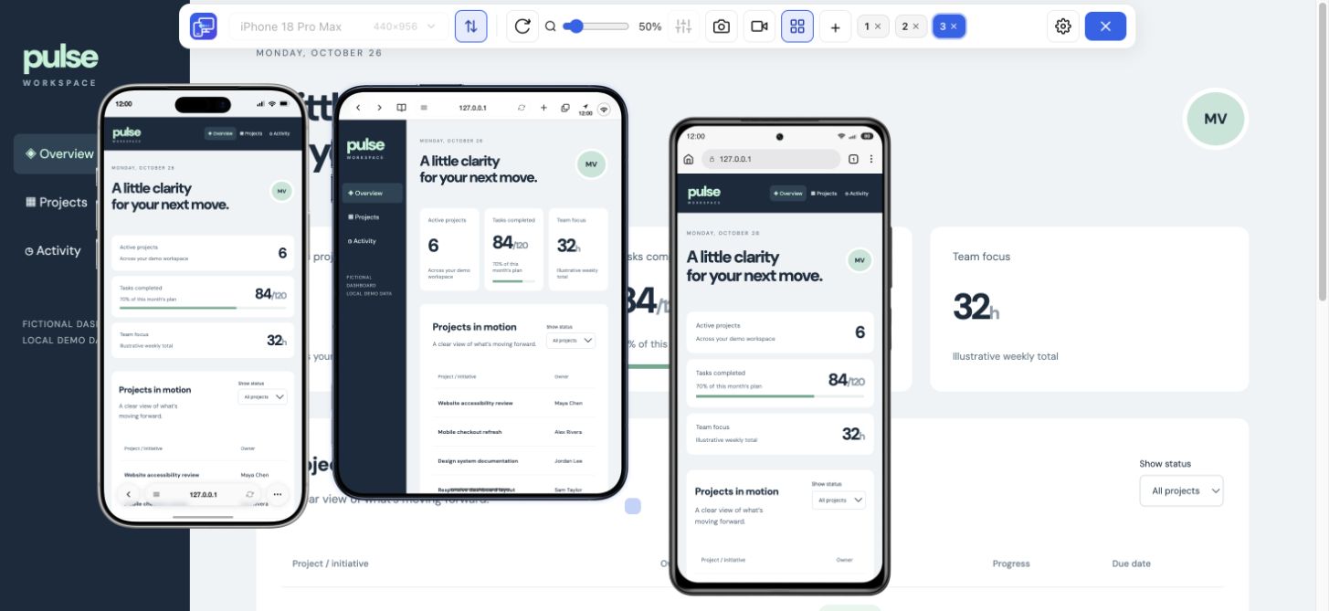
Mobile Viewer supports up to five mobile previews beside the desktop page. Choose useful differences, and use Sync when shared interactions help you compare the same state.
Use the reference to choose your next comparison, then open your own page in Mobile Viewer. It is a free Chrome extension for practical website previews.
Install extensionChrome Web StoreFreeFree browser extension · No account required · Runs on your computer
Device reference
Search iPhone sizes, compare CSS rectangles and choose a website test configuration.
Explore deviceFeature
Compare Samsung, Pixel and Xiaomi website layouts in your Chrome workspace.
Explore featureFeature
Check the layout between phone and desktop with iPad and Galaxy Tab previews.
Explore feature