Guide
CSS breakpoints
Test a media-query boundary with a CSS example and expected results.
Explore guide Mobile Viewer
Website in 52 languages
A practical size checklist
A website has no universal width and height. Choose viewport dimensions that help you find layout problems, then check the content between those sizes. Here, dimensions mean layout space in CSS pixels; downloaded file size is a separate measurement.
Read the guideFor a news page, the browser viewport, reading column, and complete article have different dimensions. Record the viewport width and height when reporting a layout issue. Hardware screen resolution alone does not describe the space available to the page.
| Measurement | What it tells you |
|---|---|
| Viewport width | Available layout space: where cards wrap or columns change |
| Content width | Space used by a container, which may be narrower than the viewport |
| Viewport height | Visible vertical space: whether an open menu or dialog remains reachable |
| Screen resolution | Physical display pixels, which can differ from the CSS pixels used for layout |
Use your visitors and supported devices to choose the initial set. Without that information, the widths below provide an exploratory check. They are examples, not a device-popularity ranking or a standard every website must follow.
| Width | What to inspect |
|---|---|
| 320 | Long headings, crowded controls, and horizontal overflow |
| 360 and 390 | Wrapping differences between nearby narrow layouts |
| 768 | Navigation and column changes at a wider size |
| 1024 | Spacing and the transition toward a spacious arrangement |
| Your breakpoint ± 1 | The boundary where your own CSS changes the layout |
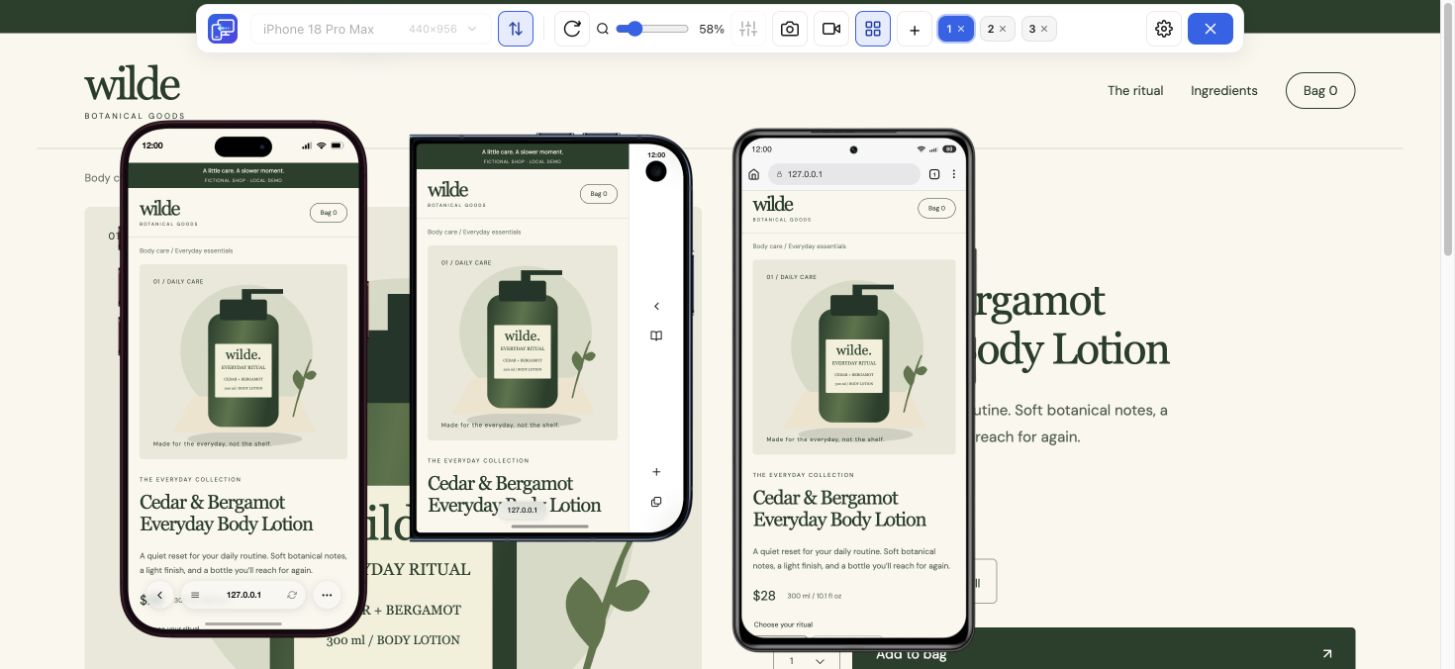
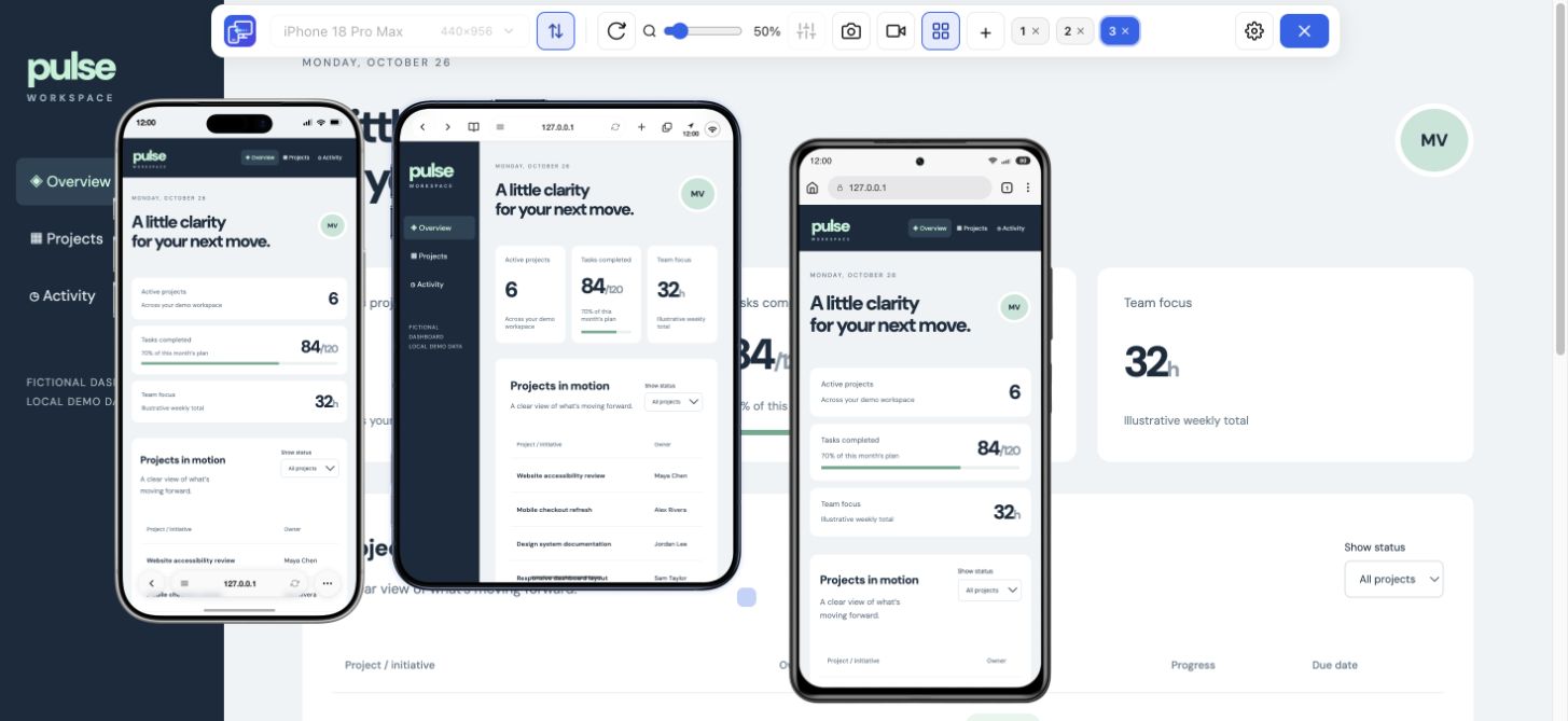
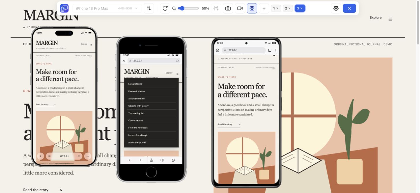
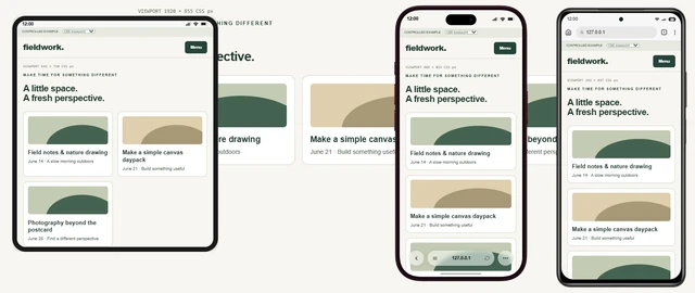
In Chrome Device Mode, enter a viewport size and inspect the page. For simultaneous comparisons, open Mobile Viewer and choose presets or custom width and height; up to five mobile previews fit beside desktop. Preview zoom changes the displayed frame size, while the selected dimensions determine the layout inside it.
For the news-page example, compare the same long headline, related-story card, and footer at every width. Then try a shorter height and landscape: extra width does not guarantee that a long menu fits vertically. If a full-height panel using 100vh extends behind mobile browser controls, consider a 100dvh declaration after the 100vh fallback. Compare short heights in the preview, then test the browser controls and keyboard on a real phone; a fixed preview does not reproduce their changing behavior. Record the dimensions and failed state so you can repeat the case after a change.
An iPad viewport can expose a layout that sits awkwardly between phone and desktop. Compare the 820 × 1180 iPad Air preset with a narrower phone and rotate the tablet. Keep CSS dimensions separate from physical display pixels, and measure the actual target browser when browser controls or keyboard height matter.
If a phone shows a scaled desktop page, inspect the viewport meta setting in the document head. Check that it uses the intended device width, then look for fixed or minimum widths forcing content wider. Use Mobile Viewer’s custom sizes to compare content wrapping after a CSS change. Verify the viewport configuration on the actual phone: a desktop frame at a custom width alone does not confirm how a mobile browser handles viewport configuration.
There is no single correct size. Start with viewports relevant to your visitors, then check intermediate widths around your layout transitions.
No. Use it for layout and ordinary interaction checks, then verify phone keyboard, touch, and browser-specific behavior on real devices.
Enter the viewport width and height you want to check, then compare up to five mobile previews beside desktop. Reuse the failing dimensions when you retest your site.
Install extensionChrome Web StoreFreeFree browser extension · No account required · Runs on your computer
Guide
Test a media-query boundary with a CSS example and expected results.
Explore guideFeature
Choose a phone or tablet, rotate its preview, and try custom screen sizes.
Explore featureFeature
Inspect layout changes at several screen widths and around your breakpoints.
Explore featureDevice reference
Search iPhone sizes, compare CSS rectangles and choose a website test configuration.
Explore deviceDevice reference
An interactive device size reference with practical website checks.
Explore device