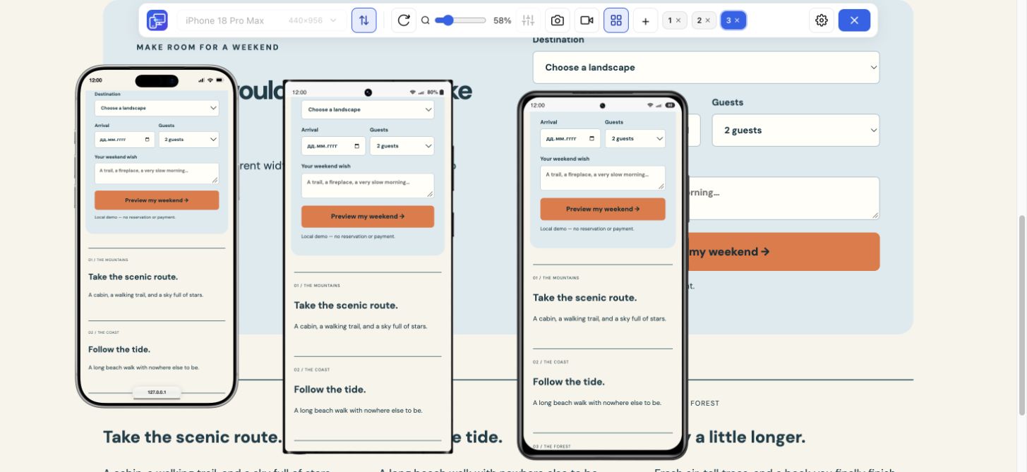
Horizon · Hero
In Hero, enable Show different media on mobile and choose an image under Mobile media 1. This section has dedicated mobile media fields.
Horizon instructionsShopify banner setup and layout checks
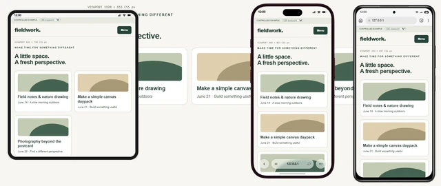
Make the banner changes in Shopify. Install Mobile Viewer for Chrome to compare the result at several phone widths beside desktop. The extension does not edit your theme.
Free browser extension · No account required · Runs on your computer
For separate desktop and mobile artwork, start with your theme’s banner section:
In Hero, enable Show different media on mobile and choose an image under Mobile media 1. This section has dedicated mobile media fields.
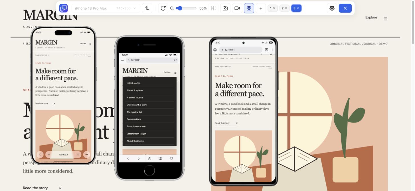
Horizon instructionsImage 2 is a second image in the same banner, not a mobile image field. For separate artwork, use a section with a mobile image picker or the two-section CSS workaround below.
Dawn instructions and CSSIn the current Horizon Hero section, the mobile artwork has its own media fields. Use these when you want to show a different Shopify banner image on desktop and mobile. Start on a duplicate theme so you can compare with the original.
In the home page template, open the Hero section. Keep the wide image in Media 1 and select Image as its media type.
In the Mobile media settings, turn on Show different media on mobile. Under Mobile media 1, select Image and choose your mobile artwork.
Save the draft, open its storefront preview and inspect phone and desktop widths. Confirm that the intended image appears, then check the heading and button separately.
In Dawn’s standard Image banner, the second image appears beside the first or stacks with it on mobile. It is not a mobile-only image field. For a different mobile banner in Dawn, distinguish a new crop from a new image: the focal point and height controls can change the crop. For independent artwork, a section with a dedicated mobile image field avoids maintaining two copies of the banner.
If you keep the standard Image banner, two sections with scoped visibility rules are a workaround. On a duplicate theme, create one section for each layout and use the CSS below. The rules target Dawn’s inner .banner element at its 749/750 px breakpoint. This is a source-based example checked on reduced markup; it still needs validation in your installed theme editor and storefront.
In the home page template, add two Image banner sections. Put the wide artwork in the first and mobile artwork in the second. Use one image per section. Match the heading, offer and button destination.
Select the first Image banner. Open its own Custom CSS field at the bottom of the section panel and paste the first example below.
Select the second Image banner and paste the second example into that section’s Custom CSS field. Save, then preview the storefront at 749 and 750 px.
Hides the desktop banner through 749 px. Paste only into the desktop section’s Custom CSS, so the other section is unaffected.
@media screen and (max-width: 749px) {
  .banner {
    display: none;
  }
}Hides the mobile banner from 750 px upward. Paste only into the mobile section’s Custom CSS. Keep the first rule on the desktop section.
@media screen and (min-width: 750px) {
  .banner {
    display: none;
  }
}A wide hero image can look right on desktop and lose its subject in a taller phone frame. First identify what needs to change: the visible crop, the artwork itself or the section layout. Increasing the image’s pixel dimensions alone does not change its composition.
Open Online Store → Edit theme and select the banner section in the home page template. Switching the editor to mobile preview changes the view; it does not automatically create a separate mobile image. The section’s actual settings decide what can change independently.
If the important subject fits within the mobile frame, try a focal point. Recheck desktop too: the focus belongs to the shared image, not just the phone view.
Use a separate composition when a narrow crop cannot preserve the important subjects and room for the offer. Keep campaign text and the button in the theme’s controls.
If the offer or button is covered, check the section height and text placement. A different image ratio can change an adaptive section’s height; increasing resolution alone will not fix the layout.
A focal point tells a compatible theme which part of the image should stay in view. Shopify supports it in the Horizon family and Dawn 7.0.0 or later. Use this when the important subject can fit inside the mobile crop.
In the theme editor, click the selected banner image to open it. You can also open the same file from Content → Files.
Click the part of the image that needs to stay visible, or drag the blue dot to it. Save the change, then inspect the storefront at the phone width that failed.
Check desktop and any other section using that file. Shopify keeps one focal point per image; changing it applies wherever the same image is used.
There is no single Shopify image banner size that fits every theme and section height. A 390 px viewport does not mean the image area is 390 px wide or that you should upload a 390 px-wide file. Measure the displayed image area after choosing the section height.
Choose a Shopify hero image size using these steps. The worked illustration below uses a deliberately chosen 390 × 520 CSS px mobile area to explain the method; it is not a universal Shopify setting.
Choose the section height and text placement in the theme editor. In the current Dawn Image banner, Height → Adapt to first image makes the first image’s ratio determine the banner height; fixed height choices can crop it.
Open the storefront in Chrome Device Mode at the width you want to check. Right-click the banner image and choose Inspect. In DevTools, select the image or its media container and read its displayed width and height in the element highlight or box model. Exclude any text placed below the image.
For a 390 × 520 area, width:height is 3:4. A 1200 × 1600 original has the same ratio and about three image pixels per CSS pixel at that size. Use a high-quality source; enlarging a small original does not add detail.
Worked illustration: crop → focus → mobile artwork
The wide artwork puts the bottle near the right edge. Compare three states in the same 3:4 mobile frame. The sample heading and button stay in the same position.
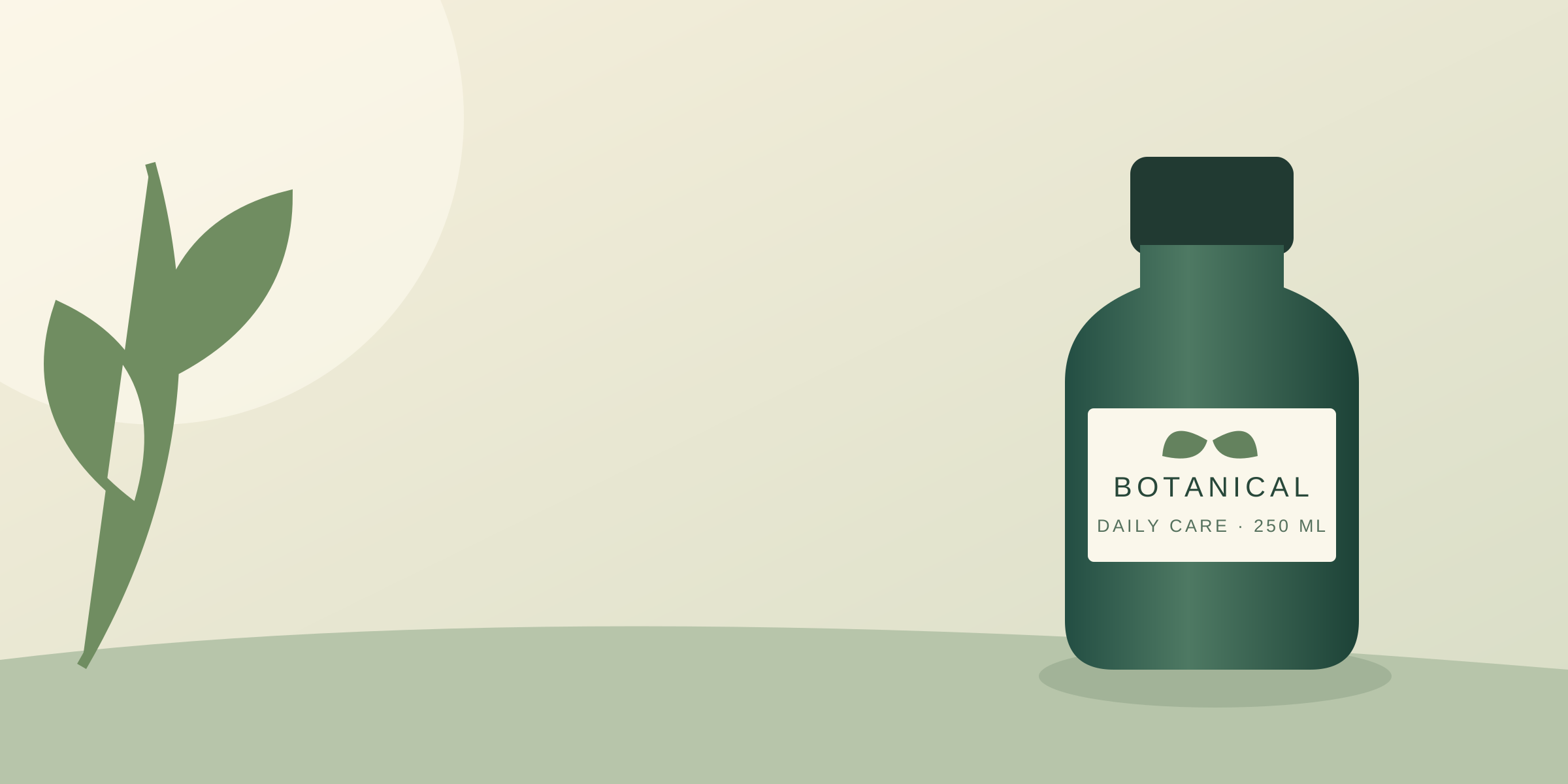
Original crop: the bottle is mostly outside the frame. Only 37.5% of the wide image’s width fits this portrait area.
Original illustration using CSS image positioning, not a Shopify editor or an exact reproduction of its focal-point calculation. This desktop frame shows the full wide image; other cropped uses of a shared file can change when its focal point moves.
| Displayed image area · CSS px | Ratio | Example source image |
|---|---|---|
| 1200 × 600 desktop area | 2:1 | 2400 × 1200 px |
| 390 × 520 mobile area | 3:4 | 1200 × 1600 px |
| 1200 × 400 shallow banner area | 3:1 | 2400 × 800 px |
Open the saved storefront preview at 320, 390 and 430 CSS px beside desktop. Compare the image first, then follow the main action. If a check fails, use the table below to choose the next change instead of repeatedly exporting a larger file.
Install Mobile Viewer in desktop Chrome and open the saved storefront preview or published page you want to check. If the preview asks for a password or access, complete the normal access step first.
Add phone previews or custom sizes such as 320 × 800, 390 × 844 and 430 × 932 CSS px. Check the original failing width and one nearby width after the change.
Read the full offer and click the banner button in each layout. Confirm the collection or page is correct. Capture a failed state and repeat the same sizes after the fix.
| Observed problem | Next check |
|---|---|
| The subject is cut off | Check the image-area ratio and focal point. If all important details cannot fit, change the composition. |
| Horizon still shows the desktop artwork | Confirm Show different media on mobile is enabled and Mobile media 1 has a selected image with the Image type. |
| Two Dawn banners appear, or neither appears | Check that each visibility rule is in its own section field, not the global theme field. Retest at 749 and 750 px. |
| Text or the button covers the subject | Check the text position and section height. Try placing the mobile content below the image where the section supports it. |
| The button opens the wrong collection | Correct its destination. With two sections, update both copies and follow each button again. |
Use this short record when you change artwork, theme height or campaign copy. Keep the theme version and exact failing size so the next person can reproduce the result. Finish with a check on your target phone and browser, especially for touch and mobile browser behavior.
SHOPIFY MOBILE / DESKTOP BANNER CHECK
Storefront page:
Theme, version and section:
Desktop / mobile artwork dimensions:
Section height / focal point:
Viewport sizes in CSS px: 320, 390, 430, 1440
Theme breakpoint / sizes checked around it:

[ ] Correct artwork appears; exactly one intended banner is visible
[ ] Important product details or subjects remain visible in the intended crop
[ ] Heading and offer are readable, including the longest text
[ ] Primary button is visible and opens the intended collection or page
[ ] No blank section gap or sideways scrolling
[ ] Same page checked again after the change
[ ] Other uses of the same image checked after a focal-point change

Failed size and state:
Screenshot / recording:
Fix and retest result:Measure the displayed image area after setting the section height. In the worked example, a 390 × 520 mobile area has a 3:4 ratio, so the 1200 × 1600 artwork fits that shape. The 2400 × 1200 landscape example fits a 2:1 area. Your theme’s own measurements decide which ratio to use.
Keep the main subject visible, use readable theme text and leave enough space for the button. Try the image focal point and section height first. If the composition cannot fit, use separate mobile artwork, then check several phone widths and the button destination.
The standard Image banner’s second image is a second part of the same banner. The mobile stacking setting changes its layout. For different artwork by viewport, use a section with a mobile image field or two sections with correctly scoped visibility rules.
Check the original image quality and the resolution actually loaded at the display size. A focal point changes the visible crop, not the file’s detail. Check the theme’s image sizing and avoid enlarging a small source beyond what it can display clearly.
Make the banner changes in Shopify. Mobile Viewer lets you compare the accessible storefront in desktop Chrome at several viewport sizes, inspect the result and capture evidence for a retest. Verify device-specific behavior on a real phone.
Install the Chrome extension, open your storefront and compare phone layouts beside desktop. Check the image, read the offer and follow the button before you finish the theme update.
Install extensionChrome Web StoreFreeFree browser extension · No account required · Runs on your computer
Feature
Follow a user journey across mobile sizes and record what needs fixing.
Explore featureFeature
View the current website on mobile sizes alongside its desktop version.
Explore featureGuide
Test a media-query boundary with a CSS example and expected results.
Explore guideGuide
Check six mobile tasks, fix an overflowing action and copy your results for a retest.
Explore guide